
Business owner and developer reviewing why a website not converting needs UX and trust fixes

Website Not Converting? 9 Fixable Issues

Quick answer: A website not converting usually has one or more fixable problems: slow loading, unclear messaging, weak calls to action, poor mobile design, missing trust signals, confusing forms, or broken tracking. Start by testing speed, checking your main offer, simplifying the next step, and reviewing real user behavior before redesigning everything.

Website Not Converting? 9 Fixable Issues Business Owners Miss

If your website not converting is starting to feel like a mystery, the problem is probably not your whole business.

Most low-converting websites fail for simple reasons. Visitors do not understand the offer fast enough. They do not trust the page. They cannot find the next step. Or the site loads slowly enough that they leave before judging anything.

I see this often with small business websites, WordPress builds, Wix sites, booking pages, and early startup apps. The owner thinks they need “more traffic.” However, the site is quietly wasting the traffic they already have.

That is why conversion work should come before bigger ad spend.

Why Is My Website Not Converting Even With Traffic?

A website can get traffic and still fail because traffic only creates opportunity. It does not create trust by itself.

A visitor lands with a question in mind. Can this business solve my problem? Is it credible? How much will this cost? What happens if I click? Can I leave safely if this is not right?

If the page does not answer those questions quickly, the visitor hesitates. Then they leave.

This is especially true for service businesses. A restaurant, agency, consultant, clinic, SaaS startup, or local trades company does not just need a pretty homepage. It needs a clear path from interest to action.

For ecommerce and booking websites, the friction gets even sharper. Baymard Institute reports an average documented cart abandonment rate of about 70.22%. Their checkout research also shows that many abandonments come from fixable UX issues, such as high extra costs, forced account creation, long checkout flows, site errors, and trust concerns.

That does not mean every business can recover every lost visitor. Some people are just browsing. Still, it proves the bigger point: small design and flow issues can cost real money.

Is Your Website Too Slow To Convert?

Speed is one of the easiest conversion problems to underestimate.

Business owners often test their website on office Wi-Fi and assume it works fine. Customers may open it on mobile data, during a commute, with five other tabs open. That changes everything.

Google says Core Web Vitals measure real user experience across loading, interactivity, and visual stability. Their recommended targets include Largest Contentful Paint within 2.5 seconds, Interaction to Next Paint under 200 milliseconds, and low layout shift.

Google AdSense Help also states that 53% of visits are likely to be abandoned if mobile pages take longer than three seconds to load. That is not a tiny design preference. That is lost attention.

Common speed killers include oversized images, too many plugins, cheap hosting, render-blocking scripts, unused page builder code, heavy sliders, and tracking tags added without control.

A practical fix starts with three checks:

  1. Test key pages in PageSpeed Insights.
  2. Compress and convert large images to WebP.
  3. Remove scripts and plugins that do not support sales, leads, analytics, or security.

If your WordPress site uses Elementor, speed still matters. Elementor can work well, but only when sections, images, fonts, scripts, and hosting are handled properly.

Does Your Homepage Explain The Offer Fast Enough?

Your homepage should answer three questions within seconds:

What do you do?
Who is it for?
What should the visitor do next?

Many sites fail here because the headline sounds attractive but vague. “Digital solutions for modern growth” says almost nothing. “WordPress websites for UK tour operators who need online bookings” says much more.

Clear beats clever.

This matters because visitors skim first. They do not read every paragraph in order. They scan the headline, buttons, menu, images, and first few lines. Then they decide whether to stay.

For example, if you build a booking website for tours, the top section should show the tour type, location, proof, and booking action. A related guide on this site covers how to add FareHarbor booking to WordPress for tour operators: https://syedaounraza.online/add-fareharbor-booking-wordpress/

That kind of page has a clear job. It should move someone from interest to booking without making them hunt.

Are Your Calls To Action Too Weak Or Too Many?

A call to action should feel like the next logical step.

The problem starts when every section asks for something different. “Book a call,” “Learn more,” “Download,” “Subscribe,” “View services,” “Get quote,” and “Contact us” may all appear on one page. Because every button competes, none of them wins.

Pick one primary action per page.

For a service business, that may be “Request a quote.” For a restaurant, it may be “Order online.” For a SaaS app, it may be “Start free trial.” For a portfolio site, it may be “Send project details.”

Use secondary CTAs only when they help cautious visitors. For example, “View pricing guide” can support “Request a quote.” It should not replace it.

Also, avoid vague button text. “Submit” is weak. “Get my website audit” is stronger. “Send project details” is clearer than “Contact.”

Do Visitors Trust You Enough To Take Action?

Trust is not a design decoration. It is part of the conversion path.

A visitor may like your offer and still avoid contacting you if the site feels thin. This happens often on new business websites. The layout looks modern, but the proof is missing.

Add trust signals near decision points. Good examples include:

Client logos, if allowed.
Short testimonials with names or business types.
Project screenshots.
Before-and-after notes.
Security badges for checkout pages.
Clear privacy and refund information.
A real About page.
A working Contact page.

For AdSense-focused sites, trust also affects approval. Aoun’s guide on creating a privacy policy page for Google AdSense explains why legal and trust pages matter: https://syedaounraza.online/privacy-policy-page-google-adsense/

For service websites, I would add one strong opinion: a faceless site converts worse. Show a real person, real project context, or real process. People hire people, not templates.

Is Your Form Asking For Too Much Too Soon?

Forms kill conversions when they feel like work.

A first enquiry form does not need twenty fields. It usually needs name, email, message, and maybe budget or service type. You can ask deeper questions after the first contact.

Long forms can work for serious quote requests. However, the page must explain why each field matters. If you ask for budget, say it helps recommend the right approach. If you ask for timeline, say it helps check availability.

For mobile users, every extra field feels heavier. Typing on a phone is slower. Dropdowns can be annoying. File uploads may fail. That is why simple forms often win for first contact.

Also test the form yourself. Send a message from your phone. Check whether it arrives in the inbox or spam. Then check the confirmation message.

A beautiful form that sends leads nowhere is not a design issue. It is a business leak.

Are You Sending Everyone To The Same Page?

Not every visitor has the same intent.

Someone searching “Flutter app development cost” is not ready for the same page as someone searching “hire Flutter developer.” One wants pricing education. The other may want a proposal.

That is why landing pages matter.

If you offer WordPress, Wix Studio, Flutter, Firebase, and AI integration services, do not force every visitor through one generic services page. Build focused pages or posts around each buying situation.

For example, a startup comparing app budgets can read the Flutter pricing guide here: https://syedaounraza.online/flutter-app-development-cost-2026/

After that, a soft CTA makes sense. The visitor has context. They understand the cost drivers. Now they can ask for a scoped estimate without feeling pushed.

Is Your Mobile Experience Quietly Breaking The Sale?

Many websites are designed on desktop and judged by the owner on desktop. Customers often arrive on mobile.

That mismatch hurts conversions.

On mobile, check these details:

Can the headline fit without awkward wrapping?
Does the main button appear above the fold?
Is the WhatsApp or phone link easy to tap?
Does the menu open cleanly?
Are images cropping important faces or products?
Can users complete the form with one thumb?
Does the page jump while loading?

Layout shift is more than annoying. It can cause misclicks. A visitor may try to tap “Book” and hit something else because the page moves.

Google’s Core Web Vitals guidance treats visual stability as part of user experience for a reason. A stable page feels more trustworthy.

Are You Measuring The Wrong Conversion?

A website not converting may actually be converting in places you do not track.

For a small business, conversions can include contact form submissions, WhatsApp clicks, phone taps, quote requests, booking button clicks, checkout starts, newsletter signups, and file downloads.

If you only track page views, you cannot diagnose the funnel.

Set up GA4 events for key actions. Add Search Console to see search queries. Use a heatmap tool if traffic volume supports it. Review form submission logs. Check WhatsApp link clicks.

Then separate the problem:

Traffic problem: not enough qualified visitors.
Message problem: visitors leave quickly.
UX problem: visitors engage but do not act.
Technical problem: visitors try to act but something fails.
Offer problem: visitors understand the page but do not want the deal.

That distinction saves money. It stops you from redesigning a site when the real issue is tracking, pricing, or one broken form.

Should You Redesign Or Fix The Existing Website?

Do not redesign first. Diagnose first.

A full redesign makes sense when the brand, structure, CMS, and conversion path are all wrong. However, many websites need targeted fixes instead.

Start with the highest-impact pages. Usually, these are the homepage, service page, pricing page, product page, checkout page, booking page, and contact page.

Fix the obvious issues first:

Speed.
Headline clarity.
CTA placement.
Mobile layout.
Trust proof.
Form delivery.
Analytics events.
Broken links.
Checkout friction.

After that, review the data again.

This is where a developer who understands both business and build quality helps. Aoun works across WordPress and Elementor, Wix Studio and Velo, Flutter and Firebase, and AI integrations. That matters because conversion problems often cross boundaries. The issue might be copy, but it might also be code, hosting, checkout logic, CRM routing, or analytics.

What Is The Fastest Website Conversion Checklist?

Use this quick audit before spending more on ads:

  1. Does the first screen explain the offer clearly?
  2. Does the page have one main CTA?
  3. Does the site load fast on mobile?
  4. Does every form work?
  5. Do WhatsApp, phone, and email links work?
  6. Is pricing or next-step information clear enough?
  7. Are there real trust signals near CTAs?
  8. Does the site show well on iPhone and Android sizes?
  9. Are GA4 and Search Console tracking useful actions?
  10. Is checkout or booking shorter than it needs to be?

If you answer “no” to three or more, traffic is not your first problem. Conversion is.

FAQ

Why is my website getting traffic but no leads?

Your website may get traffic but no leads because visitors do not see a clear offer, trust proof, or next step. Slow speed, weak calls to action, broken forms, and poor mobile design can also stop interested visitors from contacting you.

What is a good website conversion rate?

A good website conversion rate depends on the industry, traffic source, offer, and page type. A local service page, ecommerce checkout, SaaS trial page, and blog post all convert differently. Track your own baseline first, then improve it page by page.

How do I know if my website has a conversion problem?

You likely have a conversion problem if visitors view key pages but do not click, call, submit forms, book, or buy. Check GA4 events, Search Console queries, form logs, heatmaps, and mobile speed results before guessing.

Can website speed really affect conversions?

Yes, website speed can affect conversions because slow pages lose attention and trust. Google states that 53% of mobile visits are likely to be abandoned when pages take longer than three seconds to load.

Should I use WordPress or Wix for better conversions?

WordPress and Wix can both convert well when built properly. WordPress gives more control for SEO, performance, and custom systems. Wix Studio can work well for fast business sites, especially when Velo handles custom features.

What should I fix first if my website is not converting?

Fix the highest-friction item first. For many sites, that means mobile speed, unclear headlines, weak CTAs, missing trust signals, or broken forms. Start with the page that gets the most qualified traffic.

Final Thought

A website does not need to be perfect to convert. It needs to be clear, fast, trustworthy, and easy to act on.

If your current site feels close but not quite working, send Aoun the page and ask for a practical review before rebuilding everything. You can start with a short WhatsApp message here: Message Aoun on WhatsApp


UK shop owner spotting one of the common UK small business website mistakes on her phone

10 UK Small Business Website Mistakes Losing You Sales

Quick answer: UK small business website mistakes usually come down to speed, mobile usability, and unclear next steps for visitors. Fixing slow load times alone matters most, because Google’s own research found 53% of mobile visits are abandoned if a page takes longer than three seconds to load. Most of the ten mistakes below are fixable without a full rebuild.

I’ve audited enough UK small business sites now to notice the same handful of problems repeating, regardless of industry. A plumber in Leeds and a boutique in Brighton usually make the same mistakes, just dressed up differently. None of them are complicated to fix once you know what to look for.

Here are the ten I see most often, and what actually fixes each one.

1. Slow Page Load Times

This is the big one, and it’s not close. Google’s own research found that 53% of mobile visits are abandoned if a page takes longer than three seconds to load. That’s more than half your potential customers gone before they even see what you offer.

Oversized images are the most common culprit I find on UK small business sites — a photo taken straight from a phone camera, uploaded at full resolution, with no compression. That single habit can add several seconds to every page load.

2. Desktop-Only Thinking on a Mobile-Majority Web

Many UK small business sites still get designed on a large monitor first, then squeezed onto mobile as an afterthought. That’s backwards, because Google predominantly indexes and ranks your site based on its mobile version, not your desktop layout.

Cramped buttons, tiny text, and hover-only menus are the usual symptoms. If you have to pinch and zoom to read your own homepage, so does everyone else.

3. No Clear Call to Action

A surprising number of small business homepages never actually tell visitors what to do next. There’s no “Book now,” no “Get a quote,” no “Call us today” — just information, sitting there, waiting for someone to figure it out themselves.

That’s a mistake because most visitors won’t figure it out. They’ll leave and call the next business on their search results page instead.

4. Cookie Banners That Don’t Meet UK Rules

This one’s specific to the UK, and it catches businesses off guard constantly. Cookie use here is governed by PECR, not GDPR directly, and the ICO’s official guidance requires genuine prior consent before non-essential cookies load — not a banner that just informs you they’re already running.

There’s no small-business exemption here, either. The ICO’s enforcement priority tends to focus on larger, high-traffic sites first, but that doesn’t mean smaller businesses are immune from a complaint-triggered investigation.

5. Outdated Contact Information

I still find sites listing a phone number that’s been disconnected for two years, or an address for a location the business moved out of. It sounds minor. However, it’s one of the fastest ways to lose trust with a visitor who’s ready to actually reach out.

This mistake usually happens because nobody’s assigned to check the site regularly after launch. It’s not a design flaw — it’s a maintenance gap.

6. No Local SEO Signals

A lot of UK small businesses build a generic website with no mention of the specific towns or areas they actually serve. That’s a missed opportunity, because local search intent — “plumber near me,” “bakery in [town]” — makes up a huge share of how small businesses get found.

Adding your actual service area, a Google Business Profile link, and location-specific page content usually helps far more than people expect, for relatively little extra work.

7. Stock Photography That Looks Like Stock Photography

Generic smiling-people-in-a-meeting stock photos quietly undermine trust. Visitors have seen those exact images a hundred times on other sites, and it subconsciously signals “template,” not “established local business.”

Real photos of your actual shop, team, or work — even taken on a decent phone camera — tend to build more credibility than a paid stock library ever will.

8. Forms That Ask for Too Much, Too Soon

Long contact forms with a dozen required fields scare people off before they’ve even decided if they trust you yet. Most visitors filling out a first-contact form just want to start a conversation, not fill out a job application.

Name, contact method, and a short message is usually enough. You can ask for the rest once someone’s actually engaged.

9. No Social Proof Above the Fold

Reviews, testimonials, and trust badges matter, but only if a visitor actually sees them before they decide to leave. Burying your five-star reviews at the very bottom of the homepage means most people never scroll far enough to find them.

Even a small snippet — “Rated 4.9 on Google by 200+ customers” — near the top of the page does more work than a full testimonials section nobody reaches.

10. Treating the Website as “Done” After Launch

This is the mistake underneath most of the other nine. A website isn’t a one-time purchase — it’s something that needs occasional attention as your business, your offers, and your customers’ expectations change.

Sites that haven’t been touched in two or three years tend to accumulate every mistake on this list simultaneously, because nobody’s been checking.

Which of These Mistakes Should You Fix First?

Speed and mobile usability affect every visitor, every time, so those two come first. A missing call to action or outdated stock photo only costs you the visitors who get that far — a slow, broken mobile experience costs you the majority before they get anywhere.

If you’re not sure how your own site performs on this front, it’s worth running an actual Core Web Vitals audit rather than guessing. Most of these ten mistakes show up clearly once you measure rather than assume.

How Do I Know If My Site Needs a Rebuild or Just Fixes?

Not every mistake on this list needs a full redesign. Slow images, missing CTAs, and outdated contact details are usually quick fixes on an existing site. Desktop-first architecture and structural mobile problems sometimes genuinely do need a rebuild, especially on older themes.

If you’re planning any kind of rebuild and aren’t sure which platform actually fits your business, my free Platform Finder Quiz walks through that decision in a couple of minutes before you commit to anything.

Frequently Asked Questions

What is the most common website mistake for UK small businesses? Slow page load speed, particularly on mobile. Google’s own research shows 53% of mobile visits are abandoned if a page takes longer than three seconds to load.

Do UK small businesses need to follow different cookie rules than the EU? Yes. UK cookie use is governed by PECR and enforced by the ICO, separately from EU GDPR, though the consent principles are similar — genuine prior consent before non-essential cookies load.

Is there a small business exemption from UK cookie consent rules? No. PECR applies to any organisation with a website accessible to UK visitors, regardless of size, though the ICO’s enforcement priority tends to focus on larger, high-traffic sites first.

Does a slow website really affect sales, or is that overstated? It’s not overstated. Beyond abandonment rates, slow-loading sites also rank worse in Google search, since Core Web Vitals are a direct ranking factor tied to page speed.

Should I redesign my whole website or just fix specific issues? Usually just fix specific issues. Most of the common mistakes — speed, missing CTAs, outdated content — don’t require a full rebuild, unless the underlying site structure is genuinely outdated.

How often should a small business update its website? There’s no fixed rule, but checking contact details, page speed, and content accuracy every few months prevents most of the mistakes on this list from accumulating unnoticed.

None of these ten mistakes are dramatic on their own. Stacked together, though, they quietly cost UK small businesses customers every single day, often without the owner ever realising why enquiries feel lower than they should.

If you want a second pair of eyes on your own site — speed, mobile usability, and compliance included — message me on WhatsApp and I’ll take an honest look.

Business owner testing his website on mobile after realizing desktop-first design hurt usability

Why Desktop-First Design Fails Small Business Sites

Quick answer: Desktop-first design fails in 2026 because Google indexes and ranks your site based on its mobile version, not your desktop layout. Worldwide, mobile devices now edge out desktop for web traffic too. A site designed for a big monitor first, then squeezed onto a phone, usually loses both rankings and conversions.

I still get client sites where the desktop version is polished and the mobile version feels like an afterthought — cramped buttons, text that needed pinching to read, a menu that barely works with a thumb. It’s rarely intentional. It’s just what happens when a designer builds on a 27-inch monitor and checks mobile last, if at all.

That habit made sense a decade ago. It doesn’t anymore, and the reasons are more concrete than “mobile is popular now.”

What Does “Desktop-First Design” Actually Mean?

Desktop-first design means building a site’s layout, typography, and interactions for a large screen first, then adapting or shrinking that design down for mobile. It sounds efficient. In practice, it usually means mobile gets the leftover attention.

Mobile-first design flips the order: you design for the smallest screen and smallest bandwidth first, then expand up to tablet and desktop. That approach forces harder decisions early, like which content actually matters, instead of hiding the problem behind a bigger canvas.

Why Is Desktop-First Design a Problem for SEO in 2026?

This is the part most business owners don’t realize until it costs them. Google’s crawler doesn’t evaluate your desktop site at all for most ranking decisions anymore.

According to Google’s own Search Central documentation, Google predominantly uses the mobile version of your content for indexing and ranking. If your mobile site has less content, fewer internal links, or missing structured data compared to desktop, that gap becomes invisible to Google — because it simply isn’t looking at your desktop version to fill it in.

That means a beautifully built desktop homepage with thin, stripped-down mobile content isn’t actually competing on its strengths. Google never sees them.

Does Mobile Traffic Actually Justify This?

Yes, and the gap keeps closing in mobile’s favor. As of May 2026, StatCounter’s worldwide data puts mobile at 51.04% of global web traffic against 48.96% for desktop.

That’s closer to even than some headline stats suggest, and the split varies a lot by industry. A restaurant or local service site typically sees mobile traffic well above that average, because people search for those businesses on their phone, often while deciding where to go right now. A B2B software company might see the opposite, with desktop still dominant among researchers and decision-makers at work.

That’s an important nuance most “mobile is everything now” articles skip. Desktop-first design isn’t automatically wrong for every business — it’s wrong for the majority that don’t check which side of that split they’re actually on.

What Breaks Most Often on Desktop-First Sites?

I see the same handful of problems repeatedly, and none of them are exotic.

Touch targets sized for a mouse cursor. Buttons and links that work fine with a precise mouse pointer become frustrating to tap accurately with a thumb, especially in navigation menus.

Text that requires zooming. Font sizes chosen to look proportional on a large monitor often shrink below comfortable reading size once squeezed onto a phone screen.

Hidden or stripped mobile content. Some older theme setups quietly drop sections of content from the mobile version rather than just collapsing them visually, which means Google’s crawler never sees that content at all.

Desktop-only navigation patterns. Hover-triggered dropdown menus don’t translate to touch. On mobile, they either don’t work or need an awkward workaround.

Slower mobile load times. Heavy desktop-oriented images and scripts get sent to mobile devices too, on slower connections, which hurts both user patience and Core Web Vitals scores.

How Do I Know If My Site Has This Problem?

Open your own site on your phone and try to complete the action you most want visitors to take — book a call, fill out a form, add something to a cart. If that feels clunky to you on your own device, it’s costing you conversions from strangers who won’t push through the friction.

You can also check Google Search Console under Settings, then Crawler. It’ll show whether Googlebot Smartphone or Googlebot Desktop is your primary crawler. For nearly every site in 2026, it should say Smartphone — if it doesn’t, that’s worth investigating directly with Google’s support.

Beyond that manual check, it’s worth running an actual Core Web Vitals audit, since a desktop-first build often hides its worst performance problems specifically on mobile, where they matter most for rankings.

Is Responsive Design the Same as Mobile-First?

No, and this is where a lot of confusion comes from. Responsive design means a layout adapts across screen sizes — it’s a technical approach. Mobile-first is a design philosophy about which screen you prioritize when making decisions.

A site can be technically responsive and still be designed desktop-first, if every decision started with the big screen and mobile only got adjustments afterward. That’s the trap: the site “works” on mobile without ever being genuinely built for it.

If you’re planning a new build and aren’t sure which platform makes a true mobile-first approach easiest for your specific business, my free Platform Finder Quiz walks through that decision in a couple of minutes.

Frequently Asked Questions

What is desktop-first design? Desktop-first design means building a website’s layout and content for a large screen first, then adapting it down for mobile devices afterward, often as a lower priority.

Does desktop-first design hurt SEO? Yes, in most cases. Google predominantly indexes and ranks sites based on their mobile version, so content or features missing from mobile are effectively invisible to search rankings.

Is desktop-first design ever the right choice? It can make sense for businesses where desktop traffic genuinely dominates, such as some B2B software platforms used primarily at work. Checking your own analytics is more reliable than assuming.

What percentage of web traffic is mobile in 2026? Mobile devices accounted for 51.04% of worldwide web traffic in May 2026, according to StatCounter, narrowly ahead of desktop at 48.96%. That split varies significantly by industry and region.

How do I check if Google is indexing my mobile or desktop site? In Google Search Console, go to Settings, then Crawler. It shows whether Googlebot Smartphone or Googlebot Desktop is your primary crawler, which should be Smartphone for virtually every site today.

What’s the difference between mobile-first design and responsive design? Responsive design is a technical approach where layouts adapt to different screen sizes. Mobile-first is a design philosophy that prioritizes mobile decisions from the start, rather than adapting a desktop layout afterward.

Desktop-first design isn’t a moral failing — it’s usually just an old habit that never got updated. However, the businesses still building that way in 2026 are handing rankings and conversions to competitors who fixed this years ago.

If your site was built desktop-first and you want it rebuilt around how people actually find and use it today — on WordPress, Wix, or a custom Flutter app — message me on WhatsApp and I’ll take a look.

Developer testing micro-interactions UX feedback on a form field animation

Micro-Interactions UX: What Actually Improves Sites

Quick answer: Micro-interactions UX only helps when the animation communicates status, not when it just decorates a button. A checkmark that confirms a field is valid reduces form errors. A bouncing icon that does nothing but move rarely changes user behavior at all — that’s the line worth knowing.

I’ve built enough client sites to have a strong opinion here: most “micro-interactions” advice online is really about making things look busy. That’s not the same as making them useful. The two get confused constantly, and it costs businesses real conversions.

So let’s separate decoration from function, because that distinction is the entire point.

What Is a Micro-Interaction, Actually?

A micro-interaction is a small, contained response to a single user action — a click, a hover, a form submission. Think of the checkmark that appears when you type a valid email, or the subtle shake a form gives when you leave a required field empty.

Every micro-interaction has four parts: a trigger, a rule that decides what happens, visible feedback, and a mode that governs repeat behavior. Miss the feedback step, and the interaction stops doing its job. That’s the part people skip most often.

Why Do Some Micro-Interactions Improve UX and Others Don’t?

The difference comes down to purpose. Functional micro-interactions reduce uncertainty. Decorative ones just add movement.

Research from the Baymard Institute is one of the more rigorous independent sources on this, since they run large-scale checkout usability studies rather than opinion pieces. Their findings consistently point to one pattern: unclear feedback during form validation drives up error rates and abandonment, while real-time confirmation of a completed field reduces both.

That’s the whole business case in one sentence. A pulsing progress indicator that speeds up as data loads gives users a real signal. A static spinner gives them nothing but a wait. One builds trust. The other just delays frustration.

Which Micro-Interactions Are Worth Building?

Not every interaction deserves engineering time. These are the ones I actually recommend to clients, because they consistently pay for themselves.

Inline form validation. Confirming a field is correct the moment someone finishes typing it, rather than after they hit submit, catches errors before they compound. This matters most on longer forms — bookings, quote requests, checkout.

Loading states that show progress, not just motion. A progress bar or staged label (“Uploading… Processing… Done”) sets expectations. A generic spinner doesn’t tell anyone how long to wait, so people leave.

Button state changes. A button that visibly disables and shows “Sending…” after a click stops the classic problem of users clicking submit five times because nothing seemed to happen.

Cart and quantity feedback. A brief confirmation when an item is added to a cart — a count updating, a short highlight — reassures shoppers the action registered, without needing a full page reload.

Which Micro-Interactions Are Mostly Decoration?

Here’s where I’ll push back on a lot of design blog advice: bouncing icons, confetti bursts, and elaborate page-transition animations rarely move the needle on conversions. They can make a portfolio piece look impressive. On a working business site, they usually just add page weight.

Parallax scrolling effects fall into the same bucket for most small business sites. They look striking in a demo, but they add complexity for a payoff that’s mostly aesthetic — and they’re one of the more common triggers for motion sensitivity issues in real users.

That’s not a small concern, either. According to the official W3C WCAG guidance on interaction-triggered animation, users must be able to disable non-essential motion animation, because it can cause dizziness, nausea, or headaches for people with vestibular disorders. Parallax scrolling is specifically called out as a common offender. If your site has decorative motion, it should respect a visitor’s reduced-motion setting, not just look nice for everyone else.

Do Micro-Interactions Actually Slow Down a Site?

They can, if you’re not careful. Heavy animation libraries loaded for a handful of small effects add unnecessary JavaScript weight, which drags down load times and hurts Core Web Vitals scores.

The fix isn’t avoiding micro-interactions altogether. It’s building them with lightweight CSS transitions instead of large animation frameworks wherever possible. A button hover effect doesn’t need a 200KB library behind it.

If you’re not sure whether your site’s current animations are dragging down performance, that’s worth checking before adding anything new. My Core Web Vitals optimization service covers exactly this — finding what’s slowing a page down before you build more on top of it.

How Do I Decide Which Micro-Interactions My Site Needs?

Start with your highest-friction moment, not your homepage. For most small business sites, that’s a form, a booking flow, or a checkout — the place where a confused user actually costs you money.

Ask one question before adding any interaction: does this tell the user something they need to know? If yes, build it. If it’s just movement for its own sake, it can probably wait, especially if your site isn’t fast to begin with.

Not sure which platform gives you the flexibility to build these well — WordPress, Wix, or something custom? My free Platform Finder Quiz walks through that in a couple of minutes before you commit to a build.

Frequently Asked Questions

What is a micro-interaction in web design? A micro-interaction is a small, contained response to a single user action, such as a click, hover, or form submission — for example, a checkmark confirming a valid email field.

Do micro-interactions improve conversion rates? Functional ones can. Research from the Baymard Institute links clear, real-time form feedback to lower error rates and reduced checkout abandonment. Purely decorative animations show far less measurable impact.

Can micro-interactions slow down a website? Yes, if they rely on heavy JavaScript animation libraries. Lightweight CSS-based transitions typically achieve the same effect without adding significant page weight.

Should every button have a hover animation? No. A subtle state change on click or hover can help, but excessive animation on every element usually distracts more than it helps, especially on content-heavy pages.

Are micro-interactions an accessibility concern? They can be. WCAG guidance requires that non-essential motion animation triggered by interaction can be disabled, because it can cause discomfort for users with vestibular disorders.

What’s the difference between a micro-interaction and motion design? A micro-interaction is a single, contained response to one user action. Motion design is broader — it choreographs animation across an entire interface to guide attention and create a cohesive feel.

Good micro-interactions are invisible when they work. Nobody thanks a form for validating cleanly — they just don’t notice friction that isn’t there. That’s the actual goal, not visual flourish.

If you want your site’s interactions rebuilt around what actually reduces friction — on WordPress, Wix, or a custom Flutter app — message me on WhatsApp and I’ll take a look at what’s there now.

Business owner comparing dark mode and light mode versions of her business website with a developer

Dark Mode for Business Websites: Do You Need It?

Quick answer: A dark mode business website genuinely helps SaaS products, developer tools, and content-heavy platforms used for long reading sessions. It usually doesn’t help e-commerce, healthcare, or trust-driven service businesses, where color accuracy and brand consistency matter more than eye strain reduction. Whether a dark mode business website makes sense for you depends entirely on your audience, not a universal assumption.

I get asked about building a dark mode business website constantly, usually because a client saw a competitor’s sleek dark-themed site and assumed it was now table stakes. It isn’t, and the data behind that assumption is weaker than most articles let on.

The Stat Everyone Cites Is Weaker Than It Sounds

Here’s something worth knowing before you spend a dollar on this. You’ll see “80% of users prefer dark mode” repeated across dozens of design blogs. Most of that figure traces back to OS-level adoption surveys, how many people enabled dark mode somewhere on their phone, not genuine preference for browsing business websites specifically.

The more careful research tells a different story. Nielsen Norman Group’s study of mobile users found preference splits roughly into thirds: about a third preferred dark mode consistently, a third preferred light mode consistently, and the rest switched based on context. That’s a meaningfully different picture than “everyone wants dark mode now,” and it’s the number I’d actually trust when making a business decision.

That doesn’t mean dark mode is worthless. It means the case for a dark mode business website needs to rest on your specific audience and use case, not a headline statistic borrowed from unrelated OS settings data.

Where Dark Mode Genuinely Helps

Dark mode earns its keep for products used during long, focused sessions, developer tools, SaaS dashboards, coding environments, and content platforms where users read for extended periods. Reduced screen brightness genuinely eases eye strain during those longer sessions, which is a real, well-supported benefit.

It also carries a genuine technical advantage on OLED and AMOLED screens, common on most modern phones, where darker pixels literally consume less power than lit ones. For a mobile-heavy SaaS product, that battery benefit is a real, measurable win, not just a stylistic choice.

Where It Actually Hurts

Here’s where I’ll take a clear position most design blogs avoid. For e-commerce, healthcare, and many service-based businesses, a dark mode business website often works against you, not for you.

Product photography, especially clothing, food, and anything color-critical, reads differently against a dark background than the white or neutral background customers expect from familiar shopping experiences. That mismatch can quietly undermine purchase confidence, even if nobody consciously articulates why something feels slightly off.

Trust-driven businesses, healthcare providers, financial services, legal practices, generally benefit more from the clean, familiar, high-contrast feel of a well-executed light design than from a dark theme that can read as trendy rather than trustworthy to an older or more risk-averse audience. That’s not a universal rule, but it’s a pattern worth taking seriously before defaulting to dark mode because it looks current.

The Real Cost of “Just Add a Toggle”

Here’s the part most articles gloss over entirely, and it’s genuinely important for budgeting purposes. Offering both light and dark modes isn’t a simple CSS variable swap you add in an afternoon. It’s effectively two design systems that both need to work correctly.

Third-party embeds, social widgets, review plugins, chat tools, cookie consent banners, frequently ignore dark mode entirely, showing up as jarring white boxes on an otherwise dark page. Someone needs to review every single third-party element on your site and either hide it in dark mode or find a compatible alternative. That’s real, unglamorous development work, not a one-line toggle.

Color contrast also needs separate verification for both themes. The W3C’s WCAG 2.2 standard requires a minimum 4.5:1 contrast ratio for normal text, and that ratio has to hold true in both your light and dark versions independently, not just the one you designed first.

Before committing budget to a dark mode business website, get a clear quote on this hidden implementation work, not just the visual mockup.

Is a Dark Mode Business Website Right for Your Industry?

Whether a dark mode business website helps or hurts comes down almost entirely to what you sell. SaaS and content platforms tend to benefit; e-commerce and healthcare sites often don’t.

Here’s my honest answer: for most small business websites, there’s no solid, business-type-specific evidence that dark mode alone increases conversions. The engagement benefits documented in research apply most clearly to reading-heavy and tool-based products, not typical service or product-based small business sites.

If your business fits the SaaS or content-heavy category, dark mode is worth genuinely considering as a real feature, not just an aesthetic add-on. If you run an e-commerce store, a healthcare practice, or a trust-dependent service business, I’d spend that development budget on something with clearer ROI first, page speed, clearer calls-to-action, or better mobile usability, all covered in more depth in my broader web design trends roundups.

The Nuance Most Guides Skip: A Toggle Isn’t the Only Option

Here’s a distinction worth making before you assume it’s all-or-nothing. You don’t have to choose between a fully dark site and a fully light one. Respecting the visitor’s system preference automatically, using the prefers-color-scheme CSS setting, gives users who already prefer dark mode a comfortable experience without forcing a design decision onto everyone else.

That’s often a smarter middle ground than building a manual toggle from scratch: less development overhead, and it respects an existing, deliberate choice the visitor already made at the operating system level, rather than asking them to make a new one on your specific site.

If you’re weighing this decision as part of a bigger site update, it’s worth discussing with a developer who understands the real implementation cost, not just the visual concept. I’ve covered what genuine technical currency looks like in a WordPress developer specifically in what a good WordPress developer should know in 2026, and that same diligence applies directly to whether someone quotes dark mode honestly or treats it as a trivial add-on.

Frequently Asked Questions

Do most website visitors actually prefer dark mode?
Not conclusively. Nielsen Norman Group’s research found preference splits roughly into thirds between consistent dark mode users, consistent light mode users, and those who switch based on context, not an overwhelming majority favoring dark mode.

Which types of businesses benefit most from a dark mode business website?
SaaS products, developer tools, and content platforms used for long reading sessions see the clearest benefits, primarily reduced eye strain and, on OLED screens, real battery savings.

Does dark mode hurt e-commerce conversions?
It can. Product photography often reads differently against dark backgrounds than the light backgrounds shoppers expect, which can subtly undermine purchase confidence for color-critical products.

Is adding a dark mode toggle a simple development task?
No. It requires verifying color contrast separately for both themes, auditing every third-party widget for dark mode compatibility, and testing the full site twice rather than once.

Is there a simpler alternative to a manual dark mode toggle?
Yes. Respecting the visitor’s system-level prefers-color-scheme setting automatically applies dark mode for users who already chose it at the OS level, without requiring a full manual toggle build.

Should a healthcare or financial services website use dark mode?
Generally, no. Trust-driven businesses tend to benefit more from the familiar, high-contrast feel of a well-executed light design than from a dark theme, particularly with older or risk-averse audiences.

Not Sure If Dark Mode Fits Your Business?

If you’re weighing whether a dark mode business website is worth the investment, message me on WhatsApp and tell me what you’re building. I’ll give you a straight, honest read rather than a trend-driven sales pitch.

Small business owner comparing freelance vs in-house developer costs on a spreadsheet

Freelance vs In-House Developer: Which Fits a Small Business Budget

Quick answer: For most small businesses, freelance vs in-house developer comes down to workload consistency. A freelancer costs less overall if you need under 20-25 hours a week of ongoing work, while an in-house developer becomes cost-effective once you need full-time, continuous development. Below that threshold, in-house salary and benefits usually cost more than the work justifies.

I get asked this constantly by business owners scaling past their first website. The honest answer isn’t “freelancers are cheaper” or “employees are better.” It depends entirely on how much ongoing work you actually have.

What Does an In-House Developer Really Cost?

According to the U.S. Bureau of Labor Statistics, the median annual wage for web developers was $90,930 in May 2024. That number is just the starting point, though, not the real cost of hiring one.

Once you add payroll taxes, benefits, equipment, and overhead, that $90,930 salary typically balloons to a fully-loaded cost of $115,000 to $145,000 a year. Benefits and payroll taxes alone usually add another 25-30% on top of base salary. That’s before counting recruiting costs, onboarding time, or the weeks a new hire spends ramping up before they’re fully productive.

For a small business, that’s a significant fixed cost, one you’re paying whether your developer has a light week or a packed one.

What Does a Freelancer Actually Cost?

Freelance web developer rates in 2026 typically range from $18-$45/hour for junior developers in lower-cost regions to $150-$220+/hour for senior specialists in the US and Western Europe. That range feels wide, but it mirrors the same experience-based spread you’d see in full-time salaries.

Here’s the number that surprises people: a freelancer generally needs to charge 40-50% more than an equivalent hourly employee rate just to cover their own taxes, benefits, and business overhead. That means a freelancer billing $85/hour is roughly equivalent, in true cost terms, to paying an employee around $55/hour once you factor in what an employer would otherwise absorb.

That’s not a reason to distrust freelance rates. It’s a reason to compare them fairly, since the freelancer’s rate already includes costs an in-house employee’s salary doesn’t reflect on paper.

Side by Side: What Does $90,000 Actually Buy You?

An in-house developer at $90,930 salary, loaded to roughly $120,000 with benefits and overhead, gives you consistent, full-time availability for one person’s skill set, working on whatever you assign them, every week of the year.

That same $120,000 could instead cover 800-1,300 hours of freelance work at typical mid-to-senior rates, depending on region and specialization. For many small businesses, that translates to more actual project output, because you’re not paying for slow weeks, meetings, or downtime between projects, only for work delivered.

The trade-off is availability and continuity. An in-house developer is there tomorrow morning without scheduling. A freelancer, even a great one, is juggling other clients and isn’t sitting on standby for your next request.

When In-House Actually Wins

Here’s where I’ll push back on the “freelancer is always cheaper” narrative, because it isn’t universally true. If your business genuinely needs 35-40 hours of development work every single week, ongoing feature builds, constant maintenance, active product development, an in-house developer often works out cheaper per hour than stacking freelance rates for that same volume.

In-house hires also build institutional knowledge over time. They understand your systems, your codebase, and your business context in a way that resets slightly with each new freelancer you bring on for a project. For businesses running a complex, evolving product, that continuity has real value beyond the hourly math.

The Mistake Most Small Businesses Make: Hiring In-House Too Early

Here’s my honest take after watching this play out repeatedly. Small businesses often hire an in-house developer the moment they feel “established enough,” without actually running the math on their weekly workload first.

If your development needs fluctuate, a big push before launch, then quiet maintenance for months, a full-time salary sits idle during the quiet stretches while still costing the same fixed amount. A freelancer, or a small rotation of freelancers, scales naturally with that fluctuation instead.

The businesses that get burned worst are the ones who hire in-house for workload that was never consistent enough to justify it, then face the awkward reality of underutilizing a salaried employee or the disruption of letting them go.

Is There a Middle Ground?

Yes, and it’s worth considering before committing to either extreme. A retainer arrangement with a trusted freelancer, a fixed monthly hour block for ongoing maintenance and updates, gives you predictability closer to in-house continuity without the fixed salary and benefits burden.

I’ve broken down the broader freelancer-versus-agency decision, which overlaps significantly with this comparison, in my freelancer vs agency guide. If you’re specifically weighing WordPress project costs as part of this decision, my WordPress developer cost breakdown covers current 2026 pricing across experience levels.

If you want a realistic sense of what your specific project or ongoing needs would cost either way, the Free Website Cost Calculator gives you a starting estimate in a couple of minutes.

Frequently Asked Questions

Is it cheaper to hire a freelance developer or an in-house developer?
For workloads under roughly 20-25 hours a week, freelancers are usually cheaper overall. Once you need full-time, continuous work, an in-house hire often becomes more cost-effective per hour.

How much does an in-house web developer actually cost a small business?
The median salary is $90,930 according to BLS data, but fully-loaded cost with benefits, payroll taxes, and overhead typically reaches $115,000-$145,000 annually.

Why do freelance developer rates seem high compared to employee salaries?
Freelancers must cover their own taxes, benefits, and business overhead, which means they typically charge 40-50% more per hour than an equivalent employee rate just to break even.

Can a freelancer provide the same continuity as an in-house developer?
Not exactly, though a retainer arrangement with a consistent freelancer can approximate it. In-house employees generally build deeper institutional knowledge over time.

What’s the biggest mistake small businesses make when choosing between freelance and in-house?
Hiring in-house before workload is consistent enough to justify a full-time salary, which leaves the position underutilized during slower periods.

Is a retainer a good middle ground between freelance and in-house?
Yes, for many small businesses. A retainer offers more predictability than one-off freelance projects, without the fixed cost and commitment of a full-time salary.

Not Sure Which Fits Your Business?

If you’re weighing freelance against in-house for your specific workload, message me on WhatsApp and tell me what you’re working with. I’ll give you a straight read on what actually fits your budget.

Business owner and developer reviewing custom functionality before deciding to hire a Wix Velo developer

Hire a Wix Velo Developer: When You Actually Need One

Quick answer: Hire a Wix Velo developer when you need custom functionality the drag-and-drop editor can’t provide — dynamic pages driven by a database, custom user permissions, third-party API integrations, or interactive tools unique to your business. For a standard brochure site, the regular Wix editor is usually enough on its own.

Wix now powers well over 200 million websites worldwide, and most of those never touch Velo at all. That’s worth knowing before you assume you need custom development just because your site feels limited.

What Is Wix Velo, Actually?

Velo is Wix’s built-in coding platform, letting you add JavaScript, connect databases, and build custom logic directly inside the Wix editor. Think of it as the difference between decorating a pre-built house and rewiring parts of it yourself.

According to Wix’s own developer documentation, Velo’s available features and resource limits scale with your Wix Premium plan. That means the plan you’re on directly affects what a Velo developer can actually build for you, which is worth checking before you request a quote.

When You Don’t Actually Need a Velo Developer

Here’s something worth saying plainly: most small business sites don’t need Velo at all. If your site is a standard brochure layout, a portfolio, or a simple service page with a contact form, Wix’s regular editor and existing apps usually cover everything you need.

Wix’s app market already handles booking systems, basic e-commerce, and email marketing without custom code. Paying a developer to build something the app market already offers is money spent solving a problem that doesn’t exist.

When You Actually Do Need One

Your Site Needs Dynamic, Database-Driven Pages

If you want individual pages generated automatically from a database, say, a directory of 200 properties or products, without manually building each page, that’s a genuine Velo use case. The built-in editor can’t do this on its own.

You Need Custom User Permissions or Logins

Membership areas with different access levels, gated content, or custom dashboards for logged-in users typically require Velo’s backend capabilities. Standard Wix apps handle basic memberships, but anything beyond that usually needs custom code.

You Need to Connect to an External API

If your business relies on a third-party tool, a CRM, a custom booking system, an inventory platform, and you want it talking directly to your Wix site, that integration almost always requires Velo.

You Want Truly Custom Interactive Tools

Calculators, configurators, or interactive quizzes built specifically around your business logic go beyond what pre-built apps offer. That’s exactly where a Velo developer earns their fee.

What Should You Look For When Hiring?

Can They Show You a Live Site With Custom Velo Functionality?

Ask for a URL, not a screenshot. A real Velo developer can point you to a site with a working dynamic feature, not just describe one in theory.

Do They Understand Your Wix Plan’s Limits?

Since Velo’s capabilities scale with your Premium plan, a developer who doesn’t ask which plan you’re on, or aren’t on yet, might quote work your current plan can’t actually support.

Can They Explain Database Collections in Plain Terms?

You don’t need to understand Velo’s technical details yourself. However, a developer who can explain how your data will be structured, in language you understand, is more likely to build something you can actually manage afterward.

What Does It Cost to Hire a Wix Velo Developer?

Wix Velo developers typically charge $50–$150 per hour, depending on experience and project complexity. For a fixed project involving genuine custom functionality, expect $500–$5,000 for smaller features and considerably more for complex, database-driven builds.

That range sits close to broader WordPress development pricing, since both involve genuine custom coding rather than template assembly. I’ve covered similar hourly and project-based numbers in more depth in my WordPress developer cost guide, which is useful for comparing platforms if you’re still deciding between WordPress and Wix.

If you want a realistic number specific to your project, the Free Website Cost Calculator gives you a starting range in a couple of minutes.

The Mistake I See Most: Hiring Velo Skills for a Non-Velo Problem

Here’s my honest take. Plenty of clients come to me asking for “custom Wix development” when what they actually need is a better use of existing Wix apps, or simply a cleaner design within the standard editor.

Before hiring specifically for Velo, ask yourself whether an existing app or template feature could solve the problem. If the answer is genuinely no, that’s when custom code earns its cost. If you’re not sure, a good developer will tell you honestly rather than quoting custom work you don’t actually need.

Since hiring risk isn’t unique to Velo work, it’s worth reviewing general warning signs before committing to any freelancer. I’ve covered those in more detail in red flags to watch for when hiring a freelance developer.

Frequently Asked Questions

What is Wix Velo used for?
Velo is Wix’s built-in coding platform for adding custom JavaScript, database-driven pages, custom user permissions, and third-party API integrations beyond what the standard editor supports.

Do I need a Velo developer for a simple business website?
Usually not. Standard brochure sites, portfolios, and basic service pages are typically well-served by Wix’s regular editor and existing apps, without any custom code.

How much does it cost to hire a Wix Velo developer?
Wix Velo developers typically charge $50–$150 per hour, or $500–$5,000+ for a fixed project, depending on the complexity of the custom functionality needed.

Is Wix Velo free to use?
Velo itself is included with any paid Wix Premium plan at no extra cost, though the resources and features available scale with which plan you’re on.

What’s the difference between Wix Velo and the regular Wix editor?
The regular editor uses drag-and-drop tools and pre-built apps, while Velo adds custom JavaScript code, database connections, and advanced functionality beyond what the editor alone can build.

Can a Velo developer connect my Wix site to other software I use?
Yes. Velo supports API integrations, so a developer can connect your Wix site to CRMs, booking systems, or other third-party tools your business already relies on.

Not Sure If You Need Custom Wix Development?

If you’re unsure whether your project genuinely needs Velo or just a better setup within Wix’s standard tools, message me on WhatsApp and describe what you’re trying to build. I’ll give you a straight answer, not a sales pitch for custom code you don’t need.

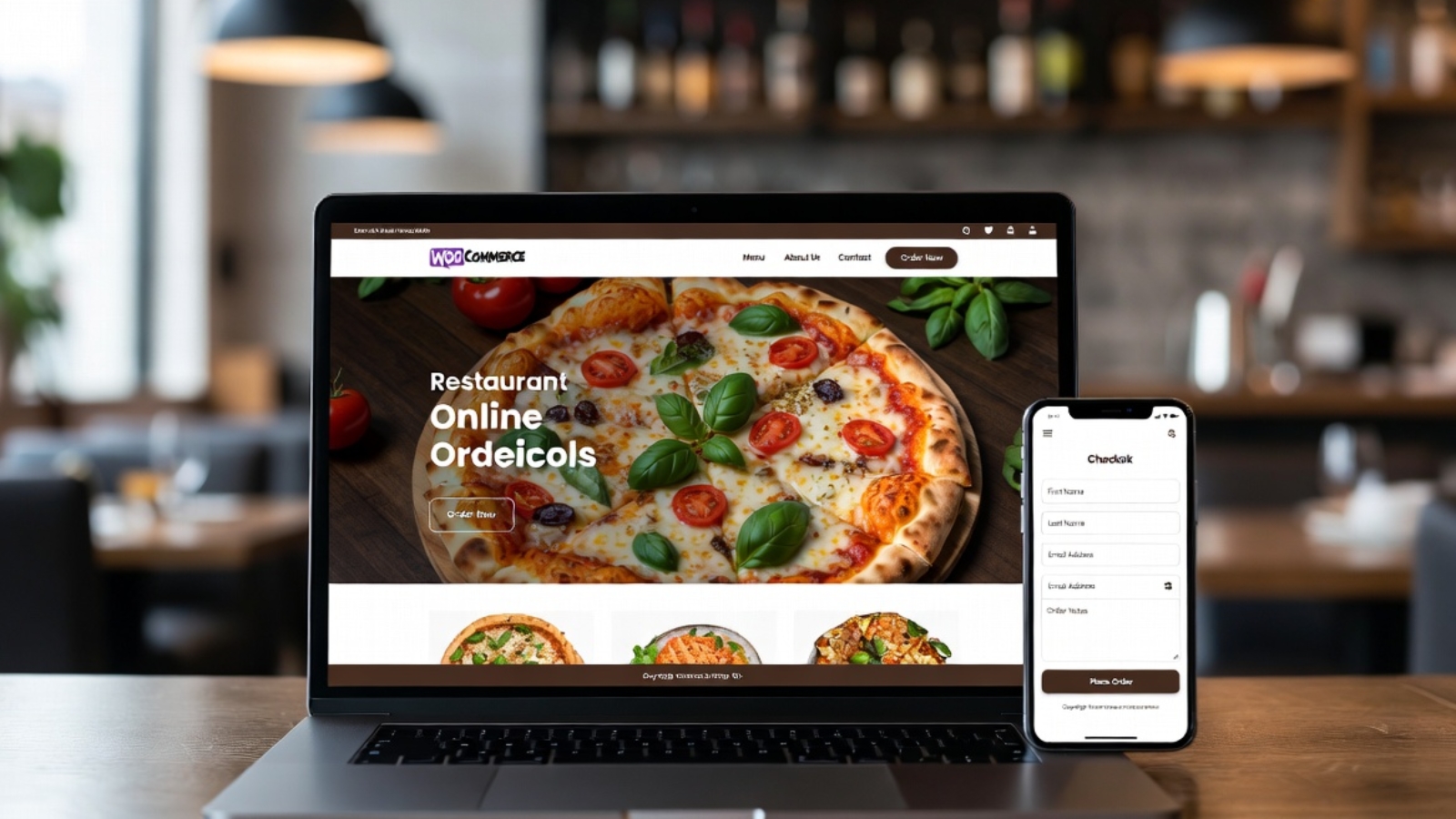
Business owner and developer reviewing a store together while learning what to look for when hiring a WooCommerce developer

WordPress Developer for WooCommerce: What to Look For

Quick answer: To hire a WooCommerce developer, check their PHP and hooks/filters experience, ask for a live store they’ve built, confirm they’ve handled payment gateway integrations, and get a fixed-scope quote for your specific store size. Expect $1,500–$10,000 for a standard store, more for custom checkout flows or large catalogs.

WooCommerce isn’t a website builder you drag and drop your way through. It’s a full plugin ecosystem sitting on top of WordPress, and hiring the wrong person for it usually shows up later, when your store breaks during a sale.

Why WooCommerce Hiring Is Different From Regular WordPress Hiring

A general WordPress developer can build a beautiful brochure site without touching a line of PHP. WooCommerce work is different, because a store involves inventory logic, tax rules, payment processing, and shipping calculations working together correctly, every time.

WooCommerce currently powers roughly a third of all online stores globally, according to 2026 market share data, which means the pool of people calling themselves “WooCommerce developers” is enormous. That popularity is exactly why vetting matters more here than for a standard brochure site.

What Should You Actually Check Before Hiring?

1. Can They Explain Hooks and Filters, Not Just Plugins?

WooCommerce’s real power comes from its hooks and filters system, documented directly in WooCommerce’s official developer documentation. A developer who only knows how to install plugins, without understanding how to customize behavior through hooks, will hit a wall the moment your store needs something non-standard.

Ask directly: “How would you change what happens after checkout without breaking a future WooCommerce update?” A real developer mentions actions and filters. Someone who suggests editing core plugin files is giving you a red flag, because that approach breaks on every single update.

2. Have They Handled Real Payment Gateway Integrations?

Stripe, PayPal, and regional gateways all behave differently, and getting them wrong causes failed transactions or, worse, silent payment errors nobody notices until customers complain. Ask for a specific example of a gateway they’ve configured, not just “yes, I’ve done payments before.”

3. Do They Understand Performance at Scale?

A WooCommerce store with 20 products behaves very differently from one with 2,000. Database queries, caching, and image optimization all matter more as your catalog grows. A developer who’s only worked on small stores may not know how to keep a large one fast.

4. Can They Show You a Live Store, Not Just Screenshots?

Ask for a URL to something they’ve actually built and shipped, ideally one still running today. A live store proves they’ve handled the unglamorous parts too: order management, customer accounts, and post-launch bug fixes.

5. Do They Quote Based on Your Actual Catalog Size?

A developer who quotes the same flat number regardless of whether you have 10 products or 10,000 probably hasn’t thought through what your store actually needs. Good WooCommerce developers ask about catalog size, expected order volume, and shipping complexity before quoting anything.

What Does a WooCommerce Developer Actually Cost?

Pricing depends heavily on scope. A standard store with 20-50 products and one payment gateway typically runs $1,500–$5,000. A more complex build with custom shipping rules, subscriptions, or multiple integrations can run $5,000–$15,000 or more.

Hourly rates for WooCommerce specialists generally fall in the same range as broader WordPress development, since it’s fundamentally WordPress work. I’ve broken down current hourly and project-based pricing in more detail in my WordPress developer cost guide, which applies directly here since WooCommerce sits on top of WordPress.

If you want a rough number for your specific store before requesting quotes, the Free Website Cost Calculator gives you a starting range in a couple of minutes.

The Red Flag Most Clients Miss: Page-Builder-Only Stores

Here’s an opinion I’ll stand behind: a developer who builds your entire store inside a page builder, with no custom code capability at all, is going to hit a ceiling fast. Page builders work fine for product pages and layout. However, custom checkout logic, complex shipping rules, and payment gateway troubleshooting all require actual PHP knowledge underneath.

Ask specifically whether they can work outside the page builder if something needs custom code. If the answer is vague, that’s worth pausing on, especially for a store planning to scale.

This overlaps with a broader hiring risk worth understanding fully. I’ve covered the general warning signs in red flags to watch for when hiring a freelance developer, which applies just as much to WooCommerce hiring as any other project.

Freelancer, Agency, or WooCommerce-Specific Specialist?

A general freelancer works fine for a simple store with standard products and one payment gateway. Once your store needs subscriptions, multi-currency support, or custom shipping logic across regions, a WooCommerce-focused specialist is worth the premium over a generalist.

Agencies make sense for large stores with tight launch deadlines and multiple integrations happening simultaneously. For most small businesses launching their first store, though, one experienced freelancer covering both WordPress and WooCommerce specifically is usually the practical middle ground.

Frequently Asked Questions

How much does it cost to hire a WooCommerce developer?
A standard store with 20-50 products typically costs $1,500–$5,000, while complex builds with subscriptions or custom shipping rules can run $5,000–$15,000 or more.

What should I ask a WooCommerce developer before hiring them?
Ask about their experience with hooks and filters, a specific payment gateway they’ve integrated, and a live store URL they’ve built and still maintain.

Is a general WordPress developer enough for a WooCommerce store?
For a simple store, often yes. For stores needing custom checkout logic, subscriptions, or complex shipping rules, a WooCommerce-specialized developer is a safer choice.

Can page builders handle a full WooCommerce store?
Page builders work well for layout and product pages, but custom checkout logic and payment troubleshooting usually require actual PHP knowledge beyond what a page builder alone provides.

How do I know if a WooCommerce developer can handle my catalog size?
Ask for examples of stores they’ve built with a similar product count and order volume. Performance needs differ significantly between small and large catalogs.

Do WooCommerce developers charge more than regular WordPress developers?
Rates are generally similar, since WooCommerce work is built on WordPress. However, developers with specific ecommerce and payment integration experience may charge a premium for that specialization.

Ready to Get a Real Quote for Your Store?

If you’re planning a WooCommerce store and want a straight answer on scope and cost, message me on WhatsApp and tell me what you’re building. I’ll give you an honest read, not a generic sales pitch.

Small business owner comparing website pricing quotes while researching small business website cost in 2026

How Much Should a Small Business Website Cost in 2026?

Quick answer: Small business website cost in 2026 ranges from $15/month on a DIY builder to $35,000+ for a full agency build. Most professional sites land between $2,000 and $8,000 upfront, plus $100–$480 a month in ongoing hosting, security, and maintenance that many owners forget to budget for.

Every client asks me some version of the same question: “So, realistically, what am I going to spend?” It’s a fair question. However, it doesn’t have one answer, because “website” covers everything from a single landing page to a full booking platform.

Why Does the Range Swing So Wildly?

A website’s cost depends almost entirely on who builds it, not the software behind it. A DIY builder, a freelancer, and an agency can all produce a working site, but the price gap between them is enormous.

That’s because you’re not just paying for code. You’re paying for design decisions, testing, revisions, and someone available when something breaks. The more of that you handle yourself, the less you pay upfront, and the more time and risk you absorb instead.

According to the U.S. Small Business Administration, over 80% of consumers believe a business with a website is more credible than one with only a social media page. That’s exactly why cutting corners on your site, just to save money, tends to cost more in lost trust than it saves in cash.

DIY, Freelancer, or Agency: What Do You Actually Get at Each Price Point?

DIY Website Builders: $15–$140/Month

Platforms like Wix, Squarespace, or Shopify let you build a site yourself with a template and a drag-and-drop editor. No developer required, and you can launch within days.

The trade-off is real, though. You become the designer, the copywriter, and the tech support all at once. Your site will also look recognizably template-based, since thousands of other small businesses use the same builder.

Freelance Developer: $1,500–$8,000 One-Time

A freelancer gives you a custom-designed site built around your actual brand, not a template stretched to fit. Expect $1,500–$8,000 for a typical five-to-ten-page business site, with delivery in four to eight weeks depending on complexity.

This is usually the sweet spot for small businesses that want something professional without agency-level overhead. You get direct access to the person building your site, and no account manager sitting in between.

Agency Build: $5,000–$35,000+

Agencies bundle a full team — designer, developer, project manager, sometimes a copywriter — into one price. That team structure pays off on larger, business-critical builds with multiple moving parts and a firm deadline.

For a simple brochure site, though, that overhead is usually more than you need. Agencies make the most sense once your project involves e-commerce, custom integrations, or content that needs to launch on a fixed timeline. If you’re specifically comparing WordPress developer rates within this range, I’ve broken that down in more detail in my WordPress developer cost guide.

The Hidden Ongoing Costs Nobody Budgets For

Here’s the part that catches almost every first-time website owner off guard: the upfront build is never the whole bill. Domains typically run $10–$20 a year. Hosting ranges from $2 a month on shared plans to well over $100 a month for managed WordPress hosting.

Add SSL certificates (often free, sometimes up to $75/year), premium plugins ($50–$400/year), and routine maintenance ($50–$200/month for custom sites). All told, most small businesses should budget $1,100–$5,000 a year in ongoing costs, on top of whatever they paid to build the site.

Skipping these isn’t really an option, because an unmaintained site quietly turns into a liability — outdated plugins, expired SSL, broken forms nobody notices until a customer complains.

What Actually Drives Your Number Up or Down?

Five factors move the price more than anything else: page count, custom features (booking systems, e-commerce, member logins), copywriting, professional photography, and how much ongoing support you want built in.

A simple five-page site with a contact form sits at the low end of any range. Add an online store, a booking calendar, and custom animations, and the same “website” can cost three or four times as much, even on the identical platform.

That’s why getting an accurate number for your specific project matters more than any general range. The Free Website Cost Calculator walks through your actual features and gives you a realistic estimate in a couple of minutes.

The Mistake That Costs More Than It Saves

Here’s an opinion I’ll stand behind: choosing the cheapest option without checking what it actually includes is the single most expensive mistake small business owners make on websites.

A $300 template site that needs a full rebuild eighteen months later because it can’t handle a new feature costs more, in total, than a $3,000 custom build that scales with your business. Cheap-hosting migrations alone can run $700–$6,000 to fix once a business outgrows its starter plan. That’s a mistake that’s completely avoidable with the right choice up front.

Frequently Asked Questions

What is the average small business website cost in 2026?
Most professional small business websites cost between $2,000 and $8,000 upfront, with DIY builders running $15–$140 a month and agency builds starting around $5,000 and reaching $35,000 or more.

Are DIY website builders cheaper than hiring a freelancer?
Upfront, yes. DIY builders cost $200–$600 a year including hosting, while a freelancer typically charges $1,500–$8,000 one-time. However, freelancers deliver custom branding that templates can’t match.

What ongoing costs come after building a website?
Expect $1,100–$5,000 a year for hosting, domain renewal, SSL, plugins, and maintenance, depending on whether you’re using a builder or a custom-built site.

Is it worth paying more for a custom-built website instead of a template?
It depends on your growth plans. A custom site scales more easily as your business adds services or features, while templates often need a costly rebuild once they’re outgrown.

How much does WordPress cost compared to a DIY builder?
WordPress itself is free, but hosting ($25–$80/month), themes, plugins, and development labor bring total cost to roughly $1,500–$15,000 depending on complexity, compared to a flat $15–$140/month builder subscription.

Do agencies charge more than freelancers for the same website?
Yes, usually 50–100% more, because you’re paying for a full team rather than one person. That premium pays off on complex projects but is often unnecessary for a simple business site.

Ready to Get a Real Number for Your Project?

Every business’s numbers look a little different once you factor in your actual pages, features, and goals. If you’d rather skip the guesswork, message me on WhatsApp and tell me what you’re building — I’ll give you a straight answer, not a generic range.

Wix Studio vs WordPress 2026: Which Is Better for Your Business Website?

Wix Studio vs WordPress 2026: Which Is Better for Your Business Website?

In 2026, choosing between Wix Studio and WordPress is one of the biggest decisions for businesses building or rebuilding their online presence. Both platforms have evolved significantly, but they serve different needs.

As Syed Aoun Raza, a freelance developer specializing in both Wix Velo custom coding and WordPress development, I’ve built websites on both for clients across the US, UK, EU, and beyond. This in-depth guide shares real-world experience to help you decide.

Quick Verdict

  • Choose Wix Studio for speed of launch, built-in tools, and designer-friendly workflows.
  • Choose WordPress for ultimate flexibility, SEO power, ownership, and scalability.

Let’s break it down in detail.

Platform Overview

Wix Studio (2026) Wix’s advanced platform for agencies and professionals. It includes powerful drag-and-drop, Velo coding for custom logic, better hosting, and CMS capabilities.

WordPress (2026) The open-source powerhouse. With Elementor, Gutenberg, and thousands of plugins, it powers over 40% of the web.

Detailed Comparison

1. Ease of Use Wix Studio wins for beginners and designers — intuitive editor, no hosting hassles. WordPress has a learning curve but offers more control once mastered. I use Elementor to make it almost as visual.

2. Design Freedom Wix Studio: Excellent templates and advanced editor. WordPress: Unlimited freedom with custom code, themes, and builders. Winner for complex designs.

3. Speed & Performance Wix has improved but can be bloated. WordPress, when optimized (caching, CDN, good hosting), often outperforms. My WordPress sites regularly hit 95+ PageSpeed scores.

4. SEO Capabilities WordPress is stronger with plugins like Rank Math/Yoast and full control over structure. Wix has improved significantly but still lags in some advanced areas.

5. Cost Wix: Subscription model with limits. WordPress: Lower ongoing costs but requires hosting/maintenance.

6. Scalability & Custom Development WordPress wins for large sites and custom features. Wix Studio + Velo is good for medium projects.

7. E-commerce Both capable. WooCommerce on WordPress offers more flexibility.

Real Client Examples from My Work

  • Tourism Booking Site (Aruba): Chose WordPress + FareHarbor for maximum control and SEO. View project.
  • Restaurant Sites (Denmark): WordPress + WooCommerce for full menu and ordering control.
  • Wix Velo Projects: Used when clients wanted faster launch with custom coding.

When to Choose Wix Studio

  • Need a site live quickly.
  • Prefer all-in-one platform.
  • Team has designers, not developers.
  • Smaller to medium projects.

When to Choose WordPress

  • Want full ownership and no platform lock-in.
  • Need advanced SEO and traffic growth.
  • Complex functionality or e-commerce.
  • Long-term scalability.

Migration & Hybrid Approaches Many clients start on Wix and move to WordPress as they grow. I help with both migrations and custom Velo coding.

Performance & Security in 2026 WordPress requires maintenance but offers better long-term security when updated properly. Wix handles more automatically.

My Recommendation as a Freelance Developer For most businesses targeting organic growth in the US/UK/EU — WordPress provides better ROI. For speed-to-market or specific design needs — Wix Studio with Velo.

I offer development services on both platforms. Contact me for an honest assessment of your project.

Conclusion Wix Studio and WordPress are both excellent in 2026, but the right choice depends on your goals, budget, and technical needs.

Ready to build or rebuild your website? Let’s discuss the best option for your business. Message me on WhatsApp .