
Quick answer: Warm minimalist design combines the clean, uncluttered structure of minimalism with earthy tones, natural textures, and softer typography, replacing the stark white-and-black minimalism that dominated the early 2020s. It’s become the 2026 small business aesthetic because it signals approachability without sacrificing the clarity that made minimalism popular in the first place.
I’ve watched client requests shift noticeably this year. Fewer people ask for “clean and modern” in the sterile, corporate sense. More people ask for something that feels clean but also, in their words, “warm” or “human.”
Why Cold Minimalism Is Losing Ground
Stark white backgrounds, harsh black text, and geometric sans-serif fonts defined minimalism for most of the last decade. That look still works for certain brands, but it’s stopped feeling distinctive, partly because AI-generated design tools now produce that exact aesthetic instantly and at scale.
That’s not a small factor. As AI-generated visuals become smoother and more uniform, audiences increasingly notice, and gravitate away from, anything that reads as generic or machine-made. Warm minimalist design pushes in the opposite direction: textures that look handled, imperfect edges, colors pulled from soil and wood rather than a pure white-black system. It reads as deliberately human, which is exactly the point.
Even Pantone’s own 2026 Color of the Year selection, Cloud Dancer, a soft, billowy white rather than a stark, clinical one, reflects this broader shift. The company describes it as offering calm and clarity rather than sterile minimalism, which tracks closely with what’s actually showing up across small business website redesigns this year.
What Warm Minimalist Design Actually Looks Like
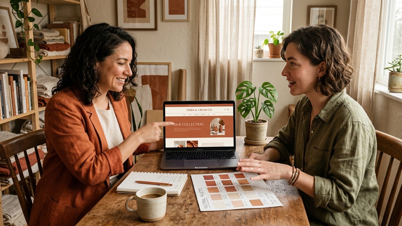
The color palette is the most obvious signal. Terracotta, sage green, muted olive, sand, clay, and soft taupe have replaced the pure white, pure black, single-accent-color palettes that dominated minimalist design previously. These tones read as grounded and natural rather than corporate or sterile.
Typography softens too. Serif and slab-serif fonts, or rounded sans-serifs with warmer proportions, are replacing the hyper-geometric sans-serifs that felt tech-forward a few years ago. The goal isn’t decoration for its own sake. It’s making the same clean layout feel inviting rather than clinical.
Texture matters more than most business owners expect. Subtle paper grain, soft shadows, or organic shapes breaking up rigid grid lines all contribute to that “handled” feeling, without abandoning the underlying simplicity that makes minimalism effective in the first place. The structure stays clean. The surface feels warmer.
Why This Fits Small Businesses Specifically
Here’s the part worth understanding beyond just following a trend. Cold, ultra-minimal design often reads as corporate, distant, even slightly intimidating, exactly the opposite of what most small businesses want to communicate to a first-time visitor.
Warm minimalist design keeps the clarity and professionalism minimalism is known for, while signaling something closer to “run by real people who care,” which matters enormously for service businesses, artisan retailers, wellness brands, and anyone selling trust as much as a product. A cold, sterile aesthetic can genuinely work against a business whose entire pitch is personal attention and craftsmanship.
That said, this isn’t universal. A fintech startup or enterprise SaaS product may still benefit more from a sharper, more technical-feeling minimalism than a warm, earthy one. This trend fits businesses selling warmth and relationship, not every business by default.
The Accessibility Trap of Warm Palettes
Here’s a genuinely useful nuance most trend articles skip entirely, and it’s worth taking seriously before you commit to earthy tones across your whole site. Warm neutrals, muted sage on cream, soft taupe on off-white, often carry noticeably lower contrast than the stark black-on-white combinations they’re replacing.
The W3C’s WCAG 2.2 standard requires a minimum 4.5:1 contrast ratio for normal body text to meet accessibility guidelines. Plenty of warm, muted color pairings that look beautiful in a mockup fail that ratio when actually tested, which means visitors with low vision genuinely struggle to read your content.
The fix isn’t abandoning the palette. It’s testing your actual text-and-background combinations against the real contrast ratio before finalizing anything, and reserving the softest, most muted tones for accents and backgrounds rather than body text itself. A warm palette and an accessible one aren’t mutually exclusive, but they don’t happen automatically together either.
How to Apply This Without a Full Rebrand
Here’s where I’ll give a genuinely practical answer, not just design theory. You don’t need to rebuild your entire site to bring in this aesthetic. Swapping your accent colors, background tones, and a few key typography choices often shifts the overall feeling significantly without touching your core layout or navigation structure.
Start with your homepage hero section and one or two other high-visibility pages first. Test how the warmer palette reads against your actual content and photography before committing sitewide, since a shift this visible deserves a trial run rather than an all-at-once overhaul.
This overlaps with a broader principle I’ve covered in web design trends that actually improve conversions: test a change on real traffic before assuming it’s the right call for your entire site, rather than adopting a trend wholesale because it’s currently popular.
The Mistake I See Most: Warmth Without Structure
Here’s my honest take after seeing this trend implemented poorly a few times already. Some redesigns lean so heavily into texture, muted color, and organic shapes that the underlying clarity minimalism was known for gets lost entirely. The result feels cluttered and soft rather than warm and clean.
Warm minimalist design still needs the discipline of actual minimalism underneath: generous white space, clear hierarchy, one obvious next step per page. The warmth comes from color and texture choices layered on top of that structure, not from abandoning the structure itself. If your redesign feels busier than your old cold-minimalist site, you’ve missed the point of the trend entirely.
Frequently Asked Questions
What is warm minimalist design?
It combines minimalism’s clean structure and generous white space with earthy color palettes, softer typography, and natural textures, replacing the stark white-and-black minimalism popular in previous years.
Why is warm minimalist design popular for small businesses in 2026?
It signals approachability and human authenticity, which matters for service businesses and brands built on personal trust, while still maintaining the clarity and professionalism minimalism provides.
Does every business benefit from switching to warm minimalist design?
No. Fintech, enterprise SaaS, and other more technical-feeling brands may still benefit more from a sharper, cooler minimalism than an earthy, warm one.
Are warm color palettes harder to make accessible?
Often, yes. Muted, earthy tones frequently carry lower contrast than stark black-on-white combinations, so testing actual contrast ratios against WCAG standards matters more with these palettes.
Do I need a full website rebuild to adopt warm minimalist design?
Not necessarily. Updating accent colors, backgrounds, and typography often shifts the overall feeling significantly without requiring changes to your site’s core layout or structure.
How do I know if warm minimalist design fits my brand?
If your business relies on personal trust, craftsmanship, or approachability, warm minimalist design likely fits well. If your brand leans technical or corporate, a cooler aesthetic may serve you better.
Curious If This Aesthetic Fits Your Brand?
If you’re considering a refresh and want an honest read on whether warm minimalist design fits your business, message me on WhatsApp and tell me what you’re working with. I’ll give you a straight answer, not a trend-driven pitch.