
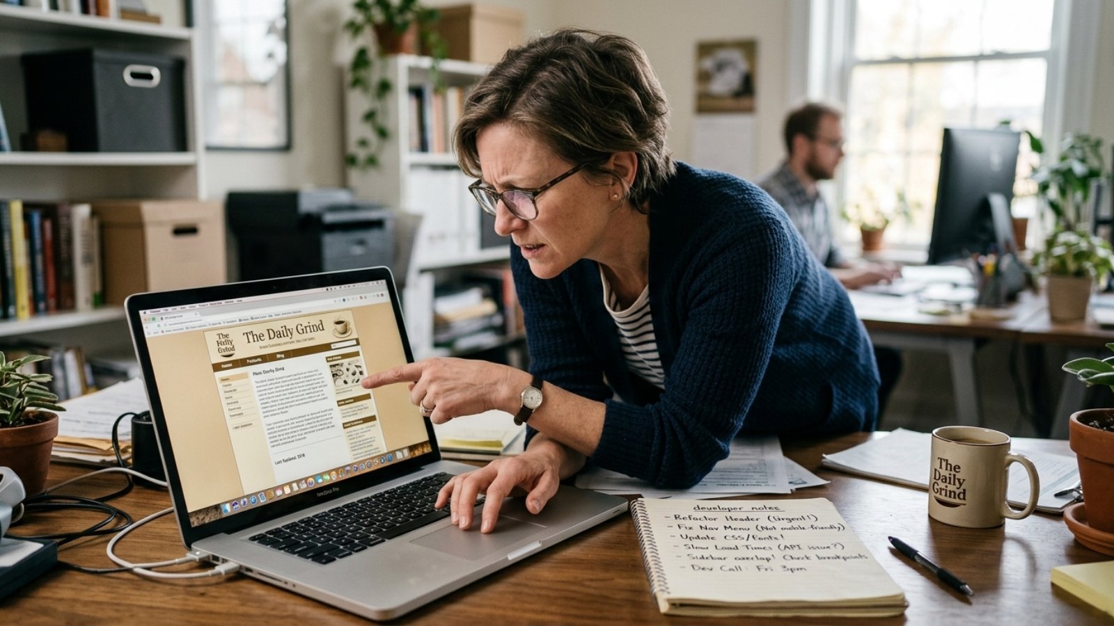
Business owner spotting signs their website needs a redesign while reviewing it on a laptop

Signs Your Website Needs a Redesign in 2026

Quick answer: Your website needs a redesign if it fails on mobile, loads slowly, or looks visibly dated next to competitors. It also needs one if you can’t update it without calling a developer for every small change. Spot two or more of these signs, and patching individual pages won’t fix the root problem.

The 60-Second Test: Do You Actually Need a Redesign?

Before reading further, try this. Open your site on your phone. Then ask a friend or colleague — someone who’s never seen it — for their honest first impression.

If they hesitate, or say something like “it looks fine, I guess,” that hesitation is data. First impressions form almost instantly. A lukewarm reaction usually means your site isn’t doing its job.

This quick test won’t tell you why something feels off. However, it’s a fast way to check your gut instinct against someone else’s. Do it before you spend time diagnosing the technical details below.

Design Signs Your Website Needs a Redesign

Some signs are visible the moment you load the homepage. These are the easiest to spot, but business owners often get used to them and stop noticing.

  • Your layout doesn’t adapt properly on phones. Text that’s too small, buttons that overlap, or horizontal scrolling are immediate red flags. Most of your traffic is likely mobile already.
  • Fonts, colors, or imagery feel dated. Design trends shift fast, and a site that looked sharp in 2021 can look tired by 2026.
  • Competitors’ sites look noticeably more polished. When a prospect compares three options side by side, an outdated design quietly signals an outdated business.
  • Your branding has changed, but your website hasn’t caught up. A new logo sitting on an old template creates a disjointed impression.

Technical Signs Your Website Needs a Redesign

These signs are harder to see with the naked eye, but they matter just as much. In fact, they often matter more, because they affect whether people find your site at all.

Page speed is the big one. Google now scores responsiveness using a metric called Interaction to Next Paint, or INP. It measures how quickly your site reacts to clicks, taps, and form entries. It tracks the entire visit, not just the first click. Google’s own web.dev documentation sets the bar at 200 milliseconds. At least 75% of real user interactions need to respond that fast for Google to call it “good” performance. Older sites built on heavy themes or bloated plugins routinely miss this mark. That gap can quietly hurt both user experience and search rankings.

Other technical warning signs include:

  • Frequent plugin conflicts or security warnings on WordPress sites
  • A CMS or page builder that’s been discontinued or rarely updated
  • Broken forms, dead links, or checkout errors nobody has fixed in months
  • No HTTPS, or an outdated SSL setup

Sometimes load speed is the only real problem, separate from the design itself. That’s often a narrower, cheaper fix than a full redesign. It’s worth diagnosing this first, before you commit to a bigger project.

Business Signs Your Website Needs a Redesign

Here’s the part most redesign checklists skip. Sometimes the site itself is fine, but it no longer matches the business behind it.

Ask yourself honestly — does your website still describe what you actually sell? Businesses evolve constantly. They add services, drop others, and shift focus, and websites frequently lag years behind that reality. Maybe your homepage still promotes something you no longer offer. Maybe it skips your most profitable service entirely. Either way, that’s a business misalignment no plugin update will fix.

Another sign: your own team avoids sending prospects to the website. If they say “it doesn’t really show what we do anymore,” that’s as clear a signal as you’ll get. I’ve heard variations of that exact sentence from more than one client before we started a rebuild.

Redesign vs. Refresh: Which One Do You Actually Need?

Not every sign above means you need a full rebuild. That distinction matters, because a redesign and a refresh are different projects with very different price tags.

A refresh typically covers copy updates, new photos, and a color or font tweak. It’s fast, usually inexpensive, and doesn’t touch the underlying structure.

A redesign rebuilds the site’s structure, navigation, and technical foundation. Choose this route when the problems are structural. Think poor mobile responsiveness, an outdated CMS, or a site that fights you on every new page.

Most businesses across the industry now go through a major redesign roughly every two to three years. Smaller refreshes tend to happen in between. That timeline still shifts depending on how fast your specific industry moves, though. Want a clearer sense of what a redesign would cost for your situation? Skip the industry averages — our website cost calculator gives you an instant, no-signup estimate instead.

My Honest Take: Don’t Redesign Just Because It’s “Time”

Here’s where I’ll disagree with a lot of agency advice. Redesigning on a fixed calendar schedule, just because “it’s been a few years,” often wastes money.

If your site converts well, loads fast, and represents your business accurately, skip the redesign. A fresh coat of paint rarely moves revenue on its own. The signs above exist for a reason. They tell you when a redesign will actually solve a real problem, not just satisfy an itch for something new.

That said, maybe your site is quietly losing you leads, and you’re not sure why. Design, speed, and messaging can all be culprits. Our guide on why your website isn’t converting walks through the most common causes in more detail.

Frequently Asked Questions

How do I know if my website needs a redesign or just a refresh? A refresh fixes surface issues like outdated copy or images. You need a full redesign when the problems run deeper. Think broken mobile layouts, slow technical performance, or a CMS that can’t support your current needs.

How much does a website redesign cost in 2026? Costs vary widely depending on scope, page count, and platform. A small refresh might cost a few hundred dollars, while a full custom rebuild can run into the thousands. A project-specific estimate beats any industry average.

How often should a small business redesign its website? Most businesses redesign every two to three years. Fast-moving industries may need it sooner. Slower-changing sectors can often wait longer if the site still performs well.

Does a slow website really mean I need a full redesign? Not always. Slow speed is sometimes fixable through targeted performance work. Image compression or a hosting change can fix it without rebuilding the entire site.

Will a redesign hurt my current SEO rankings? It can, if done carelessly. Losing old URLs or content without proper redirects is the most common cause. Keep a redirect plan and preserve your existing content, though, and a redesign usually protects or improves rankings over time.

What’s the biggest mistake businesses make when redesigning their website? They focus entirely on visual appearance and ignore the technical and business-alignment issues underneath. A beautiful site that’s still slow, or still promotes the wrong services, only solves part of the problem.

If you’ve spotted two or more of these signs, that’s usually enough to justify a proper look. Message me on WhatsApp with your site link. I’ll tell you honestly whether you need a full redesign, a smaller refresh, or nothing at all.
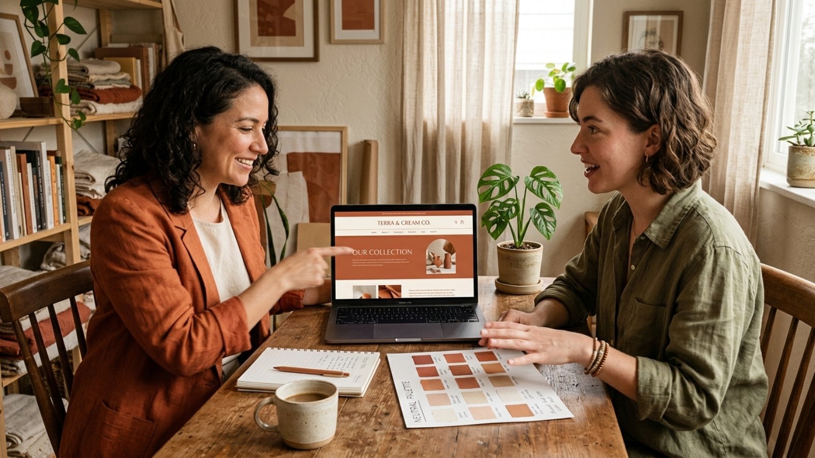

Business owner and designer reviewing a warm minimalist design mockup in earthy tones

Warm Minimalist Design: The 2026 Business Look

Quick answer: Warm minimalist design combines the clean, uncluttered structure of minimalism with earthy tones, natural textures, and softer typography, replacing the stark white-and-black minimalism that dominated the early 2020s. It’s become the 2026 small business aesthetic because it signals approachability without sacrificing the clarity that made minimalism popular in the first place.

I’ve watched client requests shift noticeably this year. Fewer people ask for “clean and modern” in the sterile, corporate sense. More people ask for something that feels clean but also, in their words, “warm” or “human.”

Why Cold Minimalism Is Losing Ground

Stark white backgrounds, harsh black text, and geometric sans-serif fonts defined minimalism for most of the last decade. That look still works for certain brands, but it’s stopped feeling distinctive, partly because AI-generated design tools now produce that exact aesthetic instantly and at scale.

That’s not a small factor. As AI-generated visuals become smoother and more uniform, audiences increasingly notice, and gravitate away from, anything that reads as generic or machine-made. Warm minimalist design pushes in the opposite direction: textures that look handled, imperfect edges, colors pulled from soil and wood rather than a pure white-black system. It reads as deliberately human, which is exactly the point.

Even Pantone’s own 2026 Color of the Year selection, Cloud Dancer, a soft, billowy white rather than a stark, clinical one, reflects this broader shift. The company describes it as offering calm and clarity rather than sterile minimalism, which tracks closely with what’s actually showing up across small business website redesigns this year.

What Warm Minimalist Design Actually Looks Like

The color palette is the most obvious signal. Terracotta, sage green, muted olive, sand, clay, and soft taupe have replaced the pure white, pure black, single-accent-color palettes that dominated minimalist design previously. These tones read as grounded and natural rather than corporate or sterile.

Typography softens too. Serif and slab-serif fonts, or rounded sans-serifs with warmer proportions, are replacing the hyper-geometric sans-serifs that felt tech-forward a few years ago. The goal isn’t decoration for its own sake. It’s making the same clean layout feel inviting rather than clinical.

Texture matters more than most business owners expect. Subtle paper grain, soft shadows, or organic shapes breaking up rigid grid lines all contribute to that “handled” feeling, without abandoning the underlying simplicity that makes minimalism effective in the first place. The structure stays clean. The surface feels warmer.

Why This Fits Small Businesses Specifically

Here’s the part worth understanding beyond just following a trend. Cold, ultra-minimal design often reads as corporate, distant, even slightly intimidating, exactly the opposite of what most small businesses want to communicate to a first-time visitor.

Warm minimalist design keeps the clarity and professionalism minimalism is known for, while signaling something closer to “run by real people who care,” which matters enormously for service businesses, artisan retailers, wellness brands, and anyone selling trust as much as a product. A cold, sterile aesthetic can genuinely work against a business whose entire pitch is personal attention and craftsmanship.

That said, this isn’t universal. A fintech startup or enterprise SaaS product may still benefit more from a sharper, more technical-feeling minimalism than a warm, earthy one. This trend fits businesses selling warmth and relationship, not every business by default.

The Accessibility Trap of Warm Palettes

Here’s a genuinely useful nuance most trend articles skip entirely, and it’s worth taking seriously before you commit to earthy tones across your whole site. Warm neutrals, muted sage on cream, soft taupe on off-white, often carry noticeably lower contrast than the stark black-on-white combinations they’re replacing.

The W3C’s WCAG 2.2 standard requires a minimum 4.5:1 contrast ratio for normal body text to meet accessibility guidelines. Plenty of warm, muted color pairings that look beautiful in a mockup fail that ratio when actually tested, which means visitors with low vision genuinely struggle to read your content.

The fix isn’t abandoning the palette. It’s testing your actual text-and-background combinations against the real contrast ratio before finalizing anything, and reserving the softest, most muted tones for accents and backgrounds rather than body text itself. A warm palette and an accessible one aren’t mutually exclusive, but they don’t happen automatically together either.

How to Apply This Without a Full Rebrand

Here’s where I’ll give a genuinely practical answer, not just design theory. You don’t need to rebuild your entire site to bring in this aesthetic. Swapping your accent colors, background tones, and a few key typography choices often shifts the overall feeling significantly without touching your core layout or navigation structure.

Start with your homepage hero section and one or two other high-visibility pages first. Test how the warmer palette reads against your actual content and photography before committing sitewide, since a shift this visible deserves a trial run rather than an all-at-once overhaul.

This overlaps with a broader principle I’ve covered in web design trends that actually improve conversions: test a change on real traffic before assuming it’s the right call for your entire site, rather than adopting a trend wholesale because it’s currently popular.

The Mistake I See Most: Warmth Without Structure

Here’s my honest take after seeing this trend implemented poorly a few times already. Some redesigns lean so heavily into texture, muted color, and organic shapes that the underlying clarity minimalism was known for gets lost entirely. The result feels cluttered and soft rather than warm and clean.

Warm minimalist design still needs the discipline of actual minimalism underneath: generous white space, clear hierarchy, one obvious next step per page. The warmth comes from color and texture choices layered on top of that structure, not from abandoning the structure itself. If your redesign feels busier than your old cold-minimalist site, you’ve missed the point of the trend entirely.

Frequently Asked Questions

What is warm minimalist design?
It combines minimalism’s clean structure and generous white space with earthy color palettes, softer typography, and natural textures, replacing the stark white-and-black minimalism popular in previous years.

Why is warm minimalist design popular for small businesses in 2026?
It signals approachability and human authenticity, which matters for service businesses and brands built on personal trust, while still maintaining the clarity and professionalism minimalism provides.

Does every business benefit from switching to warm minimalist design?
No. Fintech, enterprise SaaS, and other more technical-feeling brands may still benefit more from a sharper, cooler minimalism than an earthy, warm one.

Are warm color palettes harder to make accessible?
Often, yes. Muted, earthy tones frequently carry lower contrast than stark black-on-white combinations, so testing actual contrast ratios against WCAG standards matters more with these palettes.

Do I need a full website rebuild to adopt warm minimalist design?
Not necessarily. Updating accent colors, backgrounds, and typography often shifts the overall feeling significantly without requiring changes to your site’s core layout or structure.

How do I know if warm minimalist design fits my brand?
If your business relies on personal trust, craftsmanship, or approachability, warm minimalist design likely fits well. If your brand leans technical or corporate, a cooler aesthetic may serve you better.

Curious If This Aesthetic Fits Your Brand?

If you’re considering a refresh and want an honest read on whether warm minimalist design fits your business, message me on WhatsApp and tell me what you’re working with. I’ll give you a straight answer, not a trend-driven pitch.

Business owner discussing a project with a developer who understands design and SEO together

How to Hire a Developer Who Understands Both Design and SEO

Quick answer: To hire a developer who understands design and SEO together, look for someone who can explain how a design choice affects load speed, mobile usability, or crawlability, not just how it looks. Ask for examples where they balanced visual goals against technical SEO needs, since that trade-off is where most hires fall short.

I see this gap constantly. A client hires a designer for a beautiful site, then hires an SEO specialist afterward to fix why it isn’t ranking. By then, half the SEO fixes require undoing design decisions nobody flagged as a problem in the first place.

Why Design and SEO Usually Get Hired Separately

Most freelance marketplaces and agencies split these into different specialties, because they genuinely require different skill sets. A designer thinks in layout, color, and user flow. An SEO specialist thinks in keywords, crawlability, and search intent.

That split makes sense on paper. However, it creates a real problem in practice, because design decisions directly affect SEO outcomes, and vice versa. A gorgeous, image-heavy homepage can quietly tank your Core Web Vitals score, while a technically perfect SEO structure crammed onto an ugly, confusing layout won’t convert the traffic it earns.

According to Google’s own page experience documentation, Google’s core ranking systems specifically evaluate page experience alongside content quality. That means design and SEO aren’t separate disciplines from Google’s perspective. They’re two inputs into the same evaluation.

What Actually Separates Someone Who Understands Both

They Can Explain the Trade-Off, Not Just Pick a Side

Ask a candidate: “If a client wants a large hero video on the homepage, how do you handle that for SEO?” Someone who understands both will discuss lazy loading, compressed file formats, or a fallback image for mobile. Someone who only understands design says “sure, I’ll add it” without mentioning any of that.

They Talk About Structure Before Visuals

A developer who understands SEO thinks about heading hierarchy, URL structure, and internal linking as part of the design process, not as an afterthought bolted on later. If someone starts every project with color palettes and fonts, without asking about your target keywords or page structure, that’s a signal they’re designing in isolation.

They Know Mobile Usability Isn’t Optional

Since mobile-first indexing means Google evaluates your mobile version as the primary version of your site, a developer who understands both disciplines treats mobile design as the baseline, not an adjustment made after the desktop version looks good.

They Ask About Your Existing Rankings Before Redesigning

If you already have some organic traffic, a developer who understands SEO will ask what’s currently ranking before touching your URLs or navigation structure. Careless redesigns routinely tank existing rankings by changing URLs without proper redirects, something a purely visual designer might not think to check.

Questions to Ask Before You Hire

Here are five questions that separate genuine dual-skill developers from designers who’ve picked up SEO buzzwords:

  • “How do you balance page speed against visual design elements like animations or large images?”
  • “What happens to my existing URLs and rankings if you redesign my site?”
  • “How do you structure headings and content for both readability and SEO?”
  • “Can you show me a site where you handled both the design and the technical SEO?”
  • “What would you do differently if my goal was rankings versus if my goal was pure visual impact?”

Vague or one-sided answers to these, especially the first one, are worth noticing. A real dual-skill developer treats speed and visuals as a negotiation, not a competition where one automatically wins.

The Nuance Most Guides Skip: You Don’t Always Need One Person to Do Everything

Here’s an opinion worth stating plainly. You don’t strictly need a single person who’s equally expert at both design and SEO. What you actually need is someone who understands enough of both to avoid making decisions that quietly sabotage the other.

A specialist SEO consultant paired with a designer who genuinely listens to their input can work just as well as one dual-skill developer, sometimes better for complex projects. The failure mode isn’t hiring separately. It’s hiring separately with no communication between the two, where design decisions get finalized before SEO ever gets a look.

If you’re weighing whether your current site’s ranking problems stem from design choices specifically, I’ve broken that connection down in more detail in why your website isn’t ranking on Google.

How This Connects to Current Design Trends

The design trends actually worth adopting in 2026, performance-first layouts, mobile-optimized forms, purposeful clarity, happen to be the same choices that support strong SEO. That’s not a coincidence. I’ve covered which trends genuinely help conversions, and by extension SEO, in web design trends 2026 that actually increase sales.

That overlap is exactly why hiring someone who understands both disciplines pays off. The best design choices and the best SEO choices increasingly point in the same direction, so a developer fluent in both won’t force you to choose between them.

If you want a realistic sense of what this kind of combined project typically costs, the Free Website Cost Calculator gives you a starting range in a couple of minutes.

Frequently Asked Questions

Why do I need a developer who understands both design and SEO?
Design choices directly affect load speed, mobile usability, and crawlability, all of which influence SEO. Hiring separately without coordination often means SEO fixes later undo design decisions made earlier.

Is it better to hire one dual-skill developer or a designer and SEO specialist separately?
Either can work well, as long as they communicate throughout the project. The real risk is hiring both separately with no coordination between design decisions and SEO requirements.

Does a website redesign hurt existing Google rankings?
It can, especially if URLs change without proper redirects. A developer who understands SEO will check existing rankings before restructuring a site.

Does Google actually consider design when ranking a page?
Yes, indirectly. Google’s page experience signals evaluate factors like Core Web Vitals and mobile usability, both of which are directly shaped by design decisions.

What questions should I ask to check if a developer understands both design and SEO?
Ask how they balance visual elements against page speed, how they handle existing URLs during a redesign, and whether they can show a project where they managed both disciplines together.

Does mobile-first design really matter for SEO?
Yes. Google evaluates the mobile version of your site as the primary version for ranking purposes, so a poor mobile experience directly affects your search visibility.

Want a Developer Who Handles Both?

If you’re tired of hiring separately for design and SEO and having neither side talk to the other, message me on WhatsApp and tell me about your project. I’ll give you a straight read on what it actually needs.