Quick answer: Warm minimalist design combines the clean, uncluttered structure of minimalism with earthy tones, natural textures, and softer typography, replacing the stark white-and-black minimalism that dominated the early 2020s. It’s become the 2026 small business aesthetic because it signals approachability without sacrificing the clarity that made minimalism popular in the first place.
I’ve watched client requests shift noticeably this year. Fewer people ask for “clean and modern” in the sterile, corporate sense. More people ask for something that feels clean but also, in their words, “warm” or “human.”
Why Cold Minimalism Is Losing Ground
Stark white backgrounds, harsh black text, and geometric sans-serif fonts defined minimalism for most of the last decade. That look still works for certain brands, but it’s stopped feeling distinctive, partly because AI-generated design tools now produce that exact aesthetic instantly and at scale.
That’s not a small factor. As AI-generated visuals become smoother and more uniform, audiences increasingly notice, and gravitate away from, anything that reads as generic or machine-made. Warm minimalist design pushes in the opposite direction: textures that look handled, imperfect edges, colors pulled from soil and wood rather than a pure white-black system. It reads as deliberately human, which is exactly the point.
Even Pantone’s own 2026 Color of the Year selection, Cloud Dancer, a soft, billowy white rather than a stark, clinical one, reflects this broader shift. The company describes it as offering calm and clarity rather than sterile minimalism, which tracks closely with what’s actually showing up across small business website redesigns this year.
What Warm Minimalist Design Actually Looks Like
The color palette is the most obvious signal. Terracotta, sage green, muted olive, sand, clay, and soft taupe have replaced the pure white, pure black, single-accent-color palettes that dominated minimalist design previously. These tones read as grounded and natural rather than corporate or sterile.
Typography softens too. Serif and slab-serif fonts, or rounded sans-serifs with warmer proportions, are replacing the hyper-geometric sans-serifs that felt tech-forward a few years ago. The goal isn’t decoration for its own sake. It’s making the same clean layout feel inviting rather than clinical.
Texture matters more than most business owners expect. Subtle paper grain, soft shadows, or organic shapes breaking up rigid grid lines all contribute to that “handled” feeling, without abandoning the underlying simplicity that makes minimalism effective in the first place. The structure stays clean. The surface feels warmer.
Why This Fits Small Businesses Specifically
Here’s the part worth understanding beyond just following a trend. Cold, ultra-minimal design often reads as corporate, distant, even slightly intimidating, exactly the opposite of what most small businesses want to communicate to a first-time visitor.
Warm minimalist design keeps the clarity and professionalism minimalism is known for, while signaling something closer to “run by real people who care,” which matters enormously for service businesses, artisan retailers, wellness brands, and anyone selling trust as much as a product. A cold, sterile aesthetic can genuinely work against a business whose entire pitch is personal attention and craftsmanship.
That said, this isn’t universal. A fintech startup or enterprise SaaS product may still benefit more from a sharper, more technical-feeling minimalism than a warm, earthy one. This trend fits businesses selling warmth and relationship, not every business by default.
The Accessibility Trap of Warm Palettes
Here’s a genuinely useful nuance most trend articles skip entirely, and it’s worth taking seriously before you commit to earthy tones across your whole site. Warm neutrals, muted sage on cream, soft taupe on off-white, often carry noticeably lower contrast than the stark black-on-white combinations they’re replacing.
The W3C’s WCAG 2.2 standard requires a minimum 4.5:1 contrast ratio for normal body text to meet accessibility guidelines. Plenty of warm, muted color pairings that look beautiful in a mockup fail that ratio when actually tested, which means visitors with low vision genuinely struggle to read your content.
The fix isn’t abandoning the palette. It’s testing your actual text-and-background combinations against the real contrast ratio before finalizing anything, and reserving the softest, most muted tones for accents and backgrounds rather than body text itself. A warm palette and an accessible one aren’t mutually exclusive, but they don’t happen automatically together either.
How to Apply This Without a Full Rebrand
Here’s where I’ll give a genuinely practical answer, not just design theory. You don’t need to rebuild your entire site to bring in this aesthetic. Swapping your accent colors, background tones, and a few key typography choices often shifts the overall feeling significantly without touching your core layout or navigation structure.
Start with your homepage hero section and one or two other high-visibility pages first. Test how the warmer palette reads against your actual content and photography before committing sitewide, since a shift this visible deserves a trial run rather than an all-at-once overhaul.
This overlaps with a broader principle I’ve covered in web design trends that actually improve conversions: test a change on real traffic before assuming it’s the right call for your entire site, rather than adopting a trend wholesale because it’s currently popular.
The Mistake I See Most: Warmth Without Structure
Here’s my honest take after seeing this trend implemented poorly a few times already. Some redesigns lean so heavily into texture, muted color, and organic shapes that the underlying clarity minimalism was known for gets lost entirely. The result feels cluttered and soft rather than warm and clean.
Warm minimalist design still needs the discipline of actual minimalism underneath: generous white space, clear hierarchy, one obvious next step per page. The warmth comes from color and texture choices layered on top of that structure, not from abandoning the structure itself. If your redesign feels busier than your old cold-minimalist site, you’ve missed the point of the trend entirely.
Frequently Asked Questions
What is warm minimalist design? It combines minimalism’s clean structure and generous white space with earthy color palettes, softer typography, and natural textures, replacing the stark white-and-black minimalism popular in previous years.
Why is warm minimalist design popular for small businesses in 2026? It signals approachability and human authenticity, which matters for service businesses and brands built on personal trust, while still maintaining the clarity and professionalism minimalism provides.
Does every business benefit from switching to warm minimalist design? No. Fintech, enterprise SaaS, and other more technical-feeling brands may still benefit more from a sharper, cooler minimalism than an earthy, warm one.
Are warm color palettes harder to make accessible? Often, yes. Muted, earthy tones frequently carry lower contrast than stark black-on-white combinations, so testing actual contrast ratios against WCAG standards matters more with these palettes.
Do I need a full website rebuild to adopt warm minimalist design? Not necessarily. Updating accent colors, backgrounds, and typography often shifts the overall feeling significantly without requiring changes to your site’s core layout or structure.
How do I know if warm minimalist design fits my brand? If your business relies on personal trust, craftsmanship, or approachability, warm minimalist design likely fits well. If your brand leans technical or corporate, a cooler aesthetic may serve you better.
Curious If This Aesthetic Fits Your Brand?
If you’re considering a refresh and want an honest read on whether warm minimalist design fits your business, message me on WhatsApp and tell me what you’re working with. I’ll give you a straight answer, not a trend-driven pitch.
Quick answer: Bento grid layouts, named after Japanese bento boxes, arrange content into asymmetric modular blocks of varying sizes on a shared grid. They’re everywhere in 2026 because Apple’s product pages popularized the style, and modern CSS Grid makes them genuinely easy to build responsively. They work well for feature showcases and dashboards, but they’re not automatically right for every website.
Open Dribbble, Awwwards, or basically any SaaS landing page right now, and you’ll see the same pattern repeating: rounded rectangles of different sizes, tiled together like a neatly packed lunch. That’s a bento grid, and there’s a real reason it spread this fast.
Where Did Bento Grid Layouts Actually Come From?
The name comes from the Japanese bento box, a single tray divided into compartments holding different foods side by side. Apply that same idea to a webpage, and you get a bento grid: distinct content blocks of varying sizes, arranged together on one shared grid instead of one uniform layout.
Apple’s product keynote pages get most of the credit for popularizing this specific style, using asymmetric grids to present product specs and features in a visually engaging way rather than a boring bulleted list. Once that style appeared consistently across Apple’s marketing pages, designers across the industry picked it up quickly, and it spread from tech product pages into portfolios, SaaS dashboards, and small business homepages alike.
Why Bento Grid Layouts Genuinely Work, When They Do
Here’s the actual reasoning behind the trend, not just the aesthetic appeal. People don’t read a webpage top to bottom like a book. They scan in chunks, and a bento grid matches that natural scanning behavior by presenting content as distinct, self-contained blocks rather than one continuous stream.
That chunking also creates visual hierarchy without needing extra design elements. A larger block naturally draws the eye first, then attention moves to adjacent smaller blocks, giving you a built-in way to signal what matters most on a page without relying purely on typography size or color to do that work.
Technically, this trend exists now specifically because CSS Grid matured enough to make it practical. According to MDN’s official CSS Grid documentation, CSS Grid gives developers genuine two-dimensional control over both rows and columns simultaneously, something older layout methods like floats or even Flexbox couldn’t handle nearly as cleanly. Without CSS Grid’s maturity, bento layouts would be far more fragile and painful to build responsively.
The Accessibility Catch Nobody Mentions
Here’s a genuinely useful nuance most bento grid articles skip entirely, and it’s worth taking seriously before you get excited about this trend. When you visually reorder content on a grid, moving a block’s visual position without changing its actual position in your HTML, screen reader users navigate in a completely different order than what sighted users see.
According to MDN’s guidance on grid layout and accessibility, developers need to actively check whether visual reordering also requires updating the underlying source order, since the two can drift apart silently as a design evolves. A bento grid that looks perfectly organized visually can read as a confusing, illogical sequence to someone using a screen reader, if the HTML source order was never adjusted to match.
This is exactly the kind of gap that matters for the accessibility compliance topics I’ve covered elsewhere. Getting a bento grid’s markup order right isn’t optional polish, it’s a real accessibility requirement, not just a visual nice-to-have.
When Bento Grid Layouts Are the Wrong Choice
Here’s where I’ll push back on treating this as a universal upgrade. Data-heavy content, pricing tables, detailed spec comparisons, anything genuinely tabular, works better in a traditional table layout than forced into asymmetric bento boxes. Cramming structured data into varying box sizes usually makes it harder to compare, not easier.
Content-heavy pages built around long-form reading, blog posts, detailed service explanations, don’t benefit from bento treatment either. The whole appeal of a bento grid is chunking distinct pieces of content side by side. A single long article doesn’t have distinct chunks to arrange that way, so forcing the pattern onto it just adds visual complexity without a real functional benefit.
The Real Implementation Cost Worth Knowing About
Here’s something worth understanding before you assume this is a quick visual refresh. A genuinely responsive bento grid, one that reflows sensibly from a rich desktop layout down to a clean single-column mobile stack, takes real planning, not just dragging boxes around in a page builder.
Many WordPress page builders and drag-and-drop tools handle basic grids reasonably well, but achieving true asymmetric bento layouts with proper responsive behavior often benefits from custom CSS Grid work rather than relying entirely on a builder’s default grid widget. That’s a meaningful difference in both cost and quality between a developer who understands CSS Grid directly versus one only comfortable inside a visual builder’s constraints. I’ve covered what technical currency actually looks like in a developer more broadly in what a good WordPress developer should know in 2026, and CSS Grid fluency is a genuinely relevant piece of that picture for this specific trend.
Should Your Business Actually Use a Bento Grid?
If your homepage or landing page needs to showcase several distinct features, services, or benefits side by side, a well-built bento grid genuinely helps visitors process that information faster than a uniform list would. SaaS product pages, agency portfolios, and feature-heavy service pages are natural fits.
If your site leans more toward long-form content, structured data, or a simple service offering without many distinct features to showcase, a bento grid adds visual complexity without solving an actual problem. That’s the same trap I’ve covered with other trends in web design trends that actually improve conversions: adopting a pattern because it looks current, rather than because your specific content genuinely benefits from it.
The Mistake I See Most: Too Many Boxes, No Clear Hierarchy
Here’s my honest take after seeing this pattern implemented poorly more than once. A bento grid with eight or ten equally-sized boxes defeats the entire purpose. The whole value of the layout comes from intentional size variation, one or two larger blocks anchoring the page, smaller ones supporting them, not a uniform grid dressed up with rounded corners.
If every box is roughly the same size, you haven’t built a bento grid. You’ve built a regular grid with better border-radius values. Genuine visual hierarchy requires deciding what actually deserves the largest, most prominent block before you start designing, not after.
Frequently Asked Questions
What is a bento grid layout? A bento grid arranges content into asymmetric modular blocks of varying sizes on a shared grid, named after Japanese bento boxes. Some blocks span multiple columns or rows, creating visual hierarchy without extra design elements.
Why did bento grid layouts become popular in 2026? Apple’s product keynote pages popularized the style, and CSS Grid’s technical maturity made genuinely responsive asymmetric layouts practical to build across desktop and mobile devices.
Are bento grids accessible for screen reader users? Only if implemented carefully. Visual reordering within a grid can create a mismatch with the underlying HTML source order, which confuses screen reader navigation if not deliberately checked and corrected.
When should I avoid using a bento grid layout? Avoid it for data-heavy tables, pricing comparisons, and long-form content pages, since bento grids work best for showcasing several distinct features or benefits side by side, not structured or continuous content.
Can WordPress page builders create proper bento grid layouts? Many can create basic grids, but true responsive bento layouts with proper asymmetric sizing often require custom CSS Grid work beyond a builder’s default grid widget for the best result.
Do bento grid layouts actually improve conversions? The reasoning behind them, chunked scanning behavior and built-in visual hierarchy, is sound, but reliable, business-type-specific conversion data for bento grids specifically remains limited. Treat it as a genuine UX improvement, not a guaranteed conversion boost.
Curious If a Bento Layout Fits Your Site?
If you’re considering a redesign and want an honest read on whether a bento grid genuinely fits your content, message me on WhatsApp and tell me what you’re working with. I’ll give you a straight answer, not a trend-driven pitch.
PPSC Deputy Accountant Past Papers are the single most reliable way to prepare for the Finance Department’s BS-16 written test, and this page gives you three full years of real solved questions (2023–2025) plus a free interactive practice quiz that scores and ranks you instantly.
If you’re applying under PPSC Advertisement No. 06/2026 for the Punjab Treasuries and Accounts Service, you already know the test is short — 100 MCQs in 90 minutes — which means familiarity with the actual question style matters more than raw study hours. Below you’ll find the paper pattern, subject-wise weightage, and a direct link to practice with real past-paper questions until you can answer them without thinking twice.
What Is the PPSC Deputy Accountant Post?
Deputy Accountant is a BS-16 position under the Finance Department, Punjab Treasuries and Accounts Service. It’s an entry point into Punjab’s treasury and accounts cadre, with a clear promotion path to Accountant (BS-17) and later Deputy Treasury Officer (BS-18) through departmental exams and seniority.
Quick eligibility snapshot:
Requirement
Detail
Qualification
Bachelor’s degree (min. 2nd Division), any discipline, HEC-recognized
Age limit
Male: 18–30, Female: 18–33 (relaxations apply)
Domicile
Any district of Punjab
Test format
100 MCQs, 90 minutes, negative marking
Salary range
Approx. PKR 55,000–85,000/month with allowances
PPSC Deputy Accountant Past Papers (Year-Wise)
Real questions repeat far more often than most candidates expect — PPSC tends to reuse the same subject weightage and question style year after year. Below is a breakdown of what actually appeared in the last three exam cycles:
2024 Paper — Same subject structure, heavier on current affairs and computer shortcuts
2023 Paper — Strong focus on Islamic history dates, Pakistan Studies founding facts, and basic accounting-adjacent math (ratios, percentages, simple interest)
Rather than just reading through these as a PDF, you’ll retain them far better by testing yourself — which is exactly what the tool below does.
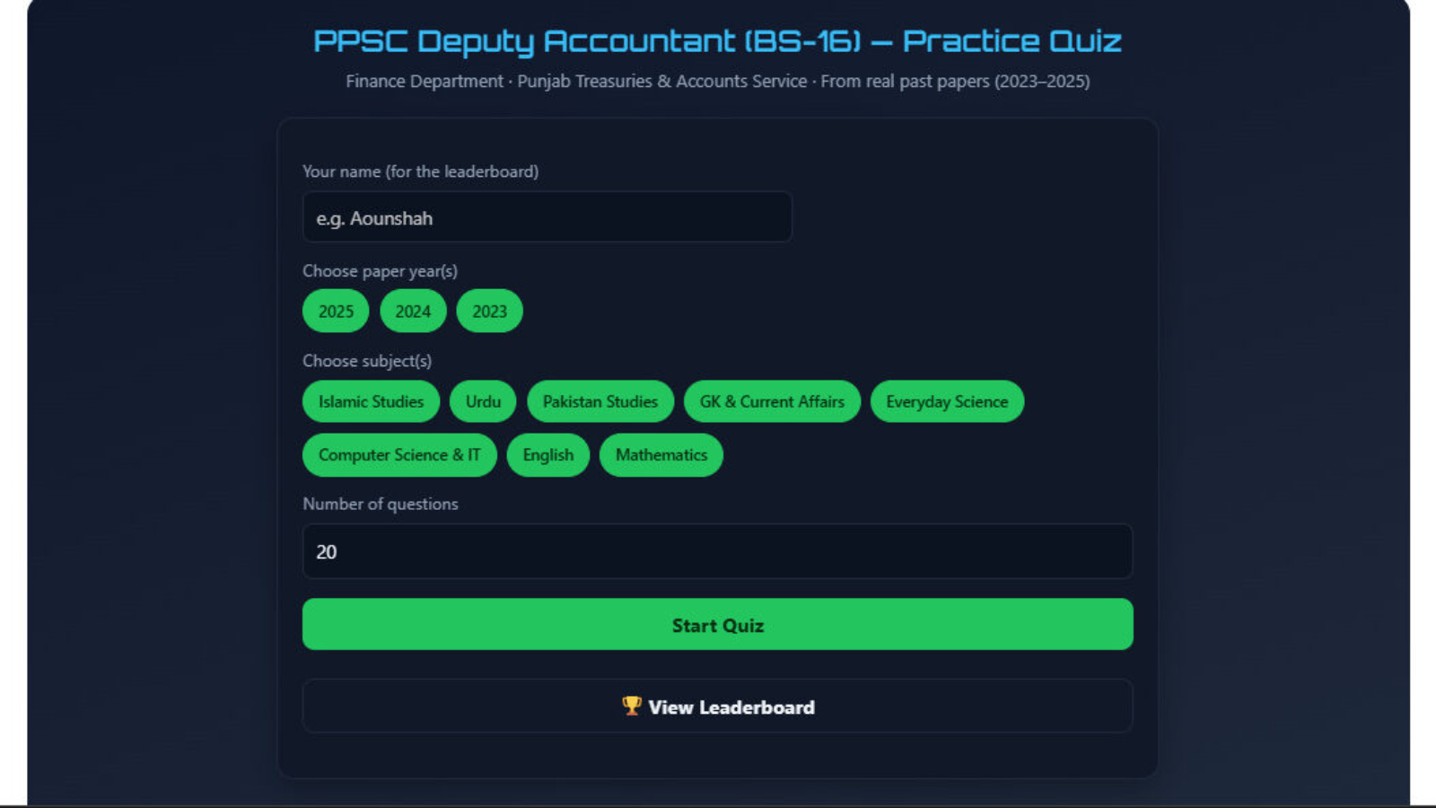
Try the Free PPSC Deputy Accountant Practice Quiz
We built a free, no-signup practice quiz using real questions from the papers above. It randomizes questions by year and subject, tracks your score, ranks you (Beginner → Expert), and saves your result to a live leaderboard so you can see how you compare to other applicants.
PPSC Deputy Accountant (BS-16) — Practice Quiz
Finance Department · Punjab Treasuries & Accounts Service · From real past papers (2023–2025)
Quiz Complete 🎉
🏆 Leaderboard
#
Name
Score
Date
PPSC Deputy Accountant Test Pattern & Subject Weightage
The written test typically follows this approximate distribution across the 100 MCQs:
General Knowledge & Current Affairs — ~26 questions
Everyday Science — ~7 questions
Computer Science & IT — ~9 questions
English Language & Vocabulary — ~12 questions
Mathematics (basic/aptitude) — ~14 questions
Negative marking applies, so accuracy matters more than attempting every question blindly.
How to Use Past Papers Effectively
Attempt them timed — 90 minutes for 100 questions leaves under a minute per question, so simulate that pressure early.
Track weak subjects — if Mathematics or Computer Science consistently costs you time, prioritize those first; GK/Current Affairs shifts yearly so don’t over-invest in memorizing old facts.
Repeat until automatic — PPSC reuses question patterns (not always exact questions), so understanding the logic behind math and English grammar items pays off more than rote memorization.
Use the quiz weekly — spaced repetition on the same question bank measurably improves recall versus a single read-through.
Frequently Asked Questions
Q: Where can I get official PPSC Deputy Accountant past papers? A: PPSC itself does not publish past question papers publicly. The papers referenced on this page are compiled from candidates’ recollections after the test and are widely used for practice, though they should be treated as a study aid rather than an official source.
Q: How many questions are in the PPSC Deputy Accountant test? A: 100 MCQs in 90 minutes, covering Islamic Studies, Pakistan Studies, Urdu, English, Mathematics, Everyday Science, Computer Science, and General Knowledge.
Q: Is there negative marking in the PPSC Deputy Accountant exam? A: Yes, incorrect answers typically deduct marks, so guessing carries risk — focus on accuracy over completing every question.
Q: What is the salary of a Deputy Accountant BS-16 in Punjab? A: Approximately PKR 55,000–85,000 per month including allowances, though this varies with posting location and annual revisions.
Q: How can I practice PPSC Deputy Accountant past papers online for free? A: Use the interactive practice quiz on this page — it pulls from real 2023–2025 papers, scores you automatically, and ranks your readiness level.
Papers compiled from publicly available candidate-recollection sources (2023–2025). Always cross-check current syllabus and eligibility criteria on the official PPSC website before applying.
Quick answer: HEC has officially released the HAT-MS answer key for the test held on July 4 & 5, 2026. You can download it directly from HEC’s official announcements page, organized by category and booklet color (Blue, Green, Pink, White, Yellow). Match your booklet color to the correct PDF to calculate your expected score before the official result.
If you sat the HAT-MS test on July 4 or 5, this is the update you’ve been refreshing your browser for. Here’s exactly how to find your key, use it correctly, and what happens next.
Where to Download the HAT Answer Key
HEC publishes answer keys through its official announcements page, not through a general Google search result — always go straight to the source to avoid outdated or incorrect keys circulating on unofficial pages. The official HEC announcement for this test lists separate PDF files for each category and booklet color combination.
How to Find Your Specific Key
HAT-MS was administered across five categories, and within each category, question booklets were distributed in five different colors to prevent copying between adjacent test-takers. That means you need to match both your category and your booklet color exactly — using the wrong color key will give you a completely inaccurate score estimate.
Steps to download:
Check your admit card or booklet cover for your exact category (General, or Category I, II, III, etc.)
Check the top corner of your question booklet for the color — it’s printed clearly on the cover
Go to the official HEC announcement page linked above
Find the file matching your category and color exactly (files are named clearly, e.g., “HAT-MS-GENERAL-AnswerKey-White”)
Download and open the PDF
How to Calculate Your Expected Score
Once you have the correct key, go through your recorded answers question by question. HAT scoring typically awards one mark per correct answer with no negative marking for incorrect ones — so there’s no penalty for guessing, which means a slightly lower calculated score from the key is still worth taking seriously if you left several answers blank.
Add up your correct answers, then compare that number against previous test cycles’ cutoffs for your category if you want a rough sense of where you stand — though HEC determines the actual passing threshold after each test cycle, so treat this as an estimate, not a guarantee.
What Happens After the Answer Key
The answer key isn’t your final result — it’s a self-assessment tool released ahead of the official scorecard. Based on HEC’s typical timeline for HAT test cycles, official results are usually published on the ETC portal within a few weeks of the answer key release. Once available, you’ll check your actual result using your CNIC or roll number on the ETC portal, not through the answer key page.
What If You Think a Question Was Wrongly Keyed
If you believe a specific answer in the key is incorrect, HEC does not typically offer a rechecking or challenge facility for HAT the way some other standardized tests do. Your best move is to double check the question against your booklet carefully first — a mismatch is often a booklet-color mix-up rather than an actual keying error.
Frequently Asked Questions
When was the HAT-MS test this key applies to held? July 4 and 5, 2026, across five categories.
How do I know which booklet color I had? It’s printed on the cover of your question booklet, along with your category. Check your admit card if you’re unsure.
Is there negative marking on the HAT test? No — HAT scoring awards marks for correct answers only, with no deduction for incorrect ones.
When will the official HAT result be announced? HEC typically releases official results a few weeks after the answer key, through the ETC portal using your CNIC or roll number.
Can I request a recheck if I disagree with the answer key? HEC does not generally offer a rechecking facility for HAT. Double-check your booklet color and category match before assuming a keying error.
Where can I prepare for a future HAT test if I need to retake it? See our full HAT test preparation guide for study resources and test structure.
You studied for weeks. You knew your formulas. You walked out feeling okay. Then the result came — 43 out of 100.
This is more common than HEC will ever tell you. Most candidates who fail the HAT test do not know why they failed — and they repeat the same mistakes in the next attempt. Gotest
This article is the one I wish had existed before my first attempt. It is not a generic “study hard” guide. It is a specific breakdown of the 7 mistakes that destroy HAT scores, a 6-week plan built around the real test pattern, and honest numbers about what score you actually need.
Why Most HAT Preparation Books Are Lying to You
Let us start with the uncomfortable truth. Many preparation books available in the market are outdated or out of scope. These books only help in getting approximately 40 to 50 marks. Earnest Prep
You read that right. The books most Pakistani students buy at Urdu Bazar are designed to help you reach 40 to 50 — which is barely the passing threshold. They are not designed for the 75+ you actually need for scholarships or the 85+ that makes you competitive nationally.
The problem is the test pattern. HAT is designed on the pattern of international testing standards — the same logic as GRE and GMAT. Those tests reward deep reasoning skills, not rote memorization. A book that teaches you to memorize synonyms will get you to 45. A strategy that trains your reasoning will get you to 80.
The 7 Mistakes That Killed Your First Score
Mistake 1 — You registered for the wrong category.
One of the most common mistakes students make is registering for the wrong test version. HAT has four categories. HAT-1 is for Computer Science, Engineering, IT, Mathematics, and Physics. HAT-2 is for Management Sciences. HAT-3 is for Arts and Social Sciences. HAT-4 is for Medical and Biological Sciences. If you studied CS but registered for HAT-2, the section weightages are completely different — and your preparation was for the wrong paper. This cannot be changed after submission. Maryamkobatain
Mistake 2 — You treated Verbal like a basic English test.
This is not just about grammar. You need to understand context, identify synonyms and antonyms, and complete sentences logically. Verbal in HAT-1 is 30 marks. Students with engineering backgrounds typically score 14 to 18 here when they could be scoring 24 to 27 with the right preparation. The gap is almost always analogies and reading comprehension — two subtypes that most preparation books ignore almost entirely. Maryamkobatain
Mistake 3 — You did Analytical Reasoning without drawing diagrams.
This single habit costs students 8 to 12 marks per paper. Analytical reasoning in HAT is based on logic puzzles — ordering games, grouping games, scheduling scenarios. Students who try to track 5 or 6 rules in their head simultaneously make errors they would never make if they had written a simple constraint diagram on paper. Write. Everything. Down. Every single time.
Mistake 4 — You did not time yourself in practice.
A 120-minute paper with 100 questions gives you exactly 72 seconds per question on average. Poor time management is one of the most common test-day failures — students spend too long on one question and run out of time for easier ones at the end. If you never practiced under timed conditions, the real test will feel like a completely different exam. Jobs4mine
Mistake 5 — You left questions blank.
HAT has no negative marking — confirmed officially by HEC. There is no negative marking in HAT, so you can attempt the full paper within the allowed time. Every blank question is a free mark you are throwing away. At the end of the paper, if you have 8 unanswered questions and 5 minutes left, guess all 8 immediately. Statistically, random guessing among 4 options gives you 2 correct answers — that is 2 marks for zero effort. Educated
Mistake 6 — You prepared from a single source.
The students who score 80+ use multiple sources simultaneously: the official HEC sample paper, the Durrani HAT Prep Guide for analytical reasoning, GRE vocabulary lists for verbal, and past paper MCQ banks for quantitative. No single book covers everything at the 80+ level.
Mistake 7 — You started preparation less than 2 weeks before the test.
You should begin your HAT preparation 30 days prior to your test. But 30 days is the minimum for passing. For 80+, you need 6 weeks of structured daily preparation. Starting 10 days before and doing 5-hour cramming sessions does not build the reasoning skills HAT tests — it just exhausts you. Earnest Prep
The Exact Marks Breakdown You Need to Know
Before building your plan, understand exactly how the marks split in HAT-1. This comes directly from the official HEC content weightage document:
Section
Questions
Marks
Time Allocation
Verbal Reasoning
30
30
35 minutes
Analytical Reasoning
30
30
38 minutes
Quantitative Reasoning
40
40
42 minutes
Total
100
100
120 minutes
To score 81, you need roughly: Verbal 22/30, Analytical 24/30, Quantitative 35/40.
To score 85+, you need roughly: Verbal 25/30, Analytical 26/30, Quantitative 35/40.
Most CS and Engineering graduates can naturally hit 32+ in Quantitative without much work. The real battle is Verbal and Analytical. That is where your preparation energy should go — 60% of your daily study time, not 30%.
The 6-Week Plan That Took One Score From 43 to 81
This is not a generic plan. It is built specifically around the HAT-1 section weightages and the exact types of questions that appear in real HAT papers.
Week 1 — Diagnose and Build Vocabulary Foundation
Day 1: Take a cold mock test. 100 questions, 120 minutes, phone off, no breaks. Score yourself section by section. Write down your starting numbers.
Days 2 to 7: Verbal only. Learn 20 new vocabulary words every single day from a GRE word list. Not from a HAT prep book — from a GRE list. The vocabulary in real HAT papers is at GRE level. Focus on antonyms, synonyms, and especially analogies. Do 20 practice questions per day. This week is slow — that is fine. You are building the foundation everything else sits on.
Week 2 — Verbal Intensive
30 Verbal questions every day. Timed — 28 minutes for 30 questions. Mix every subtype: synonyms, antonyms, analogies, fill-in-the-blank, sentence correction, reading comprehension.
Reading daily editorials from reputable news sources can significantly boost your Verbal score. Start reading Dawn or The News editorial every morning. Academic English is a specific register — the more you read it, the faster your comprehension becomes. Maryamkobatain
Analogies are your biggest opportunity. Most students ignore them. If you master analogy patterns — relationship types, part-whole, cause-effect, degree of intensity, tool-function — you gain 6 to 8 marks your competition is simply leaving on the table.
Week 3 — Analytical Reasoning Bootcamp
Two complete analytical test sets per day from the Durrani HAT Prep Guide. The guide has 25 full tests — this is the most comprehensive real analytical practice material available for HAT in Pakistan.
Analytical Reasoning is about logic puzzles and if-then scenarios. Practice with previous GRE or GAT papers is highly effective for this portion. Maryamkobatain
The rule for week 3: never check the answer key until you have fully attempted every question in a set. After checking, trace back every wrong answer to the specific rule you misread. Write that rule on a sticky note. By the end of week 3, you will have a collection of your personal mistake patterns — that collection is more valuable than any textbook.
Week 4 — Quantitative Depth
Most HAT-1 students already score 28 to 32 in Quant without much preparation. This week pushes you from 32 to 37+. Focus on the question types that cost most marks: word problems (speed, work, profit), algebraic inequalities, complex number arithmetic, and percentage questions.
Dust off your high school math books. You will encounter questions on algebra, geometry, ratios, and percentages. Speed is key here, so learn mental math shortcuts. Maryamkobatain
Spend 45 minutes daily on timed Quantitative sets — 20 questions in 18 minutes. Mental math shortcuts for percentages save significant time: 15% of any number = 10% + 5% (half of 10%). 25% = divide by 4. These seem obvious but when you are nervous in a real exam, having practiced the shortcut 50 times makes it automatic.
Week 5 — Full Mock Tests and Gap Closing
One complete 100-question timed mock test every 2 days. After each test: calculate section scores, identify your 3 weakest question types, spend the days between tests drilling only those specific types.
By the end of week 5, your score should be in the 72 to 80 range. If it is not, identify whether the gap is Verbal or Analytical — those two sections are where most of the variation sits at this level.
Week 6 — Consolidation and Test Day Mindset
No new content. Revision only. Two mock tests — start and end of the week. Review your sticky note mistake collection from week 3. Revisit your 10 most common Verbal errors.
Test day sequence: Quantitative first (40 marks, your strongest, sets a confident tone), then Analytical (30 marks, logic is fresh), then Verbal last (30 marks, vocabulary and language hold even when tired). This order maximizes marks based on energy curve and section weight.
What Score Do You Actually Need
Be honest with yourself about your goal before you start.
Score 50–59 — Passes HAT. Eligible for basic MS admissions and some HEC scholarships (Hungary, China, Morocco with minimum 50%). Not competitive for Commonwealth UK.
Score 60–74 — Eligible for all HEC scholarship programs including Commonwealth UK. Competitive for MS admissions at most Pakistani universities. Not yet in national top-tier bracket.
Score 75–84 — Strong. Competitive for Commonwealth UK nomination. Very strong position for Hungary, China, Morocco. Opens HEC Overseas PhD route at 70+.
Score 85+ — As the competition is very high, you need to get more than 85 marks out of 100 to be nationally competitive for scholarship nominations. At 85+ every door is open. This is the target worth working for. Earnest Prep
The One Resource Most Students Do Not Know About
Most HAT candidates practice from commercial books or random online MCQs. Very few practice from the actual past paper question bank.
The Durrani HAT Prep Guide contains 25 complete analytical reasoning tests extracted from real HAT papers with verified answer keys. The HEC official sample paper contains real Verbal and Quantitative questions from actual past papers. These two sources together are the closest thing to the real exam that exists publicly in Pakistan.
All 474 questions from both sources — with full answer explanations — are available free in our interactive practice tool:
👉 Practice free: syedaounraza.online/hec-hat-test-preparation-2026/
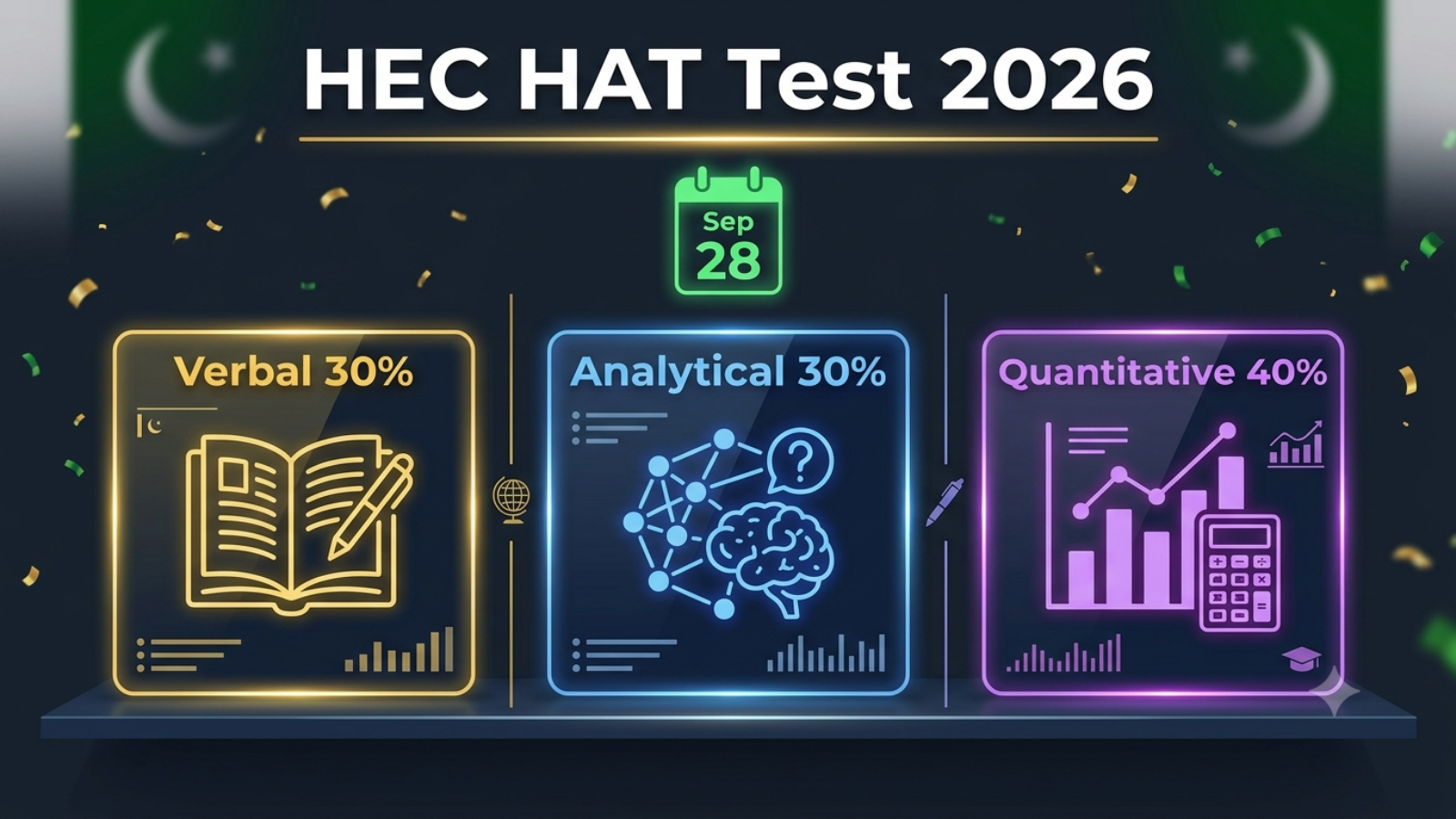
The Next HAT is September 28, 2026
The last date for online registration is Tuesday, September 9, 2026, while the HAT test will be conducted nationwide on Sunday, September 28, 2026. Gotest
You have exactly 10 weeks from today. That is more than enough time to go from 43 to 75+ if you follow the plan in this article. It is enough time to go from 65 to 85+ if you are already at an intermediate level.
Register now at etc.hec.gov.pk before September 9. The portal slows down and crashes in the final days before every registration deadline.
Quick Reference — Everything You Need
Detail
Info
Next HAT Test Date
September 28, 2026
Registration Deadline
September 9, 2026
Test Fee
Rs. 2,000
Registration Portal
etc.hec.gov.pk
Result Portal
etc.hec.gov.pk or hec.gov.pk
Scholarship Portal
scholarship.hec.gov.pk
Passing Score
50 out of 100
Competitive Score
75+ for scholarships, 85+ nationally
Score Validity
2 years
Free Practice (474 MCQs)
syedaounraza.online/hec-hat-test-preparation-2026
Frequently Asked Questions
Q: I scored below 50. Can I reappear? Yes — there is no limit on HAT attempts. If you do not pass, you can reappear in the next HAT test, which is conducted quarterly by HEC. Register for September 28. Gotest
Q: HEC uses my best score or most recent score? HEC considers the best HAT score of the last two years for shortlisting. If you scored 55 in July and 79 in September, HEC uses 79 for your scholarship application.
Q: Can I use the same HAT score for different universities? Yes. One valid HAT score works for all HEC-recognized universities and all HEC scholarship programs simultaneously.
Q: How many days before the test is the roll number slip issued? Download your roll number slip from the HEC ETC website once issued, approximately 10 days before the test date. Gotest
Q: Is the test online or paper-based? HAT is a paper-based MCQ test held at physical test centres across Pakistan. It is not conducted online.
The HEC HAT test 2026 is the single most important exam a Pakistani CS, Engineering, or IT graduate will appear in this year. It controls MS and MPhil admissions at every top Pakistani university, and it is the mandatory gateway for every HEC foreign scholarship — Commonwealth UK, Stipendium Hungaricum Hungary, Chinese Government Scholarship, and more. Whether you appeared in the July 5 test, are waiting for your result, or planning to appear in the September 28 cycle, this is the only guide you need.
Everything in this article comes from official HEC and ETC sources — no guessing, no outdated information.
What Is the HEC HAT Test?
The HEC HAT test is designed on the pattern of international testing standards of Verbal Reasoning, Analytical Reasoning, and Quantitative Reasoning. HEC started this service in 2017 to provide a well-managed and unbiased testing platform for admissions on merit basis. Gotest
The full name is Higher Education Aptitude Test, and it is conducted by the Education Testing Council (ETC) under the Higher Education Commission of Pakistan. HAT is an eligibility test conducted by HEC through ETC for the award of all HEC scholarships and for admission to MS and MPhil programmes. Ilmkidunya
The marks for the HAT test are 100 and the time permitted is two hours. The pattern of the paper is based on MCQs and the test is not negatively marked. This last point matters enormously — with no negative marking, you should attempt every single question even if you are guessing. Educated
HAT Test 2026 — Complete Schedule (All Cycles)
HEC conducts HAT almost once every two months. HAT test schedule for 2026 has five test dates. Here is the verified full 2026 calendar: Earnest Prep
HAT Cycle
Registration Deadline
Test Date
Result Expected
HAT January 2026
Mid-January 2026
January 2026
February 2026
HAT April 2026
March 30, 2026
April 19, 2026
May 8, 2026
HAT July 2026
June 2026
July 5, 2026
August 1, 2026
HAT September 2026
September 9, 2026
September 28, 2026
October 2026
HAT December 2026
November 2026
December 2026
January 2027
The last date for online registration for the September cycle is Tuesday, September 9, 2026, while the HAT test will be conducted nationwide on Sunday, September 28, 2026. Gotest
If you missed the July 5 test or want to improve your score, September 9 is your registration deadline. Register immediately at etc.hec.gov.pk — the portal gets overwhelmed in the final days before the deadline and late registrations are never entertained.
HAT Test Categories — Which One Do You Need?
This is where many students make a critical mistake. There are four main HAT categories and each has a different section weightage. The test will be conducted in the following five categories based on 16 years or equivalent education, and students should register accordingly. HEC
Arts, Humanities, Social Sciences, Psychology, Law
40%
35%
25%
HAT-4
Agriculture, Veterinary, Biological, Medical Sciences
40%
30%
30%
HAT-General
Religious Sciences and other disciplines
Varies
Varies
Varies
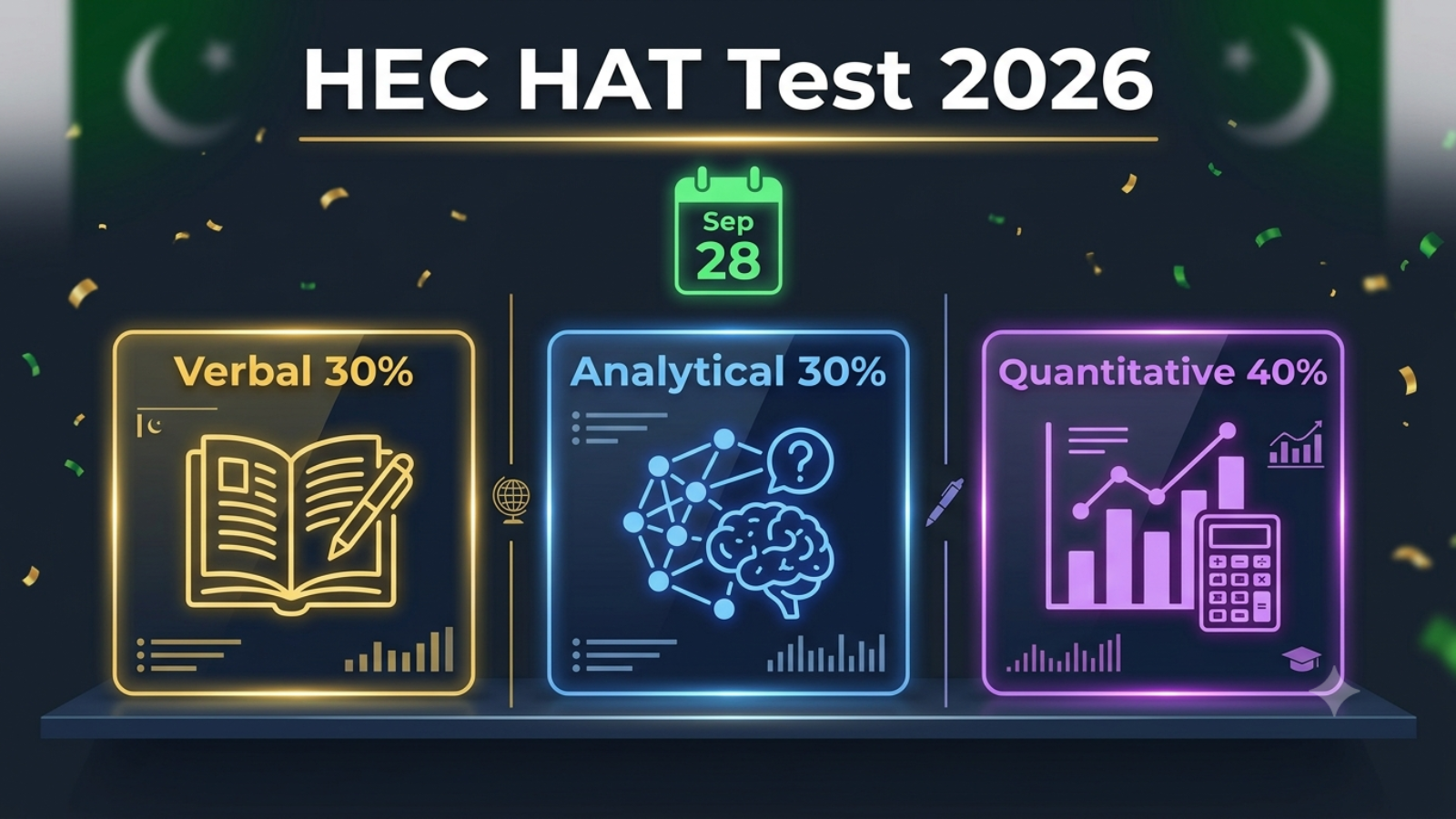
For HAT-1, the breakdown is: English/Verbal Reasoning 30%, Analytical Reasoning 30%, Quantitative Reasoning 40%, total 100%. HEC
If you studied Computer Science, Engineering, IT, Mathematics, Statistics, or Physics at Bachelor’s level, you need HAT-1. This is the category for HEC scholarships in Cybersecurity, Software Engineering, Computer Science, and all STEM fields.
Notice that for HAT-1, Quantitative Reasoning carries the highest weight at 40%. Most CS and Engineering students underestimate Verbal at 30% and lose critical marks there. In a 100-question paper, Verbal is worth 30 questions — dropping from 25/30 to 18/30 costs you 7 marks which can be the difference between a 72 and a 65.
Who Is Eligible for HAT Test 2026?
Those applicants who are interested in getting admission to MS/MPhil programmes in private and public universities of Pakistan, and those who intend to apply for scholarship schemes to be advertised by HEC, are eligible. The candidates who have completed 16 years of education or equivalent are eligible to apply. Ilmkidunya
In practical terms: if you have a 16-year Bachelor’s degree (BS, B.Com, BBA, B.Sc., B.E.) from any HEC-recognized institution, you are eligible to appear in HAT. There is no age limit for most programs, and there is no limit on the number of times you can appear.
Candidates applying for MS, MPhil, and PhD programmes, or those applying for HEC scholarships, are eligible. The score remains valid for two years. Gotest
This two-year validity is important. HEC will consider the best HAT score of the last two years for shortlisting purposes. So if you appear in July 2026 and September 2026, HEC uses whichever score is higher when evaluating your scholarship application. HEC
HAT Test Fee and Registration Process 2026
The fee for the HAT test is Rs. 2,000. This is one of the most affordable standardized tests in Pakistan — far cheaper than GRE, GMAT, or IELTS. Ilmkidunya
Here is the complete registration process:
Step 1. Visit the official HEC ETC portal: etc.hec.gov.pk
Step 2. Create your account using your CNIC number and a valid email address. Use an email you check daily — all communications including roll number slip and result are sent there.
Step 3. Complete your profile in “My Profile” section — academic history, CNIC details, contact information.
Step 4. Click on “Higher Education Aptitude Test” from the left menu panel. Select your HAT category carefully. The applicant must select the correct category on the respective online portal. If you select HAT-2 instead of HAT-1, you cannot change it after submission. HEC
Step 5. Choose your preferred test city. Test centres are subject to changes if fewer than 250 candidates choose a centre. Select a major city — Lahore, Karachi, Islamabad, Peshawar, Quetta, Multan — to guarantee your centre is not relocated. Gotest
Step 6. Pay the Rs. 2,000 fee through the online payment options available on the portal.
Step 7. Submit your application. Only submitted applications will be considered for HAT. Saving a draft is not sufficient — you must click the final Submit button. Ilmkidunya
Step 8. Download your roll number slip from etc.hec.gov.pk approximately 10 days before the test date. Carry it to the test centre along with your original CNIC.
HAT-1 Syllabus 2026 — What Exactly Is Tested
This is the section most preparation books get wrong. Here is the exact official syllabus for each section of HAT-1, sourced from HEC’s own content weightage document:
Verbal Reasoning — 30 Questions (30 Marks)
This section tests your command of the English language at an advanced level. It is not basic grammar — it is graduate-level English comprehension and vocabulary.
The subtypes you will face in HAT-1 Verbal are: synonyms (choose the word most similar in meaning), antonyms (choose the word most opposite in meaning), analogies (word relationship pairs — the most neglected subtype by most students), sentence completion with one or two blanks, reading comprehension passages (typically 2 passages with 5 questions each), grammar and sentence correction, and vocabulary in context.
The single biggest mistake HAT-1 candidates make in Verbal is ignoring analogies. Analogies typically contribute 6 to 10 questions in the real paper. Most preparation books have very few analogy questions. This creates a massive preparation gap. Students who practice analogies systematically gain 5 to 7 marks that their competition misses.
For reading comprehension, speed is the deciding factor. Practice reading academic passages and answering 5 questions in under 8 minutes. If you spend 12 minutes on one passage you will run out of time.
Analytical Reasoning — 30 Questions (30 Marks)
The HAT test syllabus includes logical reasoning as a major component. Analytical Reasoning is pure logic with no subject knowledge required. Every question is a puzzle. Educated
The three main types are: ordering games (arrange items in sequence based on given rules), grouping games (divide items into groups based on conditions), and scheduling games (assign tasks to time slots or people to positions based on rules).
Each analytical set typically has a scenario with 4 to 6 rules followed by 4 to 6 questions. In the real HAT-1 paper, there are usually 5 to 6 analytical sets per paper. You should begin your HAT preparation 30 days prior to your test. For Analytical Reasoning specifically, 30 days of daily 1-hour practice is the minimum to become genuinely fast and accurate. Earnest Prep
The Durrani HAT Prep Guide contains 25 complete analytical reasoning tests with verified answer keys — the most comprehensive real practice material available in Pakistan. Working through all 25 tests systematically is the single most effective thing you can do to boost your analytical score.
Quantitative Reasoning — 40 Questions (40 Marks)
For HAT-1, this is the biggest section with 40% weight. It covers: algebra and equations, number theory and properties, percentages and ratios, word problems (speed, distance, time, profit, loss), geometry (areas, perimeters, angles, triangles, circles), arithmetic sequences and series, basic statistics (mean, median, mode), complex numbers, and inequalities.
The difficulty level is equivalent to intermediate mathematics (FSc/A-Level) with some first-year university topics. For CS and Engineering graduates, most of these topics are already familiar. The challenge is speed and accuracy under time pressure — 40 questions in roughly 45 minutes means under 70 seconds per question.
Common high-yield topics that appear repeatedly in real HAT papers: percentage problems, ratio and proportion, algebraic inequalities, complex number arithmetic, and word problems involving age or work.
What Score Do You Need — The Honest Picture
It is important to note that merely passing this test with 50 marks does not mean success. As the competition is very high, you need to get more than 85 marks out of 100. Many preparation books available in the market are outdated or out of scope and only help in getting approximately 40 to 50 marks. Earnest Prep
This is the most important fact to absorb. The minimum passing score of 50 is irrelevant for scholarship competition. Here is what your score actually means in the context of your goals:
Score 50–59: Passes the HAT threshold. Eligible for some HEC scholarships with minimum 50% requirement (Hungary, China, Cuba, Morocco, Azerbaijan). Will struggle for admissions to top Pakistani universities where the competitive cutoff is significantly higher.
Score 60–69: Applicants are required to obtain minimum 60% marks in HAT for consideration for Commonwealth scholarship nomination. With 60–69 you meet the Commonwealth UK threshold but are at the floor of a competitive pool. HEC
Score 70–79: Candidates must have minimum 70% marks in a valid HEC Aptitude Test for HEC Overseas PhD Scholarship. At 70+ you open every major HEC scholarship program. Strong position for Hungary and China, competitive for Commonwealth. HEC
Score 80–84: Top 15–20% of all HAT candidates nationally. All major HEC scholarships accessible. Commonwealth UK nomination is realistic with a strong Statement of Purpose and confirmed supervisor.
Score 85+: Top 5–10% nationally. As the competition is very high, you need more than 85 marks to stand out for scholarship nominations. At this level, every door is open. Earnest Prep
6-Week Preparation Plan to Score 85+ in HAT-1
This plan is built specifically for HAT-1 (Computer Science, Engineering, IT) and is designed to take you from a cold start to 85+ in 42 days.
Week 1 — Diagnostic and Foundation
On day one, take a full 100-question mock test under real conditions — 120 minutes, no breaks, no phone. Score yourself honestly section by section. This diagnostic tells you exactly where to focus. Most CS graduates find Verbal is their weakest section and Quantitative is their strongest. Analytical is usually mid-range.
Spend 60% of week 1 on Verbal foundations. Learn 20 new vocabulary words daily from a GRE word list (download any free GRE vocabulary PDF — GRE Magoosh 1000 words or Barron’s 800 words are both excellent). Focus on antonyms, synonyms, and analogy patterns. These three subtypes make up roughly 50% of the Verbal section.
Week 2 — Verbal Intensive
Do 30 Verbal questions every day. Mix all subtypes — synonyms, antonyms, analogies, fill-in-the-blank, grammar. Time yourself — 30 questions should take no more than 28 minutes. Review every wrong answer and understand why the correct answer is correct. Do not just memorize the answer — understand the reasoning.
Practice reading comprehension daily. Read one academic passage and answer 5 comprehension questions in 8 minutes. Use any English newspaper editorial (Dawn, The News) for practice material. Academic English reading speed is a skill that only builds with daily repetition.
Week 3 — Analytical Reasoning
Dedicate week 3 entirely to Analytical Reasoning. Work through 2 complete analytical test sets per day from the Durrani HAT Prep Guide. Do not look at answers until you have fully attempted every question in the set. After checking, study every wrong answer and trace back exactly which rule you misread or misapplied.
The most common analytical reasoning mistakes are: misreading “immediately before” as “before” (they are different), confusing “cannot be” with “must be,” and failing to make a constraint diagram before answering questions. Draw a simple diagram for every analytical set — this alone saves 3 to 5 marks per paper.
Week 4 — Quantitative Reasoning
Work through HAT-1 Quantitative topics systematically. Spend 2 days each on: percentages and ratios, algebra and equations, word problems, geometry, and complex numbers. For each topic, do 15 to 20 questions timed. Target 40 Quantitative questions in 38 minutes — that is the pace you need for HAT-1.
Pay special attention to word problems. They appear in every single HAT paper and account for 8 to 12 questions. Common formats: two people working at different speeds completing a task, profit and loss calculations, distance-rate-time problems, mixture problems.
Week 5 — Full Mock Tests and Weak Area Attack
Take one complete 100-question timed mock test every 2 days. After each test, calculate your section-wise score. Identify the weakest 2 to 3 question types in each section and spend focused time on those specific types.
By week 5, your score should be in the 72 to 80 range if you followed the plan. The jump from 75 to 85 happens in this week through drilling your specific weak spots relentlessly.
Week 6 — Consolidation and Exam Technique
No new content in week 6. Only revision and timed practice. Take one full mock test at the start and one at the end of the week to measure your final level. Practice the specific exam technique: in the real HAT, do Quantitative first (your strongest, build confidence), then Analytical, then Verbal last. This order maximizes marks because you are freshest when doing the highest-weight section.
The night before the test, do not study. Sleep 8 hours. Bring your CNIC, roll number slip, two pens, and a pencil. Arrive at the test centre 30 minutes early.
Top 10 Universities in Pakistan That Require HAT for MS Admission
Every top Pakistani university either requires HAT or accepts it in place of their own entry test. Here are the ten most competitive:
NUST (National University of Sciences and Technology) — One of Pakistan’s highest-ranked universities for CS and Engineering. Accepts HAT for MS/MPhil admissions. Very high competitive cutoff.
COMSATS University Islamabad — Accepts HAT for all MS programs across all campuses. One of the most HAT-friendly universities in Pakistan for CS and IT graduates.
QAU (Quaid-i-Azam University) Islamabad — HAT required for all MS/MPhil programs. Strong research programs in Computer Science.
UET Lahore (University of Engineering and Technology) — Accepts HAT for MS admission in Engineering and Technology disciplines.
LUMS (Lahore University of Management Sciences) — Accepts HAT as one of the admission test options for select programs.
NED University Karachi — HAT accepted for MS Engineering programs.
University of Peshawar — HAT required for all MS/MPhil programs under HEC guidelines.
Bahauddin Zakariya University Multan — HAT accepted for MS admissions across all disciplines.
University of Agriculture Faisalabad — HAT required for MS programs in agriculture and related sciences.
Government College University Lahore — HAT accepted for MS programs in Sciences, Humanities, and Social Sciences.
HAT vs GAT — What Is the Difference?
This is one of the most frequently asked questions by Pakistani students. Here is the precise difference:
HAT (Higher Education Aptitude Test) is conducted by HEC through ETC. It is required for MS/MPhil/PhD admissions and for all HEC scholarships — both domestic and foreign. The HAT is a general aptitude test covering Verbal, Analytical, and Quantitative reasoning. It has four categories for different discipline groups.
GAT-General is conducted by the National Testing Service (NTS). It is required by some universities independently of HEC requirements. GAT-General test conducted by NTS is not applicable for HEC scholarships. Only HAT test conducted by HEC is applicable for scholarship nominations. HEC
GAT-Subject is also conducted by NTS and is discipline-specific — it tests knowledge in your specific field (CS, Engineering, etc.). The HEC Overseas PhD Scholarship requires both HAT (general aptitude) and GAT-Subject (discipline knowledge).
In summary: for HEC scholarships, you need HAT. For HEC Overseas PhD specifically, you also need GAT-Subject. For university admissions, check the specific university’s requirement — some ask for HAT, some for GAT-General, and some accept either.
Common Mistakes That Cost Pakistani Students 15+ Marks in HAT
Based on the pattern of real HAT papers and official HEC content weightages, here are the most expensive mistakes candidates consistently make:
Mistake 1 — Ignoring Analogies. Most students skip analogy preparation because their preparation books have very few analogy questions. But analogies appear in every real HAT verbal section and cost students 5 to 8 marks. Practice at least 50 analogy questions before your test.
Mistake 2 — Not drawing constraint diagrams in Analytical. Students who mentally track analytical rules without writing them down make significantly more errors and take much longer per question. Always draw a quick diagram — even a simple table or list — for every analytical scenario.
Mistake 3 — Rushing Quantitative and making calculation errors. For HAT-1, Quantitative is 40 marks. A careless arithmetic error in a word problem costs 1 mark that took 60 seconds of work to set up. Write your working clearly and re-read the question before marking your final answer.
Mistake 4 — Spending too long on a single question. In a 120-minute paper with 100 questions, you have 72 seconds average per question. If a question is taking more than 90 seconds, skip it, mark it, and return later. Never let one hard question ruin five easy ones.
Mistake 5 — Using outdated preparation books. Many preparation books available in the market are outdated or out of scope. These books only help in getting approximately 40 to 50 marks. Always prepare from official HEC sample papers and verified past paper question banks. Earnest Prep
Mistake 6 — Not attempting all questions. With no negative marking, every unanswered question is a free mark you are throwing away. If you have 5 minutes left and 8 questions unanswered, guess all 8. Statistically you will get 1 to 2 correct just from guessing — that is 1 to 2 marks for zero effort.
HAT Test Day — Complete Checklist
The night before:
Print or save your roll number slip digitally
Charge your phone
Prepare your CNIC (original — photocopy not accepted)
Pack two pens and two pencils
Sleep 8 hours minimum — cognitive performance drops 20% with less than 7 hours of sleep
Test day morning:
Eat a proper breakfast — glucose is brain fuel
Arrive 30 minutes before your reporting time
Do not study — light review only, nothing new
Keep water with you if permitted at your centre
During the test:
Read every question carefully before selecting your answer
Attempt Quantitative first, then Analytical, then Verbal — highest weight sections while freshest
Never leave any question unanswered — guess if necessary
Watch your time: 40 minutes for Quantitative, 35 minutes for Analytical, 35 minutes for Verbal, 10 minutes for review
Frequently Asked Questions — HEC HAT Test 2026
Q: When is the next HAT test after July 2026? The HAT test will be conducted nationwide on Sunday, September 28, 2026. The last date for online registration is Tuesday, September 9, 2026. Gotest
Q: What is the HAT test fee in 2026? The fee for HAT test is Rs. 2,000. Ilmkidunya
Q: How many times can I appear in HAT? There is no limit on attempts. You can appear in every HAT cycle. HEC uses your best score from the last two years for scholarship shortlisting.
Q: Is HAT compulsory for MS admission in Pakistan? Yes. HAT is mandatory for students seeking admission in MPhil/MS and PhD programmes in Pakistani universities as well as for availing HEC scholarships. All HEC-recognized universities follow this requirement. Gotest
Q: What is the passing score for HAT 2026? The minimum passing score is 50 out of 100. However, for competitive scholarship nominations you need 75+, and for top-level competition 85+.
Q: Can I use HAT score for Commonwealth scholarship? Yes. Applicant must have obtained a minimum score of 60 out of 100 in HAT test for consideration towards Commonwealth scholarship nomination. HEC
Q: Which HAT category is for Computer Science? HAT-1 is for Engineering and Technology, Computer Science, Mathematics, Statistics, and Physics. HEC
Q: Is there negative marking in HAT? There is no negative marking in HAT. You can attempt the full paper within the allowed time. Educated
Q: How long is the HAT score valid? The score remains valid for a period of two years. Gotest
Q: Where do I register for HAT 2026? Register online at etc.hec.gov.pk. In case of any issue during online registration, visit onlinehelp.hec.gov.pk or visit your nearest HEC regional office.
Start Your HAT Preparation Right Now
The September 28 test is 12 weeks away from the July 5 test. That is enough time to go from 60 to 85+ if you prepare correctly with the right material.
Practice free with 474 real HAT MCQs extracted directly from the Durrani HAT Preparation Guide and the HEC official sample paper — covering all three sections (Verbal, Quantitative, and Analytical) with full answer explanations:
Your HAT score for HEC scholarship 2026 is not just a number. It is the single most important gate between you and a fully funded master’s or PhD degree abroad — in the UK, Hungary, China, Germany, or elsewhere. Every foreign scholarship program processed through HEC has a minimum HAT score requirement, and your score directly determines whether HEC even submits your name to the partner country.
This article breaks down exactly which scholarships need what HAT score, what each program offers, how the selection process really works, and what you must do right now after receiving your July 2026 HAT result.
Why Your HAT Score Controls Your Scholarship Application
Most Pakistani students think the scholarship application process starts after they pass the HAT test. That is wrong. Under the Learning Opportunities Abroad (LOA) framework, HEC accepts a valid HAT score as the mandatory pre-screening filter for all Master’s and PhD programs. Applicants for the Hungarian, Commonwealth, and Chinese Government scholarship programs are advised to obtain a valid HAT score before applying on the LOA portal. HEC
This means HEC does not even forward your application to the scholarship partner — whether that is the UK Commonwealth Scholarship Commission, the Hungarian Tempus Foundation, or the China Scholarship Council — unless your HAT score meets their threshold. HEC’s HAT score requirement serves as a pre-screening filter. Only candidates who meet the HAT threshold are submitted to partner programs. Scholarsfunds
Passing HAT with 50 marks is not enough to be competitive. As the competition is very high, you need to get more than 85 marks out of 100 to be seriously competitive for scholarship nominations. Many preparation books in the market only help students achieve 40 to 50 marks. Earnest Prep
Understanding this reality is why your HAT score matters far beyond just clearing the minimum.
Complete Breakdown — HAT Score Required for Each HEC Scholarship 2026
Here is every major HEC-processed foreign scholarship program with the exact HAT score requirement confirmed from official HEC sources:
Scholarship Program
Country
Level
Minimum HAT Score
Competitive Score
Commonwealth Scholarship
UK
MS / PhD
60 out of 100
80+
Stipendium Hungaricum
Hungary
MS / PhD
50 out of 100
70+
Chinese Government Scholarship (CSC)
China
MS / PhD
50 out of 100
70+
HEC Overseas PhD Phase-II
UK/USA/Europe/Australia
PhD only
70 out of 100
80+
Moroccan Government Scholarship
Morocco
MS / PhD
50 out of 100
65+
Azerbaijan Government Scholarship
Azerbaijan
MS / PhD
50 out of 100
65+
Cuban Government Scholarship
Cuba
MS / PhD
50 out of 100
60+
The “minimum” score gets your application processed. The “competitive” score gets you actually nominated and sent to the partner country.
1. Commonwealth Scholarship 2026 — UK (HAT 60+ Required)
The Commonwealth Scholarship is one of the most prestigious fully funded scholarships available to Pakistani students. To qualify, applicants must hold a first division in their 16-year Bachelor’s or Master’s degree, must not have a second or third division in their terminal degree, and must obtain a minimum score of 60 out of 100 in the HAT test. IELTS is not required by HEC — though individual UK universities may have their own English requirements. HEC
What the scholarship covers: full tuition, monthly living allowance, return airfare, and arrival allowance in the UK.
The selection process involves initial screening by HEC for academic records and HAT scores, followed by forwarding of eligible applications to the Commonwealth Scholarship Commission in the UK. A confirmed supervisor at a UK university increases your chances of nomination significantly. ACAD
The Commonwealth Scholarship application deadline was recently extended. HEC officially extended the deadline for Commonwealth Scholarships, with both the HEC e-portal and the CSC portal applications due by October 21, 2026. Applicants must submit two separate online applications — one on the CSC UK portal and another on the HEC e-portal. ACAD
HAT score needed to be competitive: 75 or above. With 60 you are eligible. With 75 you are competitive. With 80+ you are in a strong position.
The Stipendium Hungaricum is Hungary’s flagship scholarship program and one of the most accessible fully funded scholarships for Pakistani students because of its relatively lower HAT threshold. Without providing a minimum HAT score of 50 out of 100, applications will not be considered for further processing. The test score is automatically updated for scholarship nominations after results are announced — applicants do not need to add their marks manually. HEC
What the scholarship covers: full tuition waiver, monthly stipend, accommodation, and health insurance for study at Hungarian universities.
In case of final selection, applicants must sign a bond on legal/stamp paper committing to return to Pakistan and serve the country for a period as prescribed by HEC immediately after completing their degree. HEC
The GAT-General test conducted by NTS is not acceptable for this scholarship. Only the HAT test conducted by HEC is valid. HEC
HAT score needed to be competitive: 65 or above. This is the most accessible route to a fully funded European degree for students with a moderate HAT score.
3. Chinese Government Scholarship (CSC) 2026 — China (HAT 50+ Required)
The CSC scholarship through HEC requires HAT for MS and PhD programs. The passing marks for the HAT test are 50 out of 100 for this program. China has one of the highest numbers of scholarship seats available to Pakistani students annually through HEC. The scholarship covers full tuition, accommodation on campus, and a monthly stipend ranging from 3,000 to 3,500 RMB depending on the study level. GradWinner
Many CSC seats for Pakistan are processed via HEC. Applications for the Chinese Government Scholarship typically open between November and January. Velocitytv
Top Chinese universities for Computer Science and Cybersecurity under CSC include Tsinghua University, Peking University, Shanghai Jiao Tong University, and Zhejiang University — all ranked in the top 100 globally for Engineering and IT.
HAT score needed to be competitive: 65 or above for general universities. 75+ for top-tier universities like Tsinghua or Peking.
Apply at: scholarship.hec.gov.pk → Learning Opportunities Abroad → Chinese Government Scholarship
This is HEC’s own flagship PhD program that sends Pakistani scholars to world-ranked universities in the UK, USA, Europe, China, and Australia. Eligibility requires an MPhil or equivalent degree, minimum 3.0 CGPA, GAT-Subject 70+ percentile, age below 35, and a faculty or university nomination. This scholarship requires candidates to be working as a lecturer or researcher at an HEC-recognized institution in Pakistan. INFO
Candidates must have a minimum of 70% marks in a valid HEC Aptitude Test (HAT). HEC will consider the best HAT score from the last two years for shortlisting purposes. HEC
For the HEC Overseas PhD, selection is based on HAT score, GAT-Subject percentile, academic CGPA, quality of the research proposal, institutional nomination, and interview performance if shortlisted. What separates shortlisted applicants from rejected ones is proposal quality combined with credible institutional backing. Scholarsfunds
Important: If you are a fresh graduate and not currently employed as a lecturer at a Pakistani university, this specific program is not accessible to you. Look at the Commonwealth, CSC, or Stipendium Hungaricum routes instead.
HAT score needed: 70 is the minimum. 80+ makes you genuinely competitive.
5. Moroccan, Azerbaijani, and Cuban Government Scholarships (HAT 50+ Required)
These are less-known but very real fully funded opportunities available through HEC LOA. All applicants for foreign-funded scholarship programs are required to obtain a minimum score of 50% in HAT or USAT. Iba
Morocco offers fully funded scholarships at Hassan II University of Casablanca and Mohammed V University in French and Arabic-medium programs. Azerbaijan offers scholarships at Baku State University and Azerbaijan Technical University. Cuba offers medical and science scholarships at University of Havana.
These programs have significantly lower competition compared to UK or China routes, making them viable options for students with HAT scores in the 55–65 range who want to study abroad on a full scholarship.
How the HEC Scholarship Selection Process Actually Works
Understanding the process end to end prevents the most common mistakes Pakistani applicants make.
Stage 1 — HAT Score Verification. You appear in HAT and receive your result. Your score is automatically linked to your CNIC in the HEC database. You do not need to manually upload it for most programs — it is pulled directly.
Stage 2 — Application on HEC LOA Portal. You apply at scholarship.hec.gov.pk under Learning Opportunities Abroad. You select your target scholarship program and fill in academic details, upload documents, and submit your Statement of Purpose.
Stage 3 — HEC Pre-Screening. HEC filters all applications based on HAT score threshold, CGPA, degree completion, and document completeness. Applications below the minimum HAT score are rejected at this stage without being forwarded.
Stage 4 — Merit Ranking. Among those who clear the HAT threshold, HEC ranks candidates by a combination of HAT score, CGPA, and program-specific criteria. Merit is strictly based on HAT score for most HEC scholarship programs. HEC reserves the right to modify the selection criteria. Iba
Stage 5 — Nomination to Partner Program. HEC forwards the top-ranked candidates to the partner country’s scholarship body — CSC for China, Tempus for Hungary, CSC UK for Commonwealth. The partner then makes the final award decision based on their own criteria including research proposal, academic fit, and available seats.
Stage 6 — Bond Signing. Successful candidates sign a legal bond with HEC committing to return to Pakistan and serve the country for a period equal to the scholarship duration. This is mandatory for all HEC-processed foreign scholarships.
What HAT Score Do You Actually Need in 2026 to Win a Scholarship?
Let us be completely honest about this. The minimum score and the competitive score are very different numbers.
Passing with 50 marks does not mean success. Competition is very high and you realistically need more than 85 marks to stand out at the national level for scholarship nominations. Earnest Prep
Here is a practical score-to-scholarship guide based on real 2026 data:
HAT Score 50–59 — Eligible for Stipendium Hungaricum, CSC China, Morocco, Azerbaijan, Cuba. These programs have lower competition. Your chances are real if your CGPA is strong (3.0 or above) and your Statement of Purpose is excellent.
HAT Score 60–69 — Add Commonwealth UK to the list. You meet the minimum for the most prestigious HEC scholarship. However, with 60 you are at the floor of a very competitive pool. Strengthen your application with a confirmed UK supervisor and a strong research proposal.
HAT Score 70–79 — Opens the HEC Overseas PhD. You are now competitive for all major programs. Focus your energy on the Commonwealth and CSC China routes where 70+ puts you in a genuinely strong position.
HAT Score 80–84 — Top tier. You are among the strongest candidates nationally. Apply for Commonwealth, CSC China, Stipendium Hungaricum simultaneously. All three are realistic.
HAT Score 85+ — National top performer. You are in the top bracket. Every HEC scholarship program is accessible to you. Focus on the Commonwealth UK or HEC Overseas PhD for the most prestigious outcome.
Documents Required for HEC Scholarship Applications 2026
Regardless of which program you apply for, have these documents ready before the portal opens:
All degree certificates and transcripts (attested by HEC where required), CNIC copy, passport copy (valid for at least 2 years beyond your program end date), HAT scorecard, two strong recommendation letters from university professors, a Statement of Purpose (500–1000 words), a research proposal for PhD programs (2000–3000 words), English Medium Certificate from your previous institution if IELTS is not available, photograph on white background, medical fitness certificate (required for Hungarian scholarship), and domicile certificate.
Do not wait until applications open to collect these. Several documents — especially the English Medium Certificate, attested transcripts, and recommendation letters — take weeks to obtain. Start now.
How to Improve Your HAT Score for the Next Cycle
If your July 2026 HAT score did not reach the level you needed for your target scholarship, the September 2026 HAT test is your next opportunity. HEC considers the best HAT score from the last two years for shortlisting purposes. This means if you scored 68 in July and then score 78 in September, HEC will use 78 for your scholarship application. HEC
The most common reason candidates score below 70 is poor preparation strategy, not lack of ability. Most preparation books on the market are designed for passing, not for scoring 80+. Real past paper questions are the only reliable preparation material.
To genuinely push your score from 60 to 80, you need to:
Practice all 25 analytical reasoning tests from the Durrani HAT Prep Guide systematically — not randomly. Work through them in order, understand the logic rules for each scenario, and review every wrong answer before moving on. Analytical reasoning is the section where disciplined practice produces the fastest score improvement.
For Verbal Reasoning — which carries 50 marks — build vocabulary daily using GRE-level word lists. Learn 20 new words every day for 6 weeks. Focus specifically on antonyms, analogies, and sentence completion — these three subtypes appear most frequently in real HAT papers.
For Quantitative Reasoning — timed practice is everything. The questions are not difficult but 30 questions in limited time creates pressure. Do timed sets of 10 questions in 12 minutes until the pace feels natural.
Practice free with 474 real HAT MCQs from the Durrani PDF and HEC official sample paper:
👉 Free HAT Practice — 474 Real Questions: syedaounraza.online/hec-hat-test-preparation-2026/
Timeline — What to Do Right Now After Your July 2026 HAT Result
If your result is announced in August 2026:
August 2026 — Check your result at etc.hec.gov.pk. Identify your score and which scholarships you are eligible for. Begin collecting all required documents immediately.
August–September 2026 — Commonwealth Scholarship portal typically opens in August–September for the next cycle. If your score is 60+, apply immediately. Do not wait.
September–October 2026 — If your score was below your target, appear in the September 2026 HAT test. Prepare intensively for 6 weeks.
October 2026 — Commonwealth Scholarship 2026 application deadline is October 21, 2026 on both the HEC e-portal and the CSC UK portal.
November–January 2027 — CSC China and Stipendium Hungaricum applications typically open for the 2027–28 academic year. Begin preparing research proposals and contacting supervisors now.
Frequently Asked Questions — HAT Score and HEC Scholarships 2026
Q: What is the minimum HAT score for HEC scholarship? The minimum varies by program. Commonwealth UK requires 60. Stipendium Hungaricum and CSC China require 50. HEC Overseas PhD requires 70. To be genuinely competitive, aim for 80+.
Q: Is HAT score the only factor for HEC scholarship selection? No. For HEC scholarships, selection is based on HAT score, CGPA, quality of the research proposal, institutional nomination where applicable, and interview performance if shortlisted. Scholarsfunds
Q: Can I apply for multiple HEC scholarships with one HAT score? Yes. One valid HAT score (from the last 2 years) can be used to apply for all LOA programs simultaneously. You cannot receive two government scholarships at the same time, but you can apply for multiple programs and accept whichever you are awarded.
Q: Does HEC require IELTS for scholarship applications? HEC does not require IELTS score for scholarship applications. However, the applicant may need to fulfil the individual university’s English requirement. An English Medium Certificate from your previous institution is accepted as an alternative by HEC. HEC
Q: My CGPA is 3.17. Am I eligible? Yes. Most HEC LOA scholarship programs require a minimum CGPA of 3.0. A 3.17 CGPA meets the eligibility threshold for Commonwealth, CSC China, and Stipendium Hungaricum. Your HAT score and Statement of Purpose will be the deciding factors.
Q: How long is my HAT score valid for scholarship applications? HEC considers the best HAT score from the last two years for shortlisting purposes. Your July 2026 score is valid until July 2028. HEC
Q: Where do I apply for HEC foreign scholarships? Apply at scholarship.hec.gov.pk under the Learning Opportunities Abroad section.
Useful Official Links
HEC Scholarship Portal: scholarship.hec.gov.pk
HEC ETC Portal (HAT Result & Registration): etc.hec.gov.pk
HAT answer key 2026 July — if you appeared in the HEC Higher Education Aptitude Test on July 5, 2026, this is the first thing you need right now. Before the official result is announced on August 1, 2026, the HEC Education Testing Council releases the answer key so every candidate can verify their answers and estimate their final score.
This article gives you the exact steps to download the HAT answer key, calculate your score accurately, understand what your score means, and plan your next move — all before the official result drops.
What Is the HAT Answer Key 2026?
The HAT answer key is an official PDF document published by the Higher Education Commission through the Education Testing Council (ETC). It contains the correct answer for every question in the HAT test, organized by question number and option letter (A, B, C, D, or E).
HEC releases the answer key within 3 to 5 days of the test date. For the July 5, 2026 HAT test, the answer key is expected between July 8 and July 10, 2026.
There are five HAT categories and each has its own separate answer key. Make sure you download the one that matches your category:
HAT Category
Covers
HAT-1
Engineering, IT, Computer Science
HAT-2
Social Sciences, Arts, Humanities
HAT-3
Medical and Health Sciences
HAT-4
Agriculture, Veterinary, Biological Sciences
HAT-5
Management Sciences, Business, Commerce
If you appeared for MS/MPhil in Computer Science or IT, you need the HAT-1 answer key.
How to Download HAT Answer Key 2026 July
Step 1. Open your browser and go to the official ETC portal: etc.hec.gov.pk
Step 2. Click on “Result and Keys” from the navigation bar.
Step 3. Look for the entry: “Answer Keys for HAT-MS (July 2026)”
Step 4. Select your category (HAT-1 for Engineering/IT/CS).
Step 5. The answer key will open as a PDF. Click Download to save it.
Step 6. Open the PDF and match it against your remembered answers or the rough work you kept after the test.
Tip: Many experienced candidates carry a small notebook into the test hall and note their chosen answers for each question. If you did this, you can calculate your exact score the same evening the answer key is released.
How to Calculate Your HAT Score Using the Answer Key
HAT uses a simple scoring system. Here is exactly how it works:
Each correct answer = 1 mark
Wrong answer = 0 marks (no negative marking)
Unanswered question = 0 marks
Total marks = 100
So your formula is simply:
Your Score = Number of Correct Answers
For example: If you got 42 Verbal questions right out of 50, 24 Quantitative right out of 30, and 16 Analytical right out of 20 — your total score is 82 out of 100.
Use this section-wise breakdown to pinpoint your strengths and weaknesses:
Section
Total Marks
Your Correct Answers
Your Score
Verbal Reasoning
50
___
___
Quantitative Reasoning
30
___
___
Analytical Reasoning
20
___
___
Total
100
What Does Your Estimated Score Mean?
Once you have calculated your score from the answer key, here is how to interpret it:
Below 50 — Did not clear the minimum threshold. You will need to reappear in the next HAT cycle. The good news: there is no limit on how many times you can attempt HAT. The September 2026 test is your next opportunity.
50 to 64 — Passed but will struggle for competitive programs. Most universities accept this range but top programs and scholarships will be difficult. Focus on improving your weakest section before retaking.
65 to 74 — Solid score. You are eligible for most MS/MPhil programs in Pakistan. However, for HEC foreign scholarships you will need to push this higher.
75 to 84 — Strong and scholarship-competitive. You are in a good position for HEC-funded scholarships to Italy, China, France, and other partner countries. Apply immediately once results are official.
85 and above — Excellent. You are among the top scorers nationally. Apply for fully funded scholarships to Germany, Italy, France, and other European countries through HEC. Your score puts you in a very strong position.
HAT Answer Key 2026 — Common Mistakes to Avoid When Calculating
Many candidates make errors when self-scoring. Watch out for these:
Mistake 1 — Counting unanswered questions as wrong. There is no negative marking in HAT. Unanswered = 0, not minus 1.
Mistake 2 — Using the wrong category answer key. If you appeared in HAT-1 and accidentally use the HAT-2 key, your calculated score will be completely wrong.
Mistake 3 — Misreading question numbers. If you skipped a question during the test and shifted your answers by one row on the answer sheet, your entire recall will be off. This is why noting answers during the test matters.
Mistake 4 — Panicking over a low estimated score. The answer key estimate is not always exactly equal to your final result. Occasional printing or scanning issues during tests can result in slight variations. Always wait for the official result before making decisions.
I Scored Low in the Answer Key — What Should I Do Right Now?
First, do not wait for the official result to start preparing again. If your estimated score is below 70, begin your next attempt preparation immediately.
Here is a smart 4-week plan before the September 2026 HAT:
Week 1 — Diagnose your weak section. Calculate your score section by section. If Verbal is your lowest, that is where you spend 60% of your time this week.
Week 2 — Practice with real past paper questions. Do not practice random MCQs from unofficial sources. Use questions directly from the Durrani HAT Prep Guide and HEC sample papers. These are the closest to the real exam.
Week 3 — Full mock tests. Take at least 3 complete 100-question mock tests under timed conditions. 120 minutes. No breaks. This builds the exam stamina you need.
Week 4 — Revision and weak area focus. Stop learning new content. Revise everything you have done. Focus exclusively on your weakest question types.
For free practice with 474 real HAT MCQs covering all three sections with full answer explanations, use our dedicated tool:
Here is what the answer key reveals about each section’s difficulty:
Verbal Reasoning (50 marks): This section tests synonyms, antonyms, analogies, sentence completion, grammar, and reading comprehension. It is the section where most candidates lose the most marks because it requires a strong vocabulary built over months, not days. If you found this hard, dedicate 30 minutes daily to vocabulary building.
Quantitative Reasoning (30 marks): This covers algebra, arithmetic, percentages, ratios, geometry, and word problems. Most Engineering and CS students find this manageable. Common errors happen in word problems and ratio questions under time pressure.
Analytical Reasoning (20 marks): This is pure logic — ordering, grouping, scheduling, and network problems. The Durrani HAT Prep Guide has 25 full analytical tests that match the real HAT pattern almost exactly. If you struggled here, work through all 25 tests systematically.
Next HAT Test 2026 — Key Dates
If you plan to reappear after the July 2026 cycle, here are the upcoming HAT opportunities:
Cycle
Registration Opens
Test Date
Result Expected
HAT September 2026
August 2026
September 2026
October 2026
HAT December 2026
November 2026
December 2026
January 2027
Register early at etc.hec.gov.pk — the portal gets overloaded near deadlines and late registrations are not entertained under any circumstances.
Frequently Asked Questions — HAT Answer Key 2026
Q: When will the HAT answer key 2026 July be released? Expected between July 8 and July 10, 2026 on etc.hec.gov.pk.
Q: Where can I download the HAT answer key 2026? Go to etc.hec.gov.pk → Result and Keys → HAT-MS July 2026 → Select your category.
Q: Is there negative marking in HAT 2026? No. There is no negative marking. Wrong answers and unanswered questions both score zero.
Q: My estimated score is below 50. Can I reappear? Yes. You can appear in the September 2026 or December 2026 HAT cycle. There is no limit on attempts.
Q: The answer key shows I scored 78. Will the official result be the same? Usually yes, but minor differences can occur due to technical variations. The official result on August 1 is the final, authoritative score.
Q: I scored 82 in the answer key. Am I eligible for HEC foreign scholarships? A score of 82 makes you competitive. Most HEC international scholarships require 75+. Apply immediately when the official result is announced and scholarships open.
HAT result 2026 July is one of the most searched phrases in Pakistan right now — and for good reason. Thousands of students appeared in the HEC Higher Education Aptitude Test on July 5, 2026, and are now waiting to find out if they made the cut for MS/MPhil admissions and HEC scholarships.
This article tells you exactly when the result will be announced, how to check it online, what your score means, and what to do next — whether you passed or not.
When Will HAT Result 2026 July Be Announced?
The HAT test held on July 5, 2026 has already been conducted successfully across Pakistan. Based on HEC’s official test calendar and the pattern from previous cycles, here is the expected timeline:
Milestone
Expected Date
HAT Test Date
July 5, 2026
Answer Key Release
July 8–10, 2026
Official Result Announcement
August 1, 2026
Merit List Publication
August 2026
HEC typically announces results within 3 to 4 weeks of the test date. The official result will be published on the ETC portal at etc.hec.gov.pk and on the main HEC website at hec.gov.pk.
How to Check HAT Result 2026 Online
Follow these steps to check your HAT result 2026 as soon as it is announced:
Step 1. Visit the official HEC ETC portal: etc.hec.gov.pk
Step 2. Click on “Result and Keys” from the top navigation menu.
Step 3. Select “HAT-MS Result July 2026” from the list.
Step 4. Enter your CNIC number or Roll Number in the provided field.
Step 5. Click “View Result.” Your scorecard will appear on the screen.
Step 6. Download or print your scorecard for future use in university admissions and scholarship applications.
Important: Your HAT score is valid for two years from the date of the test. This means your July 2026 result can be used for MS/MPhil admissions and HEC scholarships until July 2028.
How to Check HAT Answer Key 2026
Before the official result, HEC releases the answer key so you can estimate your score yourself. Here is how:
Step 1. Go to etc.hec.gov.pk
Step 2. Navigate to “Result and Keys.”
Step 3. Select your HAT category — HAT-1 for Engineering, IT and Computer Science.
Step 4. Download the answer key PDF.
Step 5. Match your answers. Each correct answer = 1 mark. There is no negative marking in HAT.
What Is a Good Score in HAT 2026?
Understanding your score is just as important as checking it. Here is what different score ranges mean:
Score Range
What It Means
Below 50
Below passing threshold — must reappear
50–59
Passing but weak — limited university options
60–74
Good — eligible for most MS/MPhil programs
75–84
Strong — competitive for HEC scholarships
85+
Excellent — highly competitive for fully funded foreign scholarships
The minimum passing score is 50 out of 100. However, for HEC foreign scholarships to Italy, Germany, China, and other countries, you need 75 or above to be seriously competitive. Top candidates who score 85+ stand the best chance of securing fully funded scholarships abroad.
HAT Result 2026 — What to Do If You Passed
Congratulations if you cleared the HAT. Here is your immediate action plan:
1. Download your scorecard from the ETC portal and save multiple copies.
2. Apply for MS/MPhil programs at public and private universities in Pakistan that accept HAT scores. Most top universities including QAU, NUST, COMSATS, and UET accept HAT in place of their own entry tests.
3. Apply for HEC scholarships — your HAT score is a mandatory requirement for most HEC-funded foreign scholarship programs. Check active scholarships at hec.gov.pk.
4. Check the HEC Italy and Germany scholarship programs — these are fully funded and require HAT 75+ as part of the eligibility criteria.
HAT Result 2026 — What to Do If You Did Not Pass
Do not panic. HAT is conducted multiple times a year and you can reappear in the next cycle.
Next HAT test dates in 2026:
September 2026 (registration opens August 2026)
December 2026 (registration opens November 2026)
The next available HAT test after July is in September 2026. Start your preparation now using real past paper questions.
Most importantly — identify your weak section. If your Analytical Reasoning let you down, practice all 25 full analytical tests. If Verbal was the problem, practice synonyms, antonyms, analogies, and grammar daily.
Want to start right now? Practice free HAT MCQs using real past paper questions on our dedicated preparation tool:
After the result is announced, HEC publishes a national merit list. Here is how it works:
The merit list ranks all candidates who appeared in the same HAT category by their score from highest to lowest. Universities and scholarship programs then select candidates from this merit list based on their own cutoff scores. A higher position on the merit list means a significantly better chance of getting into your preferred program or winning a scholarship.
Your percentile rank is as important as your raw score. A score of 75 might put you in the top 20% of all candidates, which is a strong position for scholarship applications.
Frequently Asked Questions — HAT Result 2026
Q: When will HAT result 2026 July be announced? The result is expected on August 1, 2026 on etc.hec.gov.pk.
Q: How do I check my HAT result 2026? Visit etc.hec.gov.pk, go to Result and Keys, select HAT July 2026, and enter your CNIC or Roll Number.
Q: What is the passing score for HAT 2026? 50 out of 100 is the minimum passing score. For scholarships, aim for 75+.
Q: Can I recheck my HAT result? No. HEC does not offer a rechecking facility. However you can verify using the official answer key.
Q: How long is my HAT score valid? HAT scores are valid for two years from the test date.
Q: I failed. When is the next HAT test? The next HAT test is scheduled for September 2026. Registration opens in August 2026 at etc.hec.gov.pk.
Q: Can I use my HAT score for foreign scholarships? Yes. HEC scholarships to Germany, Italy, China, France, and other countries all require a valid HAT score.
Stay Updated
For the latest HAT result 2026 updates, answer key release, and merit list, bookmark this page and check the official HEC portal at hec.gov.pk and etc.hec.gov.pk.
If you are planning to reappear, do not waste time. Start your preparation today with 474 real HAT MCQs covering all three sections — Verbal, Quantitative, and Analytical Reasoning: