
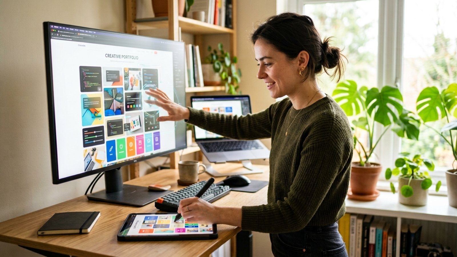
Quick answer: Web design trends 2026 lean toward bento-grid layouts, oversized expressive typography, and organic anti-grid shapes, balanced against a push for faster, lighter sites. For most small businesses, the trends worth adopting are the ones that improve clarity and speed — not the ones that just look impressive in a portfolio.
Every January, someone tells me their site “looks outdated” because it doesn’t match whatever’s trending on Awwwards. Sometimes they’re right. Often, though, the site works fine — it just looks different from what’s currently fashionable, and those are two very different problems.
So let’s separate the two. Here’s what’s genuinely shaping web design in 2026, and which of it actually matters if you’re running a small business rather than chasing design awards.
What Are the Web Design Trends Shaping 2026?
Two forces are pulling in opposite directions this year, and that tension is the real story.
On one side, design is getting louder. Bold typography, organic shapes, and saturated color palettes are replacing the flat minimalism that dominated the last several years. On the other side, performance and accessibility pressure is pushing sites toward lighter code and simpler interactions, because Google’s crawlers and AI answer engines reward speed over spectacle.
According to Elementor’s 2026 trends report, the shift toward organic layouts and softer, nature-inspired visuals reflects a broader desire for warmth after years of AI-driven, machine-perfect design. That’s a real pattern I’ve noticed across client briefs too — people want their site to feel human again.
Which 2026 Trends Are Actually Worth Adopting?
Not every trend deserves a place on your homepage. These four, however, tend to earn their keep because they improve usability along with looks.
Bento-Box Layouts
Instead of one long scrolling page, content gets grouped into clearly defined blocks — like a bento box — that visitors can scan quickly. It works especially well for service pages and pricing tables, because it lets people compare options side by side instead of scrolling endlessly.
Bold, Oversized Typography
Text is taking over the role that hero images used to play. Large, confident headlines paired with variable fonts create a strong first impression without needing custom photography. For a small business without a big content budget, that’s a genuinely practical trade.
Organic, Anti-Grid Shapes
Soft curves, layered masks, and irregular section edges are replacing the rigid rectangular grids of the past decade. Used sparingly, this breaks up a page’s rhythm and stops it from feeling like a template. Used everywhere, it just looks chaotic — so restraint matters here.
Lightweight, Fast-Loading Interactions
This one doesn’t photograph well, but it matters more than any visual trend. Sites are trimming heavy JavaScript animation libraries in favor of simple CSS-driven motion, because both users and AI crawlers increasingly reward speed over spectacle. Figma’s 2026 design trends resource notes that immersive 3D and WebGL effects are growing too, but that trend is mostly for brands with dedicated dev budgets — not something every small business site needs to chase.
Which Trends Should Small Businesses Skip in 2026?
Here’s where I’ll take a clear position: not every trend belongs on a service-based small business site, and chasing all of them at once usually backfires.
Full WebGL/3D product experiences. These look incredible for brands like Nike or IKEA, where users need to visualize a physical product. For a local plumber or a boutique consultancy, a heavy 3D scene just slows the page down without adding value.
Maximalist Y2K color explosions. Neon gradients and clashing colors work for youth and lifestyle brands with a built-in tolerance for chaos. They tend to hurt trust signals on B2B or professional service sites, where visitors are scanning for credibility, not entertainment.
Tactile brutalism for its own sake. Raw geometry and aggressive contrast can look striking in a design portfolio. On a site meant to convert visitors into paying customers, it often just adds friction — clarity should still win over spectacle.
How Do I Know Which Trend Actually Fits My Brand?
Start with your audience, not the trend list. A creative agency can get away with an anti-grid layout that a law firm can’t. That’s not a rule so much as common sense — the site still has to build trust with the specific people who land on it.
A useful filter: ask whether the trend makes your key message clearer or just louder. Bento grids and bold typography usually pass that test. Full-page WebGL scenes usually don’t, unless your product genuinely needs to be seen in 3D.
If you’re not sure which platform even fits your business goals before you touch design trends at all, my free Platform Finder Quiz walks through that decision in a couple of minutes.
The Mistake I See Most Often With Trend-Chasing Redesigns
Business owners adopt three or four trends at once, and the site ends up slower than the “outdated” version it replaced. Bold typography plus heavy animation plus a 3D hero section adds up fast, and Core Web Vitals scores drop before the new design even finishes loading for half your visitors.
That’s not a hypothetical. It’s the single most common issue I fix after someone else’s “trendy” redesign goes live. If your site has picked up new visual flair but feels sluggish, it’s worth running it through a proper Core Web Vitals audit before assuming the design itself is the problem.
Frequently Asked Questions
What is the biggest web design trend for 2026? Bento-box layouts and bold, oversized typography are the two trends showing up most consistently across 2026 design reports, because they improve both visual impact and content scannability.
Do web design trends actually affect SEO? Yes, indirectly. Trends that add heavy JavaScript or large 3D assets can slow page load times, which hurts Core Web Vitals scores and, in turn, search rankings.
Should a small business redesign its site every year to follow trends? No. A full redesign is rarely necessary. Most businesses benefit more from adopting one or two relevant trends within their existing site than from a complete annual overhaul.
Are bright, maximalist color palettes right for every business? No. They tend to suit lifestyle, beauty, and youth-focused brands well but can undermine trust on professional service or B2B sites, where visitors expect a more restrained look.
What’s replacing flat minimalism in 2026? Organic, anti-grid layouts with soft curves and irregular shapes are replacing the strict grid-based minimalism that dominated web design from roughly 2018 to 2024.
How much does a trend-driven website redesign typically cost? It depends heavily on scope — a few new sections cost far less than a full rebuild. A freelance developer can usually implement two or three trends into an existing WordPress or Wix site without a ground-up redesign.
Trends are worth knowing, but they’re not a strategy on their own. The sites that actually convert well in 2026 are the ones that pick a couple of trends deliberately and execute them cleanly, without sacrificing speed or clarity.
If you want help figuring out which of these trends