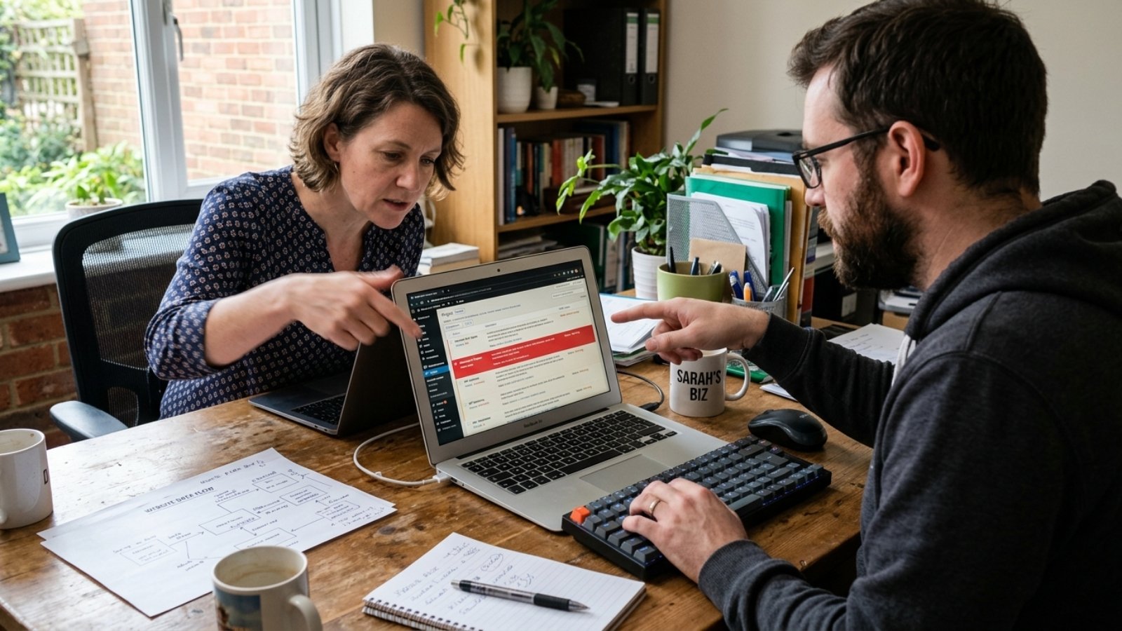

Business owner testing his website on mobile after realizing desktop-first design hurt usability

Why Desktop-First Design Fails Small Business Sites

Quick answer: Desktop-first design fails in 2026 because Google indexes and ranks your site based on its mobile version, not your desktop layout. Worldwide, mobile devices now edge out desktop for web traffic too. A site designed for a big monitor first, then squeezed onto a phone, usually loses both rankings and conversions.

I still get client sites where the desktop version is polished and the mobile version feels like an afterthought — cramped buttons, text that needed pinching to read, a menu that barely works with a thumb. It’s rarely intentional. It’s just what happens when a designer builds on a 27-inch monitor and checks mobile last, if at all.

That habit made sense a decade ago. It doesn’t anymore, and the reasons are more concrete than “mobile is popular now.”

What Does “Desktop-First Design” Actually Mean?

Desktop-first design means building a site’s layout, typography, and interactions for a large screen first, then adapting or shrinking that design down for mobile. It sounds efficient. In practice, it usually means mobile gets the leftover attention.

Mobile-first design flips the order: you design for the smallest screen and smallest bandwidth first, then expand up to tablet and desktop. That approach forces harder decisions early, like which content actually matters, instead of hiding the problem behind a bigger canvas.

Why Is Desktop-First Design a Problem for SEO in 2026?

This is the part most business owners don’t realize until it costs them. Google’s crawler doesn’t evaluate your desktop site at all for most ranking decisions anymore.

According to Google’s own Search Central documentation, Google predominantly uses the mobile version of your content for indexing and ranking. If your mobile site has less content, fewer internal links, or missing structured data compared to desktop, that gap becomes invisible to Google — because it simply isn’t looking at your desktop version to fill it in.

That means a beautifully built desktop homepage with thin, stripped-down mobile content isn’t actually competing on its strengths. Google never sees them.

Does Mobile Traffic Actually Justify This?

Yes, and the gap keeps closing in mobile’s favor. As of May 2026, StatCounter’s worldwide data puts mobile at 51.04% of global web traffic against 48.96% for desktop.

That’s closer to even than some headline stats suggest, and the split varies a lot by industry. A restaurant or local service site typically sees mobile traffic well above that average, because people search for those businesses on their phone, often while deciding where to go right now. A B2B software company might see the opposite, with desktop still dominant among researchers and decision-makers at work.

That’s an important nuance most “mobile is everything now” articles skip. Desktop-first design isn’t automatically wrong for every business — it’s wrong for the majority that don’t check which side of that split they’re actually on.

What Breaks Most Often on Desktop-First Sites?

I see the same handful of problems repeatedly, and none of them are exotic.

Touch targets sized for a mouse cursor. Buttons and links that work fine with a precise mouse pointer become frustrating to tap accurately with a thumb, especially in navigation menus.

Text that requires zooming. Font sizes chosen to look proportional on a large monitor often shrink below comfortable reading size once squeezed onto a phone screen.

Hidden or stripped mobile content. Some older theme setups quietly drop sections of content from the mobile version rather than just collapsing them visually, which means Google’s crawler never sees that content at all.

Desktop-only navigation patterns. Hover-triggered dropdown menus don’t translate to touch. On mobile, they either don’t work or need an awkward workaround.

Slower mobile load times. Heavy desktop-oriented images and scripts get sent to mobile devices too, on slower connections, which hurts both user patience and Core Web Vitals scores.

How Do I Know If My Site Has This Problem?

Open your own site on your phone and try to complete the action you most want visitors to take — book a call, fill out a form, add something to a cart. If that feels clunky to you on your own device, it’s costing you conversions from strangers who won’t push through the friction.

You can also check Google Search Console under Settings, then Crawler. It’ll show whether Googlebot Smartphone or Googlebot Desktop is your primary crawler. For nearly every site in 2026, it should say Smartphone — if it doesn’t, that’s worth investigating directly with Google’s support.

Beyond that manual check, it’s worth running an actual Core Web Vitals audit, since a desktop-first build often hides its worst performance problems specifically on mobile, where they matter most for rankings.

Is Responsive Design the Same as Mobile-First?

No, and this is where a lot of confusion comes from. Responsive design means a layout adapts across screen sizes — it’s a technical approach. Mobile-first is a design philosophy about which screen you prioritize when making decisions.

A site can be technically responsive and still be designed desktop-first, if every decision started with the big screen and mobile only got adjustments afterward. That’s the trap: the site “works” on mobile without ever being genuinely built for it.

If you’re planning a new build and aren’t sure which platform makes a true mobile-first approach easiest for your specific business, my free Platform Finder Quiz walks through that decision in a couple of minutes.

Frequently Asked Questions

What is desktop-first design? Desktop-first design means building a website’s layout and content for a large screen first, then adapting it down for mobile devices afterward, often as a lower priority.

Does desktop-first design hurt SEO? Yes, in most cases. Google predominantly indexes and ranks sites based on their mobile version, so content or features missing from mobile are effectively invisible to search rankings.

Is desktop-first design ever the right choice? It can make sense for businesses where desktop traffic genuinely dominates, such as some B2B software platforms used primarily at work. Checking your own analytics is more reliable than assuming.

What percentage of web traffic is mobile in 2026? Mobile devices accounted for 51.04% of worldwide web traffic in May 2026, according to StatCounter, narrowly ahead of desktop at 48.96%. That split varies significantly by industry and region.

How do I check if Google is indexing my mobile or desktop site? In Google Search Console, go to Settings, then Crawler. It shows whether Googlebot Smartphone or Googlebot Desktop is your primary crawler, which should be Smartphone for virtually every site today.

What’s the difference between mobile-first design and responsive design? Responsive design is a technical approach where layouts adapt to different screen sizes. Mobile-first is a design philosophy that prioritizes mobile decisions from the start, rather than adapting a desktop layout afterward.

Desktop-first design isn’t a moral failing — it’s usually just an old habit that never got updated. However, the businesses still building that way in 2026 are handing rankings and conversions to competitors who fixed this years ago.

If your site was built desktop-first and you want it rebuilt around how people actually find and use it today — on WordPress, Wix, or a custom Flutter app — message me on WhatsApp and I’ll take a look.


Business owner and designer reviewing a warm minimalist design mockup in earthy tones

Warm Minimalist Design: The 2026 Business Look

Quick answer: Warm minimalist design combines the clean, uncluttered structure of minimalism with earthy tones, natural textures, and softer typography, replacing the stark white-and-black minimalism that dominated the early 2020s. It’s become the 2026 small business aesthetic because it signals approachability without sacrificing the clarity that made minimalism popular in the first place.

I’ve watched client requests shift noticeably this year. Fewer people ask for “clean and modern” in the sterile, corporate sense. More people ask for something that feels clean but also, in their words, “warm” or “human.”

Why Cold Minimalism Is Losing Ground

Stark white backgrounds, harsh black text, and geometric sans-serif fonts defined minimalism for most of the last decade. That look still works for certain brands, but it’s stopped feeling distinctive, partly because AI-generated design tools now produce that exact aesthetic instantly and at scale.

That’s not a small factor. As AI-generated visuals become smoother and more uniform, audiences increasingly notice, and gravitate away from, anything that reads as generic or machine-made. Warm minimalist design pushes in the opposite direction: textures that look handled, imperfect edges, colors pulled from soil and wood rather than a pure white-black system. It reads as deliberately human, which is exactly the point.

Even Pantone’s own 2026 Color of the Year selection, Cloud Dancer, a soft, billowy white rather than a stark, clinical one, reflects this broader shift. The company describes it as offering calm and clarity rather than sterile minimalism, which tracks closely with what’s actually showing up across small business website redesigns this year.

What Warm Minimalist Design Actually Looks Like

The color palette is the most obvious signal. Terracotta, sage green, muted olive, sand, clay, and soft taupe have replaced the pure white, pure black, single-accent-color palettes that dominated minimalist design previously. These tones read as grounded and natural rather than corporate or sterile.

Typography softens too. Serif and slab-serif fonts, or rounded sans-serifs with warmer proportions, are replacing the hyper-geometric sans-serifs that felt tech-forward a few years ago. The goal isn’t decoration for its own sake. It’s making the same clean layout feel inviting rather than clinical.

Texture matters more than most business owners expect. Subtle paper grain, soft shadows, or organic shapes breaking up rigid grid lines all contribute to that “handled” feeling, without abandoning the underlying simplicity that makes minimalism effective in the first place. The structure stays clean. The surface feels warmer.

Why This Fits Small Businesses Specifically

Here’s the part worth understanding beyond just following a trend. Cold, ultra-minimal design often reads as corporate, distant, even slightly intimidating, exactly the opposite of what most small businesses want to communicate to a first-time visitor.

Warm minimalist design keeps the clarity and professionalism minimalism is known for, while signaling something closer to “run by real people who care,” which matters enormously for service businesses, artisan retailers, wellness brands, and anyone selling trust as much as a product. A cold, sterile aesthetic can genuinely work against a business whose entire pitch is personal attention and craftsmanship.

That said, this isn’t universal. A fintech startup or enterprise SaaS product may still benefit more from a sharper, more technical-feeling minimalism than a warm, earthy one. This trend fits businesses selling warmth and relationship, not every business by default.

The Accessibility Trap of Warm Palettes

Here’s a genuinely useful nuance most trend articles skip entirely, and it’s worth taking seriously before you commit to earthy tones across your whole site. Warm neutrals, muted sage on cream, soft taupe on off-white, often carry noticeably lower contrast than the stark black-on-white combinations they’re replacing.

The W3C’s WCAG 2.2 standard requires a minimum 4.5:1 contrast ratio for normal body text to meet accessibility guidelines. Plenty of warm, muted color pairings that look beautiful in a mockup fail that ratio when actually tested, which means visitors with low vision genuinely struggle to read your content.

The fix isn’t abandoning the palette. It’s testing your actual text-and-background combinations against the real contrast ratio before finalizing anything, and reserving the softest, most muted tones for accents and backgrounds rather than body text itself. A warm palette and an accessible one aren’t mutually exclusive, but they don’t happen automatically together either.

How to Apply This Without a Full Rebrand

Here’s where I’ll give a genuinely practical answer, not just design theory. You don’t need to rebuild your entire site to bring in this aesthetic. Swapping your accent colors, background tones, and a few key typography choices often shifts the overall feeling significantly without touching your core layout or navigation structure.

Start with your homepage hero section and one or two other high-visibility pages first. Test how the warmer palette reads against your actual content and photography before committing sitewide, since a shift this visible deserves a trial run rather than an all-at-once overhaul.

This overlaps with a broader principle I’ve covered in web design trends that actually improve conversions: test a change on real traffic before assuming it’s the right call for your entire site, rather than adopting a trend wholesale because it’s currently popular.

The Mistake I See Most: Warmth Without Structure

Here’s my honest take after seeing this trend implemented poorly a few times already. Some redesigns lean so heavily into texture, muted color, and organic shapes that the underlying clarity minimalism was known for gets lost entirely. The result feels cluttered and soft rather than warm and clean.

Warm minimalist design still needs the discipline of actual minimalism underneath: generous white space, clear hierarchy, one obvious next step per page. The warmth comes from color and texture choices layered on top of that structure, not from abandoning the structure itself. If your redesign feels busier than your old cold-minimalist site, you’ve missed the point of the trend entirely.

Frequently Asked Questions

What is warm minimalist design?
It combines minimalism’s clean structure and generous white space with earthy color palettes, softer typography, and natural textures, replacing the stark white-and-black minimalism popular in previous years.

Why is warm minimalist design popular for small businesses in 2026?
It signals approachability and human authenticity, which matters for service businesses and brands built on personal trust, while still maintaining the clarity and professionalism minimalism provides.

Does every business benefit from switching to warm minimalist design?
No. Fintech, enterprise SaaS, and other more technical-feeling brands may still benefit more from a sharper, cooler minimalism than an earthy, warm one.

Are warm color palettes harder to make accessible?
Often, yes. Muted, earthy tones frequently carry lower contrast than stark black-on-white combinations, so testing actual contrast ratios against WCAG standards matters more with these palettes.

Do I need a full website rebuild to adopt warm minimalist design?
Not necessarily. Updating accent colors, backgrounds, and typography often shifts the overall feeling significantly without requiring changes to your site’s core layout or structure.

How do I know if warm minimalist design fits my brand?
If your business relies on personal trust, craftsmanship, or approachability, warm minimalist design likely fits well. If your brand leans technical or corporate, a cooler aesthetic may serve you better.

Curious If This Aesthetic Fits Your Brand?

If you’re considering a refresh and want an honest read on whether warm minimalist design fits your business, message me on WhatsApp and tell me what you’re working with. I’ll give you a straight answer, not a trend-driven pitch.

Web designer reviewing web design trends 2026 on a bento-grid layout mockup

Web Design Trends 2026: What’s Worth Adopting Now

Quick answer: Web design trends 2026 lean toward bento-grid layouts, oversized expressive typography, and organic anti-grid shapes, balanced against a push for faster, lighter sites. For most small businesses, the trends worth adopting are the ones that improve clarity and speed — not the ones that just look impressive in a portfolio.

Every January, someone tells me their site “looks outdated” because it doesn’t match whatever’s trending on Awwwards. Sometimes they’re right. Often, though, the site works fine — it just looks different from what’s currently fashionable, and those are two very different problems.

So let’s separate the two. Here’s what’s genuinely shaping web design in 2026, and which of it actually matters if you’re running a small business rather than chasing design awards.

What Are the Web Design Trends Shaping 2026?

Two forces are pulling in opposite directions this year, and that tension is the real story.

On one side, design is getting louder. Bold typography, organic shapes, and saturated color palettes are replacing the flat minimalism that dominated the last several years. On the other side, performance and accessibility pressure is pushing sites toward lighter code and simpler interactions, because Google’s crawlers and AI answer engines reward speed over spectacle.

According to Elementor’s 2026 trends report, the shift toward organic layouts and softer, nature-inspired visuals reflects a broader desire for warmth after years of AI-driven, machine-perfect design. That’s a real pattern I’ve noticed across client briefs too — people want their site to feel human again.

Which 2026 Trends Are Actually Worth Adopting?

Not every trend deserves a place on your homepage. These four, however, tend to earn their keep because they improve usability along with looks.

Bento-Box Layouts

Instead of one long scrolling page, content gets grouped into clearly defined blocks — like a bento box — that visitors can scan quickly. It works especially well for service pages and pricing tables, because it lets people compare options side by side instead of scrolling endlessly.

Bold, Oversized Typography

Text is taking over the role that hero images used to play. Large, confident headlines paired with variable fonts create a strong first impression without needing custom photography. For a small business without a big content budget, that’s a genuinely practical trade.

Organic, Anti-Grid Shapes

Soft curves, layered masks, and irregular section edges are replacing the rigid rectangular grids of the past decade. Used sparingly, this breaks up a page’s rhythm and stops it from feeling like a template. Used everywhere, it just looks chaotic — so restraint matters here.

Lightweight, Fast-Loading Interactions

This one doesn’t photograph well, but it matters more than any visual trend. Sites are trimming heavy JavaScript animation libraries in favor of simple CSS-driven motion, because both users and AI crawlers increasingly reward speed over spectacle. Figma’s 2026 design trends resource notes that immersive 3D and WebGL effects are growing too, but that trend is mostly for brands with dedicated dev budgets — not something every small business site needs to chase.

Which Trends Should Small Businesses Skip in 2026?

Here’s where I’ll take a clear position: not every trend belongs on a service-based small business site, and chasing all of them at once usually backfires.

Full WebGL/3D product experiences. These look incredible for brands like Nike or IKEA, where users need to visualize a physical product. For a local plumber or a boutique consultancy, a heavy 3D scene just slows the page down without adding value.

Maximalist Y2K color explosions. Neon gradients and clashing colors work for youth and lifestyle brands with a built-in tolerance for chaos. They tend to hurt trust signals on B2B or professional service sites, where visitors are scanning for credibility, not entertainment.

Tactile brutalism for its own sake. Raw geometry and aggressive contrast can look striking in a design portfolio. On a site meant to convert visitors into paying customers, it often just adds friction — clarity should still win over spectacle.

How Do I Know Which Trend Actually Fits My Brand?

Start with your audience, not the trend list. A creative agency can get away with an anti-grid layout that a law firm can’t. That’s not a rule so much as common sense — the site still has to build trust with the specific people who land on it.

A useful filter: ask whether the trend makes your key message clearer or just louder. Bento grids and bold typography usually pass that test. Full-page WebGL scenes usually don’t, unless your product genuinely needs to be seen in 3D.

If you’re not sure which platform even fits your business goals before you touch design trends at all, my free Platform Finder Quiz walks through that decision in a couple of minutes.

The Mistake I See Most Often With Trend-Chasing Redesigns

Business owners adopt three or four trends at once, and the site ends up slower than the “outdated” version it replaced. Bold typography plus heavy animation plus a 3D hero section adds up fast, and Core Web Vitals scores drop before the new design even finishes loading for half your visitors.

That’s not a hypothetical. It’s the single most common issue I fix after someone else’s “trendy” redesign goes live. If your site has picked up new visual flair but feels sluggish, it’s worth running it through a proper Core Web Vitals audit before assuming the design itself is the problem.

Frequently Asked Questions

What is the biggest web design trend for 2026? Bento-box layouts and bold, oversized typography are the two trends showing up most consistently across 2026 design reports, because they improve both visual impact and content scannability.

Do web design trends actually affect SEO? Yes, indirectly. Trends that add heavy JavaScript or large 3D assets can slow page load times, which hurts Core Web Vitals scores and, in turn, search rankings.

Should a small business redesign its site every year to follow trends? No. A full redesign is rarely necessary. Most businesses benefit more from adopting one or two relevant trends within their existing site than from a complete annual overhaul.

Are bright, maximalist color palettes right for every business? No. They tend to suit lifestyle, beauty, and youth-focused brands well but can undermine trust on professional service or B2B sites, where visitors expect a more restrained look.

What’s replacing flat minimalism in 2026? Organic, anti-grid layouts with soft curves and irregular shapes are replacing the strict grid-based minimalism that dominated web design from roughly 2018 to 2024.

How much does a trend-driven website redesign typically cost? It depends heavily on scope — a few new sections cost far less than a full rebuild. A freelance developer can usually implement two or three trends into an existing WordPress or Wix site without a ground-up redesign.

Trends are worth knowing, but they’re not a strategy on their own. The sites that actually convert well in 2026 are the ones that pick a couple of trends deliberately and execute them cleanly, without sacrificing speed or clarity.

If you want help figuring out which of these trends

Business owner reviewing updated Equality Act website accessibility guidance against her own site

Equality Act Website Accessibility: 2026 Changes

This article explains recent regulatory developments in plain terms. It is not a substitute for legal advice. If you’re facing a complaint or potential litigation, consult a solicitor with disability discrimination experience.

Quick answer: Equality Act website accessibility obligations didn’t change in substance during 2026, but the framework around them did. In May 2026, the Equality and Human Rights Commission laid a draft updated Code of Practice before Parliament. Compensation bands for injury-to-feelings claims also rose in April 2026. Together, these raise the practical stakes for businesses without changing the underlying legal duty itself.

I’ve covered whether the Equality Act applies to your website in detail elsewhere. This article is about something different: what specifically shifted in 2026, and why that shift matters even though the core law hasn’t been rewritten.

What Actually Changed in 2026?

The Equality Act 2010 itself hasn’t been amended for digital accessibility purposes. However, two developments this year raise the practical weight behind the existing duty. According to the official draft Code of Practice published on GOV.UK, the Equality and Human Rights Commission laid an updated Code of Practice for Services, Public Functions and Associations before Parliament in May 2026.

This Code isn’t new legislation. It’s statutory guidance explaining how courts should interpret the existing Equality Act 2010. Courts and tribunals must still take the Code into account in relevant proceedings, though. That means an updated Code genuinely shapes how judges assess whether a business met its reasonable adjustments duty, even without changing a single word of the Act itself.

Why a “Code of Practice” Update Actually Matters for Your Website

Here’s the distinction worth understanding clearly. The Equality Act sets out the legal duty in broad terms: service providers must make reasonable adjustments for disabled people. The Code of Practice fills in the practical detail courts use to judge specific cases. It explains what counts as reasonable, how the anticipatory duty applies, and what “substantial disadvantage” actually looks like in practice.

Once it clears its parliamentary scrutiny period, an updated Code becomes the reference document courts lean on when your website accessibility gets tested in a real dispute. That’s why this update, even without new legislation, is worth paying attention to now rather than waiting for a final version to appear.

The Anticipatory Duty: Reasonable Adjustments Before a Complaint, Not After

Here’s a point worth stating plainly, because it changes how businesses should think about timing. Section 20 of the Act imposes what’s called an anticipatory duty. You’re expected to remove accessibility barriers proactively, before a disabled visitor is actually disadvantaged, not only in response to a specific complaint.

Waiting until someone complains about your inaccessible contact form isn’t a defensible strategy in practice. The duty exists ahead of any individual encountering the barrier. That’s exactly why an accessibility audit conducted now, rather than after a complaint arrives, puts you in a meaningfully stronger position.

What Happens If You Don’t Comply: The Numbers Just Went Up

Here’s data that rarely appears in general accessibility explainers, and it’s directly relevant to your actual financial exposure. Compensation for injury to feelings in discrimination claims follows what’s called the Vento bands, updated in April 2026.

The lower band now runs roughly £1,300 to £12,600 for less serious cases. The middle band runs £12,600 to £37,700. The upper band, reserved for the most serious cases, runs £37,700 to £62,900. Exceptional cases can exceed that figure entirely. Claimants can also recover financial losses and aggravated damages on top of these bands, with no upper cap on total compensation in county court or employment tribunal claims.

That’s a meaningfully different risk picture than many business owners assume when they think of accessibility as a minor compliance checkbox rather than genuine financial exposure.

[INSERT: a real client example — a business Aoun advised on accessibility risk exposure, and the specific gaps addressed before any complaint arose]

Does This Mean You Need a Completely New Approach?

Not necessarily, and here’s where I’ll push back on treating this as a reason to panic. The practical standard businesses should aim for hasn’t changed. WCAG 2.2 Level AA remains the accepted benchmark courts and the EHRC reference when judging reasonable adjustments, exactly as before this update.

What’s changed is the strength of the guidance courts will lean on, and the compensation figures attached to getting it wrong. This update doesn’t require anything fundamentally different if you’ve already addressed the technical checklist properly: keyboard navigation, color contrast, meaningful alt text, form labeling. I’ve broken that checklist down in detail in WCAG 2.2 compliance checklist for small business websites, which remains the practical roadmap regardless of this year’s Code update.

The Nuance Most Coverage of This Update Misses

Here’s my honest take. Most coverage of this year’s Code of Practice update focuses entirely on unrelated provisions within the same document, since the Code covers all nine protected characteristics, not just disability. Business owners searching specifically for accessibility implications often struggle to find coverage that isolates just the digital accessibility angle from the broader document.

The digital accessibility provisions within this update are actually the least controversial, most stable part of the Code. This year’s revision didn’t target the reasonable adjustments duty for disabled service users, including website accessibility. That’s genuinely useful context if you’ve seen alarming headlines about this Code update and wondered whether it changes your accessibility obligations specifically. It largely reinforces the existing standard rather than overhauling it.

How Does This Compare to Your EU-Facing Obligations?

If your business also sells to EU customers, remember these UK-specific developments sit alongside, not instead of, your obligations under EU law. I’ve covered that separate framework in the European Accessibility Act, which applies independently of anything happening within UK domestic legislation this year.

For businesses trading purely within the UK, though, this year’s Code update and the revised Vento bands are the developments actually worth tracking, more than any EU-specific news.

Frequently Asked Questions

Did the Equality Act 2010 itself change in 2026?
No. The Act’s text remains unchanged. What changed is the Equality and Human Rights Commission’s Code of Practice, updated statutory guidance that courts must consider when interpreting the existing law.

What is the anticipatory duty under the Equality Act?
It’s the requirement that businesses remove accessibility barriers proactively, before a disabled person is actually disadvantaged, rather than only responding after a specific complaint arises.

How much compensation can a website accessibility discrimination claim result in?
Injury to feelings compensation follows the Vento bands, updated in April 2026, ranging from roughly £1,300 in the lower band to £62,900 in the upper band, with exceptional cases exceeding that figure.

Do I need to change my website compliance approach because of the 2026 Code update?
Not fundamentally. WCAG 2.2 Level AA remains the practical benchmark. The update strengthens the guidance courts reference rather than changing the underlying technical standard businesses should meet.

Is the updated Code of Practice legally binding yet?
As a draft, it’s subject to a parliamentary scrutiny period before formally coming into force. However, courts can already consider relevant guidance when assessing compliance disputes.

Does this update apply to businesses outside England, Scotland, and Wales?
No. The Equality Act 2010 and this Code of Practice apply to England, Scotland, and Wales. Northern Ireland operates under separate disability discrimination legislation.

Want Your Website Reviewed Against Current Requirements?

If you’re not sure whether your website’s accessibility holds up against these updated standards, message me on WhatsApp and send me your link. I’ll give you a straight technical read on where the real gaps sit.

Business owner and developer reviewing GDPR gaps on her WordPress site together

GDPR and Your WordPress Site: 2026 Fixes

This article explains data protection law in plain terms. It is not a substitute for legal advice. If your business handles sensitive personal data or faces a regulatory inquiry, consult a qualified data protection professional.

Quick answer: GDPR and your WordPress site still don’t fully align in 2026 for most small businesses. That’s true even years after the regulation took effect. Common gaps include plugins acting as unlisted data processors, cookie banners with dark patterns, and mistaking WordPress’s comment checkbox for genuine consent. GDPR fines can reach €20 million or 4% of global turnover. These gaps carry real financial risk.

I still find the same handful of gaps on nearly every WordPress site I audit. GDPR isn’t new, but plenty of sites installed a plugin once, years ago, and never checked whether it actually does the job.

The Mistake Most Sites Already Made: Confusing the Comment Checkbox for a Real Cookie Banner

Here’s the one that surprises people most. WordPress ships with a built-in comment consent checkbox. It’s the little tickbox under your comment form that says “Save my name, email, and website in this browser for next time.” Some site owners assume this checkbox covers their entire GDPR consent obligation. It doesn’t.

That checkbox only covers comment-related data storage. It says nothing about analytics cookies, advertising trackers, or third-party embeds elsewhere on your site. Suppose your only “consent mechanism” is that comment checkbox, and you’re also running Google Analytics or social widgets. In that case, you have a genuine, significant gap, not a minor technicality.

What Actually Still Needs Fixing on a Typical WordPress Site

Every Plugin Is Also a Data Processor

Here’s something that gets overlooked constantly. Each plugin touching visitor data becomes a data processor under GDPR. That includes form builders, analytics tools, and SEO plugins pulling location data. Your privacy policy needs to name every single one.

Audit your active plugins. Ask honestly what data each one collects, where it gets stored, and whether that location has adequate safeguards. A plugin server outside the EU without proper safeguards can create liability you never noticed.

Google Analytics 4 Without Proper Consent Mode

Running GA4 without Consent Mode configured correctly lets tracking scripts fire before a visitor grants consent. That’s a direct breach, not a gray area. GDPR requires genuine opt-in consent before non-essential tracking begins.

Check your Consent Mode setup specifically. Don’t assume your cookie plugin handles this automatically. Many older configurations still fire tracking scripts on page load no matter what the visitor chooses.

Contact Forms Storing Data Indefinitely

Contact form submissions often sit in your database forever, with no defined retention period. That breaks the GDPR storage limitation principle. This principle requires you to keep personal data only as long as its original purpose needs.

Set a real retention policy. Delete old submissions after a defined period, and document that policy in your privacy notice. This is one of the simplest fixes here, and it frequently gets overlooked entirely.

Gravatar and Jetpack Sending Data Externally

Running Jetpack or displaying Gravatar images sends visitor data, including IP addresses, straight to Automattic’s servers. This happens automatically, without an explicit prompt each time. Disclose this clearly in your privacy policy, since it’s an external data transfer your visitors may not expect.

Cookie Banners With Dark Patterns

Some cookie banners bury “Reject” behind smaller text, poor placement, or extra clicks, while “Accept” stays big and obvious. This design choice remains a recurring enforcement target. Regulators have fined even major companies specifically for this pattern. Smaller sites aren’t automatically exempt from scrutiny.

I’ve covered the specific UK requirements around consent banner design in UK cookie consent rules 2026. The design principles overlap heavily between UK and EU frameworks.

Does GDPR Apply If You’re Not Based in the EU?

Yes, and this trips up plenty of non-EU business owners. GDPR applies based on whose data you process, not where your business sits. Suppose EU residents visit your site and their personal data gets collected, through forms, analytics, or cookies. GDPR then applies to that processing, regardless of where your servers or business are located.

A WordPress site run from Pakistan, the US, or anywhere else still needs to address these gaps if EU visitors make up part of the audience. That’s common for most public-facing business websites.

The Nuance Most Guides Skip: A Plugin Doesn’t Make You Compliant, It Makes Compliance Possible

Here’s my honest take after auditing enough of these sites. Business owners often install a GDPR compliance plugin and treat the issue as permanently closed. That’s the wrong mental model.

A compliance plugin hands you tools: a cookie banner, a data export function, a consent log. It won’t configure itself for your specific plugin stack, verify your Consent Mode setup, or write your actual privacy policy content. Treat the plugin as a starting point, not a finished solution. Treating it as “set and forget” is exactly how sites end up non-compliant years after installing something meant to fix this.

This connects to a broader pattern worth understanding. Technical currency matters as much for compliance work as it does for general WordPress development. I’ve covered what separates a current developer from an outdated one in what a good WordPress developer should know in 2026. That same currency applies directly here, too.

What Should You Actually Do About This Now?

Start by mapping every place your site collects personal data: contact forms, comments, checkout pages, analytics, and embedded third-party widgets. Then check each plugin against that map. Confirm your privacy policy discloses it, and confirm it respects consent choices instead of running on default settings.

This kind of audit often surfaces alongside other neglected technical issues. I’ve covered the broader category of overlooked WordPress problems in common WordPress mistakes that hurt rankings. Compliance gaps and SEO gaps tend to show up together on sites that haven’t had a technical review in a while.

Frequently Asked Questions

Does GDPR still apply to my WordPress site in 2026?
Yes. GDPR applies to any website processing personal data of EU residents, regardless of where the business is based. Enforcement has continued steadily since the regulation took effect in 2018.

Is WordPress’s built-in comment checkbox enough for GDPR compliance?
No. That checkbox only covers comment-related data storage. You need separate consent for analytics, advertising cookies, and other non-essential tracking elsewhere on your site.

Do WordPress plugins count as data processors under GDPR?
Yes. Any plugin that collects, stores, or transmits visitor data qualifies as a data processor. Your privacy policy should disclose each one, along with where that data gets stored.

Can I get fined for GDPR violations even as a small business?
Yes. Large companies attract more attention, but regulators have fined smaller businesses too, particularly for dark pattern cookie banners and improperly configured analytics tracking.

Does Google Analytics 4 require special GDPR configuration?
Yes. Without correctly configured Consent Mode, GA4 can fire tracking scripts before a visitor grants consent. That constitutes a direct GDPR breach, not a minor technical oversight.

How long can I legally keep contact form submissions on my WordPress site?
GDPR requires you to keep data only as long as its original purpose needs. Set a defined retention period and delete older submissions instead of storing them indefinitely.

Want Your Site Audited for These Gaps?

If you’re not sure whether your WordPress site actually addresses these GDPR requirements, message me on WhatsApp and send me your link. I’ll give you a straight technical read on what’s actually missing.

Business owner realizing her homepage is killing conversions while reviewing it on her laptop

Why Your Homepage Is Killing Your Conversions

Quick answer: Your homepage is killing your conversions if it takes too long to explain what you do, buries the call to action, or crams in more information than a visitor can process in a few seconds. Research shows people form an opinion about a webpage in roughly 50 milliseconds. Your homepage has almost no room for confusion.

I’ve audited enough homepages to know the pattern by now. The business is legitimate, the offer is solid, and the site still quietly loses visitors before they ever reach a contact form.

The 50-Millisecond Problem Nobody Accounts For

Here’s a number that should genuinely change how you think about your homepage. A peer-reviewed study published in Behaviour & Information Technology found that people form a visual opinion about a webpage in roughly 50 milliseconds, faster than a single blink.

That’s not enough time to read a headline, let alone a paragraph. Your homepage’s overall visual impression, clean or cluttered, modern or dated, gets judged before a single word registers. If that first impression feels off, everything you actually wrote may never get read at all.

The 28% Problem: Visitors Don’t Read, They Scan

Here’s the second piece of research that changes how a homepage should actually get written. Nielsen Norman Group’s research found that users read at most 28% of the words on an average page. The rest gets skimmed, or skipped entirely.

A homepage packed with paragraphs explaining your services in detail wastes most of that effort. Visitors scan in an F-shaped pattern, reading headlines and the first few words of lines carefully, then skipping the rest. If your key message isn’t in that scanned path, it functionally doesn’t exist for most visitors.

5 Homepage Mistakes That Are Actually Killing Your Conversions

1. It Takes Too Long to Say What You Do

If a visitor has to read three paragraphs to figure out what your business offers, you’ve already lost most of them. Your headline and subheadline need to answer “what is this, and is it for me” within the first glance, not after scrolling.

2. The Call to Action Is Buried or Vague

“Learn More” tells a visitor nothing about what happens next. Place a clear, specific action, “Get a Free Quote,” “Book a Consultation,” prominently above the fold. That gives scanning visitors an obvious next step instead of making them hunt for one.

3. Too Much Information Competes for Attention

A homepage trying to say everything at once, services, testimonials, awards, team bios, blog posts, forces visitors to work harder than their scanning behavior allows. That’s why the strongest homepages say less, not more, and trust supporting pages to carry the detail.

4. Stock Photography Undermines Trust

Generic stock photos of people shaking hands or smiling at laptops read as exactly what they are: filler. Real photos of your actual work, product, or team build far more credibility in that critical first glance than polished but obviously generic imagery.

5. Social Proof Is Missing or Buried Too Low

Given the F-shaped scanning pattern, content placed far down the page or off to the side gets far less attention. Most scanning visitors never see testimonials or client logos sitting below several other sections, even though they’d likely help convert.

Why This Isn’t Just About Making It “Prettier”

Here’s where I’ll push back on how most homepage advice gets framed. The goal isn’t a nicer-looking homepage. It’s a homepage structured around how people actually process information in those first few seconds, not how a business owner wants to present it.

That distinction matters because plenty of visually polished homepages still convert poorly. Their organization follows company priorities, “our story,” “our mission,” instead of the visitor’s actual scanning behavior and immediate question: is this for me, and what do I do next?

This connects closely to a broader pattern I cover in why your website isn’t getting any leads, where the homepage is often the single biggest point of silent visitor loss on an otherwise reasonable site.

Does This Mean You Need a Full Redesign?

Not necessarily. Often, the fix is restructuring what’s already there, tightening the headline, moving the call to action higher, cutting competing sections, rather than rebuilding the entire homepage from scratch.

A full redesign becomes worth it when the underlying structure genuinely can’t support these changes, a rigid template that won’t let you reorder sections or simplify the layout. If you’re weighing which situation you’re in, I cover the design principles that actually move conversion metrics, not just aesthetics, in more depth in web design trends 2026 that actually increase sales.

The Mistake I See Most: Writing the Homepage for Yourself, Not Your Visitor

Here’s my honest take after reviewing enough of these. Business owners often write their homepage the way they’d introduce their business at a networking event, background first, credentials second, offer somewhere near the end. That order makes sense in conversation. It fails completely in the 50-millisecond, scan-don’t-read reality of how people actually process a webpage.

Flip that order. Lead with what you do and who it’s for, then follow with credibility and detail for the smaller percentage of visitors who scroll further. That single reordering fixes more homepages than any visual redesign alone.

If you want a realistic sense of what restructuring or rebuilding your homepage would cost, the Free Website Cost Calculator gives you a clear estimate in a couple of minutes.

Frequently Asked Questions

Why is my homepage not converting visitors into leads?
Common causes include a slow-to-explain value proposition, a buried or vague call to action, and too much competing information for visitors to process during their brief initial scan of the page.

How quickly do people actually judge a homepage?
Research shows people form a visual opinion about a webpage in roughly 50 milliseconds, meaning your homepage’s overall clarity and design get judged almost instantly, before any text gets read.

Do visitors actually read homepage content, or just scan it?
Mostly scan. Research shows users read at most 28% of the words on an average page, typically following an F-shaped pattern focused on headlines and the first few words of each line.

Does my homepage need a full redesign to fix conversion issues?
Not always. Often, restructuring existing content, moving the call to action higher, simplifying competing sections, fixes conversion issues without a full rebuild.

Should my homepage lead with company background or the offer itself?
Lead with the offer and who it’s for. Company background and credibility details should come after, since most visitors scan the top of the page first and may never scroll further.

Does stock photography actually hurt a homepage’s credibility?
Yes. Generic stock imagery often reads as filler rather than authentic representation, while real photos of your work or team tend to build more trust during that critical first impression.

Want Your Homepage Reviewed?

If you’re not sure whether your homepage is quietly losing you leads, message me on WhatsApp and send me your link. I’ll give you a straight read on what’s actually working against you.

Business owner reviewing her website's cookie banner against the updated UK cookie consent rules

UK Cookie Consent Rules 2026: What Changed

This article explains recent changes to UK law in plain terms and is not a substitute for legal advice. If your business handles sensitive data or faces regulatory scrutiny, consult a qualified data protection professional.

Quick answer: UK cookie consent rules changed significantly in 2026 under the Data (Use and Access) Act. Some low-risk cookies, like basic analytics, no longer require consent, but you must still offer a clear way to object. PECR fines also rose to £17.5 million, matching UK GDPR penalties, so getting your cookie banner right now carries real financial stakes.

If your website hasn’t touched its cookie banner in a year or two, this is worth five minutes of your attention. UK cookie law changed more in the past twelve months than in the previous decade combined.

What Actually Changed, and When

The Data (Use and Access) Act 2025 received Royal Assent in June 2025, and its key cookie-related provisions came into force on 5 February 2026. According to the official legislation on legislation.gov.uk, the Act amended the Privacy and Electronic Communications Regulations (PECR), the law that governs cookies and tracking technologies on UK websites.

The Information Commissioner’s Office then finalized its updated guidance on 29 April 2026, clarifying exactly how businesses should apply these changes in practice. That guidance is what your website needs to comply with today, not the older cookie rules many templates and plugins were built around.

The Three Changes That Actually Matter for Your Website

1. Some Cookies No Longer Require Consent

The Act introduced new exemptions for specific low-risk purposes: basic first-party analytics used solely to improve your website, cookies that preserve your site’s appearance settings, and cookies used for emergency assistance services. If your only non-essential cookies fall into one of these categories, you may not need a full consent banner for them anymore.

However, this exemption comes with a catch. Even under these exemptions, you must still provide a “simple and free” way for visitors to object to the cookie use, and you must clearly explain what the cookie does. Silence or a confusing settings menu doesn’t satisfy that requirement.

2. Penalties Jumped to £17.5 Million

Here’s the number that should genuinely get your attention. Maximum PECR fines rose from £500,000 to £17.5 million, or 4% of global turnover, aligning cookie violations with the same enforcement level as UK GDPR breaches. That’s a 35-fold increase, and it signals the ICO treats cookie compliance as a serious matter now, not a minor technicality.

3. A New Complaints Procedure Requirement

From 19 June 2026, organizations must have a formal, documented complaints procedure for data protection issues, including an audit trail of how complaints get handled. If your privacy policy doesn’t currently mention how someone can raise a data concern with you directly, that’s a gap worth closing.

Does a Simple Business Website Actually Need a Cookie Banner?

Here’s where I’ll give you the direct answer most legal explainers dance around. If your site uses only strictly necessary cookies, things required for basic function like a shopping cart or login session, you likely don’t need a consent banner at all.

However, most small business sites run Google Analytics, embedded social media widgets, or advertising pixels, all of which typically require consent under the updated rules. Before assuming you’re exempt, audit every cookie your site actually sets. WordPress sites in particular often set cookies through plugins you installed months ago and forgot about entirely.

What Should Your Cookie Banner Actually Look Like Now?

The ICO’s guidance is specific here, and it’s worth following exactly. A compliant banner needs an “Accept All” and a “Reject All” option with equal visual prominence. That means no burying “Reject” in a tiny link while “Accept” gets a bold, colorful button, a design pattern the ICO has explicitly flagged as non-compliant.

Pre-ticked boxes for optional cookies also don’t count as valid consent, and neither does “by continuing to browse, you agree to cookies” language. Consent needs an active, clear action from the visitor, not passive acceptance through inaction.

The Nuance Most Small Businesses Miss: This Isn’t Just About the Banner

Here’s my honest take after reviewing enough client sites. Business owners fixate entirely on the cookie banner’s design and completely overlook their privacy policy, which also needs updating to reflect these changes. Your policy should now describe which cookies fall under the new exemptions, how visitors can object to them, and how your new complaints procedure works.

A pretty, technically compliant banner sitting on top of an outdated privacy policy still leaves you exposed. Both pieces need to match the current law, not just the visible banner your visitors interact with.

This kind of compliance work often overlaps with broader site health issues I cover in 10 website mistakes costing small businesses thousands, since outdated legal pages tend to show up alongside other neglected maintenance items.

What Should You Do About This Right Now?

Start by auditing every cookie your site actually sets, most WordPress sites have several plugin-installed cookies owners have never reviewed. Confirm which, if any, fall under the new exemptions, and update your banner to meet the “equal prominence” requirement for accept and reject.

Then update your privacy policy to reflect the DUAA changes and add a documented complaints procedure before the 19 June 2026 deadline, if you haven’t already. If your current developer isn’t confident navigating this, it’s worth confirming they understand current compliance requirements before your next site update. I’ve covered what a technically current WordPress developer should know in more depth in my WordPress developer cost guide, which touches on the broader skill set worth checking for.

Frequently Asked Questions

Do all UK websites need a cookie consent banner in 2026?
No. Sites using only strictly necessary cookies don’t need a banner. Most sites using analytics, advertising, or social media widgets still require consent under the updated PECR rules.

What changed in UK cookie law in 2026?
The Data (Use and Access) Act 2025 introduced new exemptions for low-risk cookies like basic analytics, raised maximum PECR fines to £17.5 million, and added a new complaints procedure requirement from June 2026.

Can I skip consent for Google Analytics on my UK site?
Only in narrow cases where the analytics use falls strictly within the new statistical purposes exemption and no other tracking occurs. Most standard Google Analytics setups still require consent.

What happens if my cookie banner doesn’t meet the new ICO requirements?
You risk enforcement action from the ICO, with maximum penalties now at £17.5 million or 4% of global turnover, though enforcement typically prioritizes serious, repeated, or large-scale violations first.

Do I need to update my privacy policy because of these changes?
Yes. Your privacy policy should reflect the new cookie exemptions, explain how visitors can object to tracking, and describe your complaints handling procedure, required from 19 June 2026.

Is this UK law different from EU cookie rules?
Yes. Since the DUAA amendments, UK cookie law is now a distinct regime from EU GDPR, with its own exemptions and requirements. Sites serving both UK and EU visitors need compliant mechanisms for each separately.

Need Help Reviewing Your Site’s Compliance?

If you’re not sure whether your cookie banner and privacy policy actually meet the updated 2026 requirements, message me on WhatsApp and send me your link. I’ll give you a straight technical read on what needs updating.

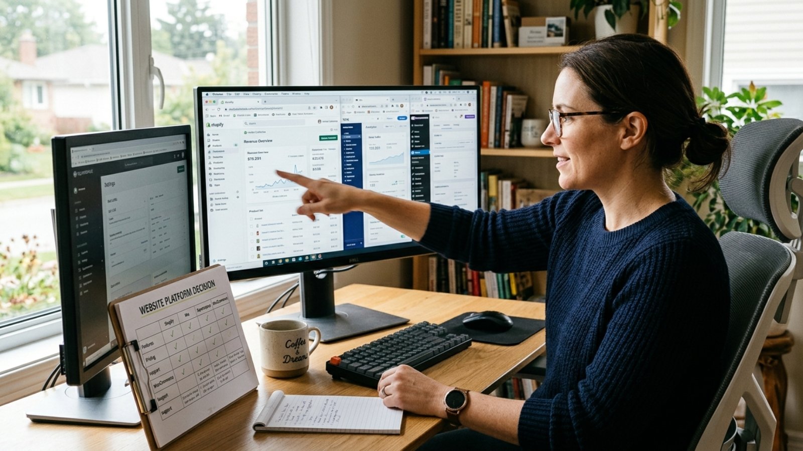
Business owner comparing platform dashboards while learning how to choose the right CMS for her business

How to Choose the Right CMS for Your Business

Quick answer: To choose the right CMS for your business, match the platform to your actual priority: WordPress for content and flexibility, Shopify for e-commerce, Wix or Squarespace for fast, low-maintenance launches, and Webflow for design control. There’s no single “best” CMS, only the best fit for what your business actually needs to do.

Every “best CMS” article promises one clear winner. That framing is misleading, because the right choice depends entirely on your priorities, not on some universal ranking.

The Real Question Isn’t Which CMS Is Best

Business owners often ask me “which platform should I use?” as if there’s a single correct answer. There isn’t. According to W3Techs’ CMS usage data, WordPress powers a dominant share of all websites globally, yet plenty of thriving businesses run happily on Shopify, Wix, or Webflow instead.

Market share tells you what’s popular. It doesn’t tell you what’s right for your specific business. That’s why the better question is: what does your business actually need this platform to do?

Match the CMS to Your Business Type, Not the Other Way Around

If You Publish Content Regularly, Choose WordPress

WordPress remains the strongest choice for content-heavy businesses, blogs, news sites, or anything publishing frequently. Its editorial tools, plugin ecosystem, and SEO flexibility are built specifically around ongoing content publishing in a way no competitor fully matches.

That flexibility comes with a trade-off, though. You’ll manage hosting, updates, and security yourself, unless you pay someone else to handle it. I’ve broken down that ongoing cost in detail in my WordPress developer cost guide, worth reviewing if content publishing is your primary goal.

If You’re Selling Products, Consider Shopify

Shopify was purpose-built for e-commerce, with inventory management, payment processing, and shipping logic handled natively. For a business whose entire purpose is selling products online, that specialization often outweighs the flexibility WordPress with WooCommerce offers.

However, if your business is content-first with e-commerce as a secondary feature, WordPress with WooCommerce may still fit better, since it keeps your blog and store on one unified platform rather than splitting functionality across two systems.

If You Need a Fast, Low-Maintenance Launch, Choose Wix or Squarespace

For a straightforward brochure site, portfolio, or service business without complex functionality needs, Wix and Squarespace let you launch in days without touching code or managing hosting separately. Both platforms bundle hosting, security, and updates into one predictable monthly fee.

The trade-off is less flexibility long-term. If your business plans significant custom functionality down the road, a booking system, a membership area, complex integrations, these platforms can hit limits that WordPress or Webflow handle more comfortably.

If Design Precision Matters Most, Consider Webflow

Webflow gives designers pixel-level control that template-based platforms rarely match, while still bundling hosting and security like Wix or Squarespace do. For design-forward businesses where visual polish drives credibility, particularly agencies, studios, or premium brands, that precision genuinely matters.

I’ve compared WordPress and Webflow specifically in more depth in WordPress vs Webflow: which is better for small business, which covers pricing and trade-offs beyond this general overview.

The Nuance Most Comparisons Get Wrong: Market Share Trends Don’t Predict Your Outcome

Here’s something worth knowing, and it’s genuinely rare in comparison articles. WordPress recently experienced its first sustained market share decline in over two decades, as hosted platforms like Wix and Shopify continue growing. That’s a real trend worth being aware of.

However, that trend says almost nothing about which platform fits your specific business. WordPress’s decline reflects broader market shifts toward simpler, hosted solutions for basic sites, not a decline in WordPress’s capability for businesses that actually need its flexibility. Don’t choose a platform based on which one is “winning” market share. Choose based on what your business specifically requires.

What Actually Determines the Right Choice for You

Five questions matter more than any platform’s popularity ranking. How often will you publish new content? Do you need to sell products, and how many? Do you want full design control, or is a clean template sufficient? Will you manage the site yourself, or hire someone? And how much custom functionality might you need as the business grows?

Answer those honestly, and the right CMS usually becomes obvious without needing a definitive “best platform” ranking at all. A business publishing three blog posts a week has a completely different answer than one selling twenty products with zero content plans.

If you want a realistic cost comparison across platforms for your specific situation, my small business website cost guide breaks down real 2026 pricing for DIY, freelancer, and agency paths across different platforms.

The Mistake I See Most: Choosing Based on What a Friend Used

Here’s my honest take. Plenty of business owners pick a CMS because a friend’s business uses it successfully, without checking whether that friend’s needs actually match their own. A friend’s thriving Shopify store tells you Shopify works for e-commerce. It tells you nothing about whether it fits your content-heavy consulting business.

Evaluate against your own five questions above, not someone else’s success story on a different platform for a different kind of business. What worked brilliantly for them might genuinely be the wrong fit for you.

If you want help matching your specific project to the right platform, the Free Website Cost Calculator walks through your actual needs and gives you a realistic starting point.

Frequently Asked Questions

What’s the best CMS for a small business in 2026?
There’s no single best CMS. WordPress suits content-heavy businesses, Shopify suits e-commerce, and Wix or Squarespace suit fast, low-maintenance launches. The right choice depends on your specific priorities.

Is WordPress still a good choice given its declining market share?
Yes. WordPress’s decline reflects growth in hosted platforms for simple sites, not a drop in capability. It remains the strongest choice for content-heavy or highly customizable businesses.

Should I choose Shopify or WordPress with WooCommerce for my online store?
Shopify suits businesses focused primarily on selling products with minimal content needs. WordPress with WooCommerce suits businesses that want content publishing and e-commerce combined on one platform.

Is Wix or Squarespace good enough for a professional business website?
Yes, for straightforward brochure sites or portfolios without complex functionality needs. Both offer low-maintenance, predictable pricing, though they offer less flexibility than WordPress or Webflow long-term.

How do I know if I need Webflow instead of WordPress?
Choose Webflow if precise visual design control matters more than plugin flexibility or content management depth, particularly for design-forward brands like agencies or studios.

Can I switch CMS platforms later if I choose wrong?
Yes, but migration involves real cost and effort, including rebuilding content and redirecting old URLs. Choosing carefully upfront based on your actual needs avoids that expense later.

Still Not Sure Which Platform Fits Your Business?

If you’re weighing your options and want a straight answer based on what your business actually needs, message me on WhatsApp and tell me what you’re building. I’ll give you an honest recommendation, not a platform sales pitch.

Small business owner comparing freelance vs in-house developer costs on a spreadsheet

Freelance vs In-House Developer: Which Fits a Small Business Budget

Quick answer: For most small businesses, freelance vs in-house developer comes down to workload consistency. A freelancer costs less overall if you need under 20-25 hours a week of ongoing work, while an in-house developer becomes cost-effective once you need full-time, continuous development. Below that threshold, in-house salary and benefits usually cost more than the work justifies.

I get asked this constantly by business owners scaling past their first website. The honest answer isn’t “freelancers are cheaper” or “employees are better.” It depends entirely on how much ongoing work you actually have.

What Does an In-House Developer Really Cost?

According to the U.S. Bureau of Labor Statistics, the median annual wage for web developers was $90,930 in May 2024. That number is just the starting point, though, not the real cost of hiring one.

Once you add payroll taxes, benefits, equipment, and overhead, that $90,930 salary typically balloons to a fully-loaded cost of $115,000 to $145,000 a year. Benefits and payroll taxes alone usually add another 25-30% on top of base salary. That’s before counting recruiting costs, onboarding time, or the weeks a new hire spends ramping up before they’re fully productive.

For a small business, that’s a significant fixed cost, one you’re paying whether your developer has a light week or a packed one.

What Does a Freelancer Actually Cost?

Freelance web developer rates in 2026 typically range from $18-$45/hour for junior developers in lower-cost regions to $150-$220+/hour for senior specialists in the US and Western Europe. That range feels wide, but it mirrors the same experience-based spread you’d see in full-time salaries.

Here’s the number that surprises people: a freelancer generally needs to charge 40-50% more than an equivalent hourly employee rate just to cover their own taxes, benefits, and business overhead. That means a freelancer billing $85/hour is roughly equivalent, in true cost terms, to paying an employee around $55/hour once you factor in what an employer would otherwise absorb.

That’s not a reason to distrust freelance rates. It’s a reason to compare them fairly, since the freelancer’s rate already includes costs an in-house employee’s salary doesn’t reflect on paper.

Side by Side: What Does $90,000 Actually Buy You?

An in-house developer at $90,930 salary, loaded to roughly $120,000 with benefits and overhead, gives you consistent, full-time availability for one person’s skill set, working on whatever you assign them, every week of the year.

That same $120,000 could instead cover 800-1,300 hours of freelance work at typical mid-to-senior rates, depending on region and specialization. For many small businesses, that translates to more actual project output, because you’re not paying for slow weeks, meetings, or downtime between projects, only for work delivered.

The trade-off is availability and continuity. An in-house developer is there tomorrow morning without scheduling. A freelancer, even a great one, is juggling other clients and isn’t sitting on standby for your next request.

When In-House Actually Wins

Here’s where I’ll push back on the “freelancer is always cheaper” narrative, because it isn’t universally true. If your business genuinely needs 35-40 hours of development work every single week, ongoing feature builds, constant maintenance, active product development, an in-house developer often works out cheaper per hour than stacking freelance rates for that same volume.

In-house hires also build institutional knowledge over time. They understand your systems, your codebase, and your business context in a way that resets slightly with each new freelancer you bring on for a project. For businesses running a complex, evolving product, that continuity has real value beyond the hourly math.

The Mistake Most Small Businesses Make: Hiring In-House Too Early

Here’s my honest take after watching this play out repeatedly. Small businesses often hire an in-house developer the moment they feel “established enough,” without actually running the math on their weekly workload first.

If your development needs fluctuate, a big push before launch, then quiet maintenance for months, a full-time salary sits idle during the quiet stretches while still costing the same fixed amount. A freelancer, or a small rotation of freelancers, scales naturally with that fluctuation instead.

The businesses that get burned worst are the ones who hire in-house for workload that was never consistent enough to justify it, then face the awkward reality of underutilizing a salaried employee or the disruption of letting them go.

Is There a Middle Ground?

Yes, and it’s worth considering before committing to either extreme. A retainer arrangement with a trusted freelancer, a fixed monthly hour block for ongoing maintenance and updates, gives you predictability closer to in-house continuity without the fixed salary and benefits burden.

I’ve broken down the broader freelancer-versus-agency decision, which overlaps significantly with this comparison, in my freelancer vs agency guide. If you’re specifically weighing WordPress project costs as part of this decision, my WordPress developer cost breakdown covers current 2026 pricing across experience levels.

If you want a realistic sense of what your specific project or ongoing needs would cost either way, the Free Website Cost Calculator gives you a starting estimate in a couple of minutes.

Frequently Asked Questions

Is it cheaper to hire a freelance developer or an in-house developer?
For workloads under roughly 20-25 hours a week, freelancers are usually cheaper overall. Once you need full-time, continuous work, an in-house hire often becomes more cost-effective per hour.

How much does an in-house web developer actually cost a small business?
The median salary is $90,930 according to BLS data, but fully-loaded cost with benefits, payroll taxes, and overhead typically reaches $115,000-$145,000 annually.

Why do freelance developer rates seem high compared to employee salaries?
Freelancers must cover their own taxes, benefits, and business overhead, which means they typically charge 40-50% more per hour than an equivalent employee rate just to break even.

Can a freelancer provide the same continuity as an in-house developer?
Not exactly, though a retainer arrangement with a consistent freelancer can approximate it. In-house employees generally build deeper institutional knowledge over time.

What’s the biggest mistake small businesses make when choosing between freelance and in-house?
Hiring in-house before workload is consistent enough to justify a full-time salary, which leaves the position underutilized during slower periods.

Is a retainer a good middle ground between freelance and in-house?
Yes, for many small businesses. A retainer offers more predictability than one-off freelance projects, without the fixed cost and commitment of a full-time salary.

Not Sure Which Fits Your Business?

If you’re weighing freelance against in-house for your specific workload, message me on WhatsApp and tell me what you’re working with. I’ll give you a straight read on what actually fits your budget.

Developer explaining block themes to a client while demonstrating what a good WordPress developer should know in 2026

What a Good WordPress Developer Should Know in 2026

Quick answer: A good WordPress developer in 2026 knows PHP, block themes and Full Site Editing, basic security hardening, and performance optimization, not just how to install plugins. If a candidate only knows classic PHP themes and page builders, they’re working with tools that WordPress itself has already moved past.

WordPress has changed more in the last three years than in the decade before it. That matters directly for hiring, because the skills that made someone a solid developer in 2020 don’t automatically make them one now.

Why This List Looks Different Than It Would Have a Few Years Ago

The biggest shift is Full Site Editing, or FSE. According to WordPress.org’s official documentation, block themes now handle every part of a site, headers, footers, navigation, entirely through blocks, rather than requiring PHP template files for structural changes.

That’s not a minor feature update. It changes how a competent developer actually builds a site day to day. A developer who’s never touched block themes or the Site Editor is working with an outdated toolkit, even if they’re technically still writing valid WordPress code.

Core Skill 1: PHP, Still, Just Applied Differently

PHP hasn’t disappeared. Business logic, custom post types, and REST API endpoints still run through it. However, the days of editing raw PHP template files for every visual change are fading fast, since block themes now handle that layer through HTML and block markup instead.

A good developer today knows when PHP is actually necessary versus when the block editor already solves the problem. Someone who defaults to custom PHP for tasks the Site Editor handles natively is often working harder than the job requires.

Core Skill 2: Genuine Comfort With Block Themes and the Site Editor

Ask a candidate to explain the difference between a block theme and a classic theme. A developer with real 2026 experience answers this without hesitation, because it’s become the default way WordPress themes are structured now.

They should also understand theme.json, the configuration file controlling global styles, colors, and typography across block themes. A developer unfamiliar with theme.json is likely still building the way WordPress worked several versions ago.

Core Skill 3: Security as a Baseline, Not an Afterthought

Outdated plugins remain one of the most common ways WordPress sites get compromised. A good developer keeps plugins updated deliberately, uses strong authentication practices, and avoids installing unnecessary plugins that widen your site’s attack surface.

This isn’t advanced knowledge. It’s baseline hygiene that separates developers who think about your site’s long-term health from those who only care about getting it launched.

Core Skill 4: Performance Optimization Beyond “Install a Caching Plugin”

Real performance work means understanding what’s actually slowing a site down: unoptimized images, excessive plugin bloat, poor hosting, or render-blocking scripts. A developer who reaches for a caching plugin as the only fix, without diagnosing the actual bottleneck, is treating a symptom rather than the cause.

Block themes genuinely help here. A clean block theme typically ships with far less JavaScript than a heavy page-builder site, which is one practical reason experienced developers have shifted toward them for new projects.

Core Skill 5: WooCommerce Fundamentals, Even for Non-Store Projects

Not every project involves e-commerce, but a good WordPress developer should still understand WooCommerce’s basics, since many clients eventually want to add a store, even if they don’t need one on day one. A developer who’s never touched WooCommerce may struggle to plan a site’s structure for that future possibility.

If your project specifically involves a store, the skill bar goes considerably higher. I’ve covered exactly what to check for in that scenario in what to look for in a WooCommerce developer.

Core Skill 6: Clear Communication, Not Just Technical Skill

Here’s something that rarely makes these lists but matters enormously in practice. A developer who can explain a technical trade-off in plain language, why a feature will slow the site, why a shortcut now creates problems later, saves you from making uninformed decisions about your own project.

Technical skill without communication just means you’ll get surprised later by decisions you never understood. Ask candidates to explain something technical to you directly during the hiring process, and pay attention to whether the explanation actually lands.

The Red Flag Most Clients Miss: Still Only Building Classic PHP Themes

Here’s my honest opinion. A developer who’s never built anything on a block theme, and still relies entirely on classic PHP templates and heavy page builders for every project, isn’t necessarily bad. But they are behind where the ecosystem has moved, and that gap tends to show up later as slower sites, harder content editing, and features that take longer to build than they should.

This doesn’t mean page builders like Elementor are automatically wrong. Plenty of solid developers still use them well for specific project needs. The red flag is a developer who’s unaware block themes exist as an option at all, not one who’s made an informed choice between approaches.

If you’re vetting candidates generally, not just for technical currency, it’s worth reviewing broader hiring risks too. I’ve covered those in more detail in red flags to watch for when hiring a freelance developer.

How Does This Affect What You Should Budget?

Developers current on block themes, FSE, and modern performance practices often charge similarly to developers using older approaches, since pricing tracks experience more than specific tooling. However, the value difference shows up later, in a site that’s faster, easier to update, and less prone to plugin conflicts.

I’ve broken down realistic 2026 pricing across experience levels in my WordPress developer cost guide, which is worth reviewing alongside this checklist before you finalize a hire.

Frequently Asked Questions

What’s the most important skill for a WordPress developer to have in 2026?
Comfort with block themes and Full Site Editing is the biggest differentiator now, since it’s become the standard way WordPress sites are structured and edited.

Is PHP still necessary for WordPress development?
Yes. PHP still handles business logic, custom functionality, and REST API work, even though block themes have shifted much of the visual template layer away from PHP files.

Should I avoid a developer who only uses page builders like Elementor?
Not necessarily. Page builders remain useful for specific projects. The concern is a developer who’s unaware of block themes as an alternative, rather than one who’s made an informed choice.

Does a good WordPress developer need WooCommerce experience?
At least basic familiarity, yes, since many sites eventually add e-commerce features. Deep WooCommerce expertise matters most specifically for store-focused projects.

How can I tell if a developer’s skills are current for 2026?
Ask them to explain the difference between block themes and classic themes, or what theme.json does. A developer with current experience answers this comfortably.

Does hiring a more current developer cost more?
Not necessarily. Pricing tracks overall experience more than specific tooling, though a developer skilled in modern practices often delivers a faster, more maintainable site for the same rate.

Want a Developer Who’s Current on Modern WordPress?

If you’re planning a project and want it built on the current WordPress standard, not outdated tooling, message me on WhatsApp and tell me what you need. I’ll give you a straight read on the right approach.