
A few months ago, a tourism operator in Aruba came to me with a problem that’s more common than people think: they were managing three separate tour brands, each with bookable inventory, and customers had no single place to discover and book all of it. Each brand had its own following, but there was no unified web presence tying them together.
This post walks through exactly how I approached the project — the technical decisions, the challenges that came up, and what I’d tell anyone facing a similar setup.
The Starting Point
The client operated under one umbrella business, working with three partner tour companies — each running their own activities, each with their own FareHarbor account for managing availability and payments. The goal was simple to state and harder to execute: build one WordPress website where a visitor could browse all three brands’ tours, check real-time availability, and book directly — without ever needing to leave the site or figure out which company to contact.
Before this project, customers were finding tours through scattered channels — direct partner websites, social media, word of mouth — with no consistent booking experience and no way for the operator to present everything as one cohesive offering.
✅ Pro Tip: If you’re in a similar position — managing multiple service providers or brands under one umbrella — don’t try to force everything into a single generic page. Customers need to understand which experience belongs to which brand, even while booking everything in one place.
Why FareHarbor
FareHarbor was already the booking system each partner used individually, which made it the obvious technical foundation rather than introducing a new platform and asking three separate businesses to migrate their existing booking workflows. FareHarbor’s Partner Network feature was the key piece that made a unified site possible — it allows one “operator” account to be granted booking permissions across multiple partner accounts, while each partner retains full control of their own inventory and payments on their end.
This meant the WordPress site didn’t need to store or manage any booking data itself. It just needed to display the right widgets, pointed at the right partner inventory, in the right places.
Planning the Site Structure
Before writing any code, the site needed a structure that made sense to a first-time visitor who had no idea three separate companies were involved. I settled on:
- A homepage introducing the umbrella brand with a clear primary call-to-action
- A single “Book a Tour” page as the main booking destination
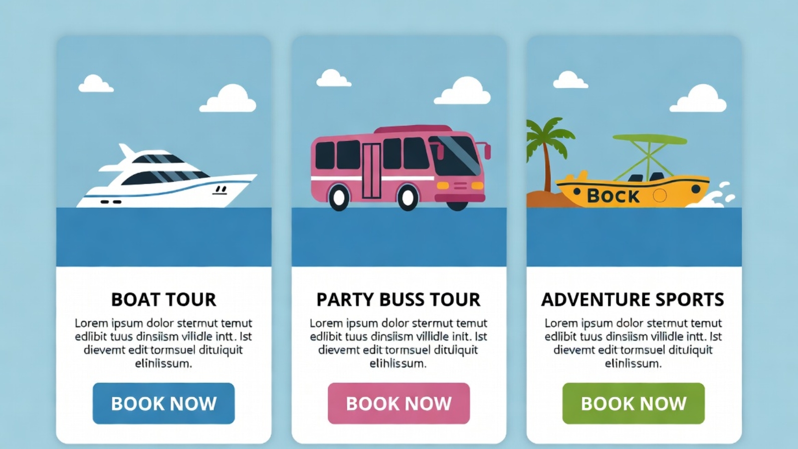
- Within that page, three distinct sections — one per partner brand — each with its own short introduction, photos, and a FareHarbor Flow widget scoped to that partner’s specific tours
- Individual tour landing pages for the most popular activities, each with its own booking widget, for better SEO and easier sharing on social media
This structure meant a customer could land on the main booking page and immediately understand: here’s a boat tour company, here’s a party bus company, here’s an adventure sports company — pick what interests you.
The Technical Build
The site was built on WordPress using Elementor for the front-end design, which gave the flexibility to create custom layouts for each partner section without needing to write a custom theme from scratch.
FareHarbor integration approach:
Each partner section used a FareHarbor Flow widget, filtered to that specific partner’s item IDs using the operator shortname and a comma-separated list of item IDs in the embed URL. This was the cleanest way to keep inventory separated visually while still pulling everything through one connected account.
<a href="https://fareharbor.com/embeds/book/operatorshortname/items/12345,67890/?full-items=yes">
  Book [Partner Name] Tours
</a>
Design decisions that mattered:
- Each partner section used a distinct accent color matching that brand’s existing identity, while keeping the overall page layout consistent — so it felt unified, not chaotic
- Mobile-first build, since the overwhelming majority of tourists browse and book from their phones, often on hotel wifi or a tourist SIM with limited data
- WhatsApp contact buttons placed throughout, because in this market a lot of customers want to ask a quick question before committing to a booking, and WhatsApp converts far better than a contact form for this audience
⚠️ Watch Out: When working with multiple FareHarbor partner accounts, every partner has to individually approve your operator account in their FareHarbor Partner settings before their inventory will show up in your widgets. This isn’t something you control from your side — it requires the partner logging into their own FareHarbor dashboard. Build this into your project timeline, because it’s a common bottleneck.
Challenges Along the Way
Coordinating partner approval timing
Since each of the three partners needed to separately approve the operator account inside their own FareHarbor dashboard, the project timeline depended partly on three different businesses responding promptly — not something a developer can speed up directly. The lesson here was building this dependency into the project plan from day one rather than assuming it would happen instantly.
Keeping brand identity intact within a unified site
The client was understandably protective of each partner’s individual brand identity — none of the three wanted to feel like they’d been absorbed into a generic “tours” page. Solving this meant treating each section almost like its own mini-landing-page within the larger site, with distinct photography, color accents, and copy tone, while still sharing the same booking mechanics underneath.
Page speed with multiple embedded widgets
Loading three separate Flow widgets on one page risked slowing things down if not handled carefully. The fix was loading the FareHarbor script tag once in the site header rather than once per widget instance, and lazy-loading each partner section’s widget so it only initialized as the visitor scrolled to that section.
The Result
The umbrella operator now has a single website where visitors can discover and book tours across all three partner brands, with live availability pulled directly from FareHarbor — no manual updates required on the WordPress side when a partner’s schedule changes. Each partner retains full control of their own pricing, availability, and payment processing through their existing FareHarbor account, while benefiting from a more polished, unified web presence than any of them had individually before.
For the operator, it meant turning three disconnected booking experiences into one coherent customer journey — without anyone needing to change how they actually run their day-to-day tour operations.
What I’d Tell Anyone in a Similar Situation
If you’re running multiple brands, partner businesses, or service providers under one umbrella and considering a similar setup, here’s what actually matters most:
- Confirm partner buy-in and FareHarbor approval timelines before committing to a launch date
- Design each section to preserve individual brand identity, not flatten everything into one generic look
- Build mobile-first from day one if your audience is tourists booking on their phones
- Load shared scripts once, not per widget, to protect page speed
- Put WhatsApp or a similarly low-friction contact option front and center if your audience prefers chat over forms
If you’re managing something similar — multiple service providers, partner brands, or locations that all need to come together under one booking experience — Contact me and I can walk you through how this could work for your situation.